New development permits have been filed for a five-story residential project at 578 7th Street in the southwest corner of Downtown Oakland. Construction would rise between Clay and Jefferson Street, adding dozens of new market-rate and affordable apartments to the Oakland housing market. Riaz Capital is responsible for the application.
578 7th Street is part of Riaz’s second opportunity fund, totaling $100 million, focusing on residential infills across Oakland. Now, Riaz is rolling out a third opportunity fund, raising $100 million to build between ten to twelve projects affordable for workforce multifamily households across the Bay Area.
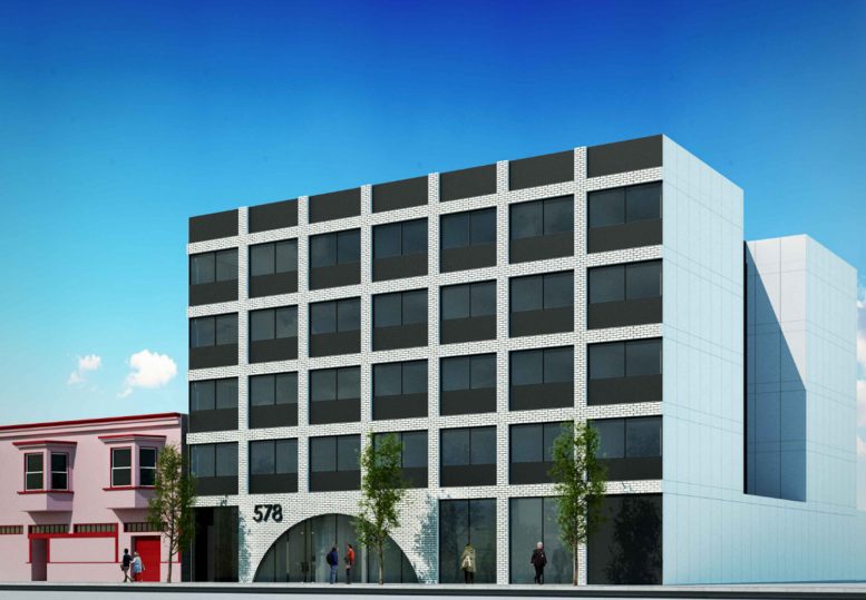
The 51-foot tall structure will yield 32,250 square feet dedicated to residential use. Of the 57 apartments, 41 will be priced at market rate, and the remaining 16 will be offered as deed-restricted affordable housing for moderate-income households.
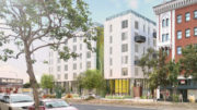
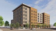
Stanley Saitowitz | Natoma Architects is responsible for the architecture. Facade materials will include white brick veneer, black aluminum framed windows, and white cement-fiber along the sides of the building. Within the planning application, the studio gave a brief description of the project, writing, “the entry to the building is highlighted with a semi-circular archway that houses recessed lighting, creating a simple-yet-elegant entry sequence. The rear of the property is designed with a smooth, white stucco finish to facilitate a future mural installation.”
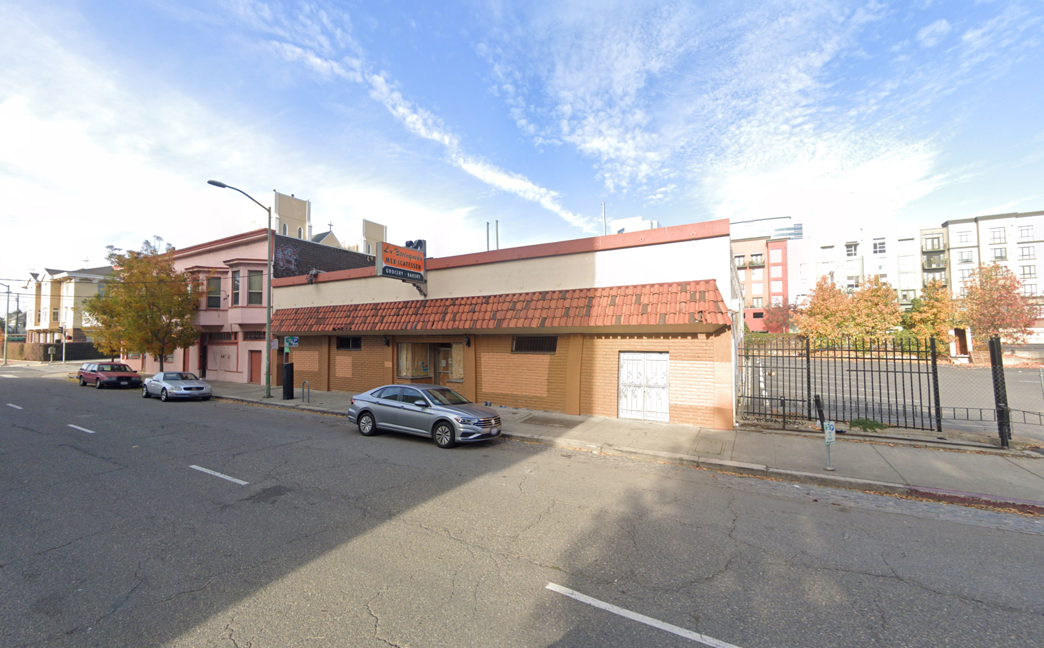
578 7th Street, image via Google Street View
Three water gum trees with gravel beds are to be planted at the front of the property. Past the trees, residents will be around the corner from Jefferson Square Park and eight minutes from the 12th Street BART station on foot. Twelve minutes south by foot, residents can also catch the San Francisco Bay Ferry from Jack London Square, connecting residents to San Francisco, Vallejo, and Alameda.
Demolition will be required of the existing vacant single-story 6,000-square foot commercial structure. The building had been occupied by La Borinqueña, a ‘Mexi-catessen’ grocery and bakery store.
Subscribe to YIMBY’s daily e-mail
Follow YIMBYgram for real-time photo updates
Like YIMBY on Facebook
Follow YIMBY’s Twitter for the latest in YIMBYnews

It is better than what is there, but the entrance is ugly. It would look better as square the round doesn’t fit. It is just a ugly building to start with but it has a lot of windows which is good.