New illustrations have been revealed and permits filed for the redesigned porte-cochère entrance for the Hilton hotel at 750 Kearny Street, located on the border of Chinatown and the Financial District in San Francisco. The exterior will be renovated once crews remove the Kearny Street pedestrian bridge. Demolition is expected to start later this year with the start of the $66 million Portsmouth Square improvement project.
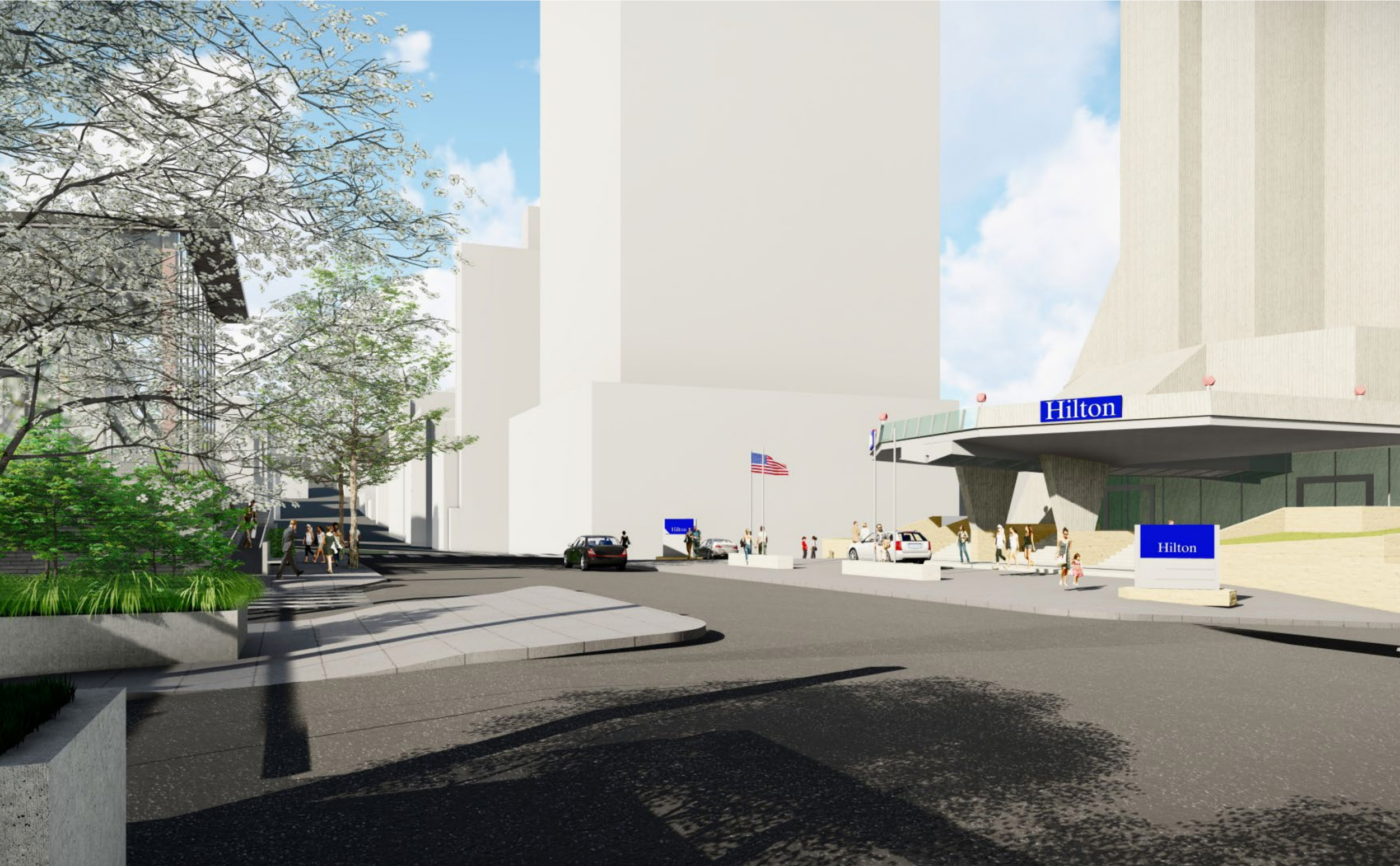
750 Kearny Street redesign, illustration by RDP
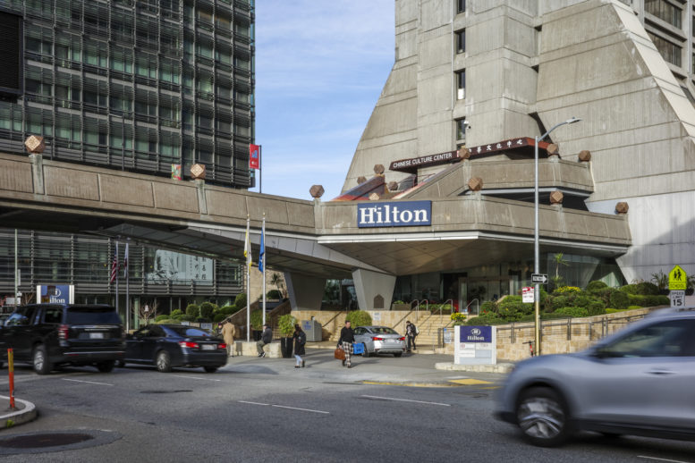
The Hilton San Francisco Financial District, formerly a Holiday Inn, was constructed in 1971 with design by Chinese American Clement Chen in collaboration with John Carl Warnecke & Associates. The 27-story building stands 298 feet tall, producing a bold example of Brutalist-style architecture in a city dominated by International Style modernism.
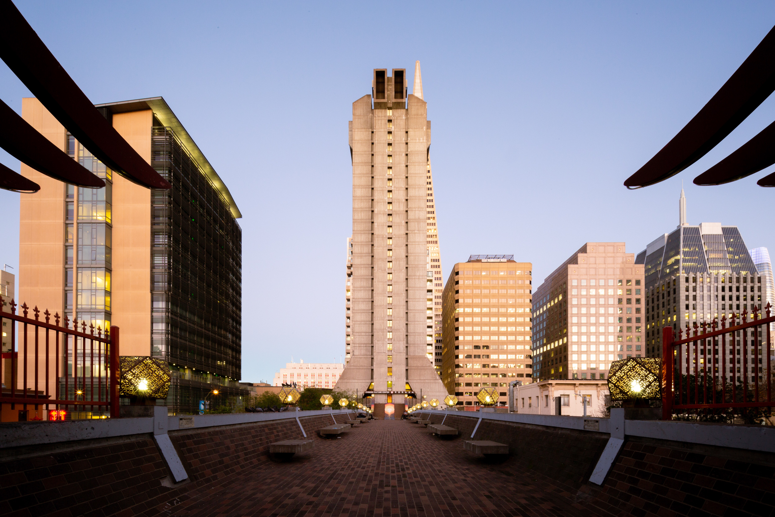
Hilton San Francisco Financial District, image by Andrew Campbell Nelson
The second and third floors of the hotel includes the roughly 20,000-square-foot Chinese Cultural Center, which opened in 1973. The pedestrian bridge connecting the center with Portsmouth Square was designed to be accessible for the neighborhood. While the bridge has been identified as eligible for listing in the California Register for its association with significant events and architectural significance, public sentiment remains adamant. Its removal will likely be celebrated as demolishing a little-used eye sore.
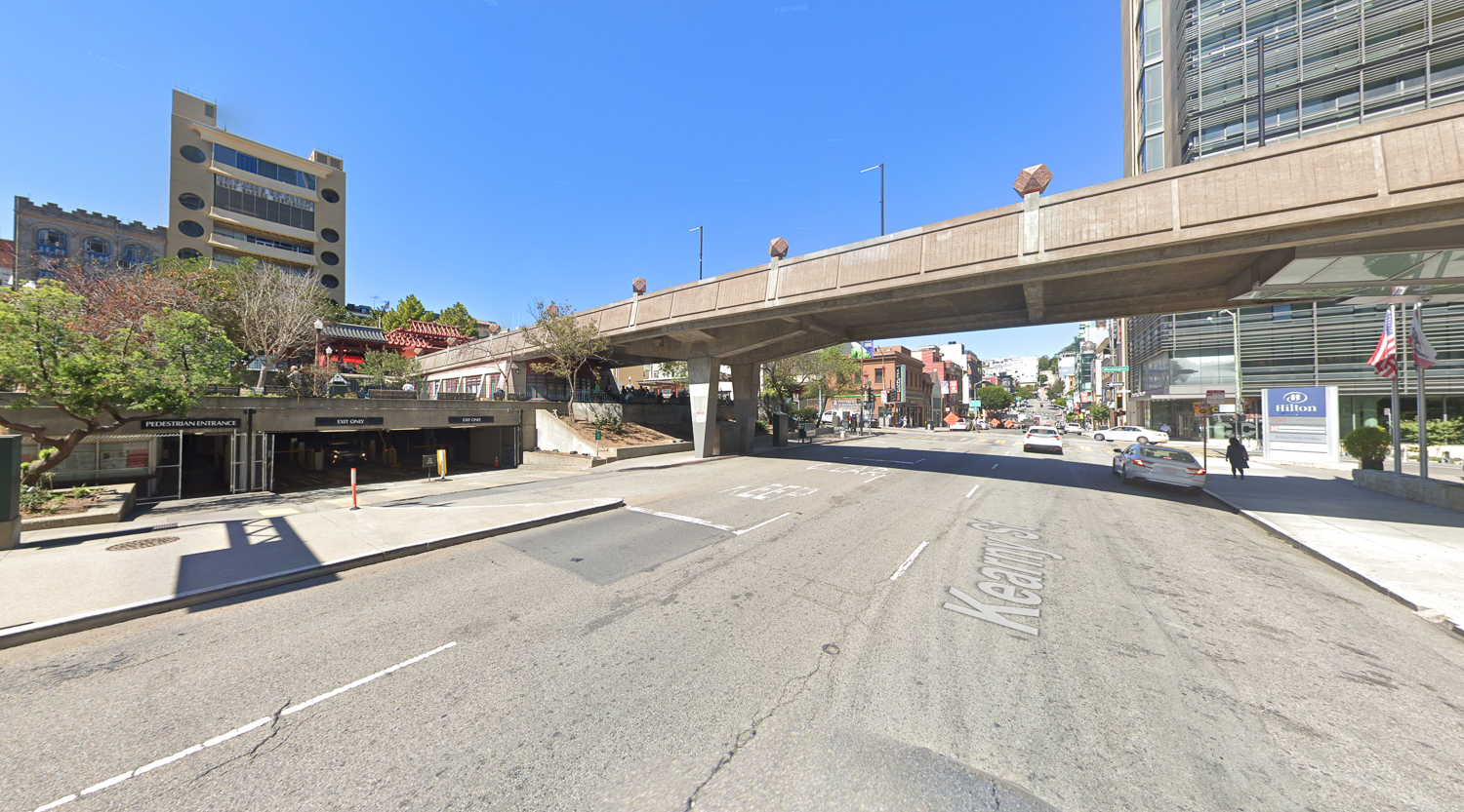
Kearny Street pedestrian bridge and Portsmouth Square, image via Google Street View
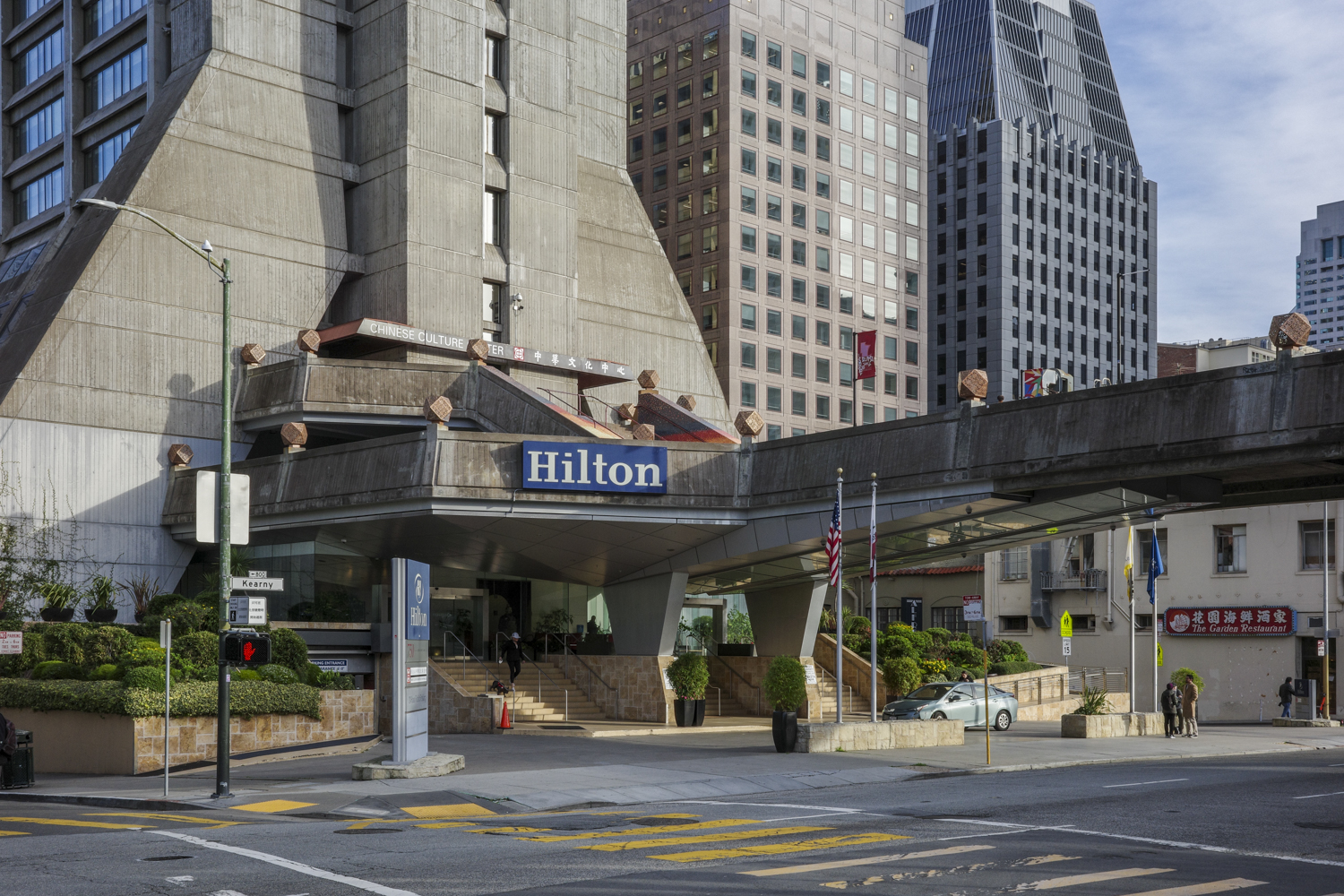
750 Kearny Street Porte-Cochère existing condition, image by Andrew Campbell Nelson
The bridge is 28 feet wide and 210 feet long, built with reinforced concrete supported by cross beams and a pair of bents on opposing sides of Kearny Street. The following passage comes from the historic resource review in the Portsmouth Square Draft Environmental Impact Report, page 2-10:
“The pedestrian bridge was built in 1971, concurrent with construction of the hotel building and designed in collaboration by architect Clement Chen and Chen Chi-kwan, an architect from Taiwan. At the time of his selection, Chen Chi-kwan was internationally recognized for his contribution to architecture, having previously studied under Walter Gropius at Harvard, taught at the Massachusetts Institute of Technology, and collaborated with I. M. Pei.”
The new hotel port-cochére, as illustrated in the Draft EIR, retains a portion of the bridge as a terrace overlooking Kearny Street, with six of the distinct cuboctahedron light fixtures along the railing. The new permits filed have also suggested analyzing the addition of two egress staircases on the exterior of 750 Kearny Street, which will involve an EIR Addendum.
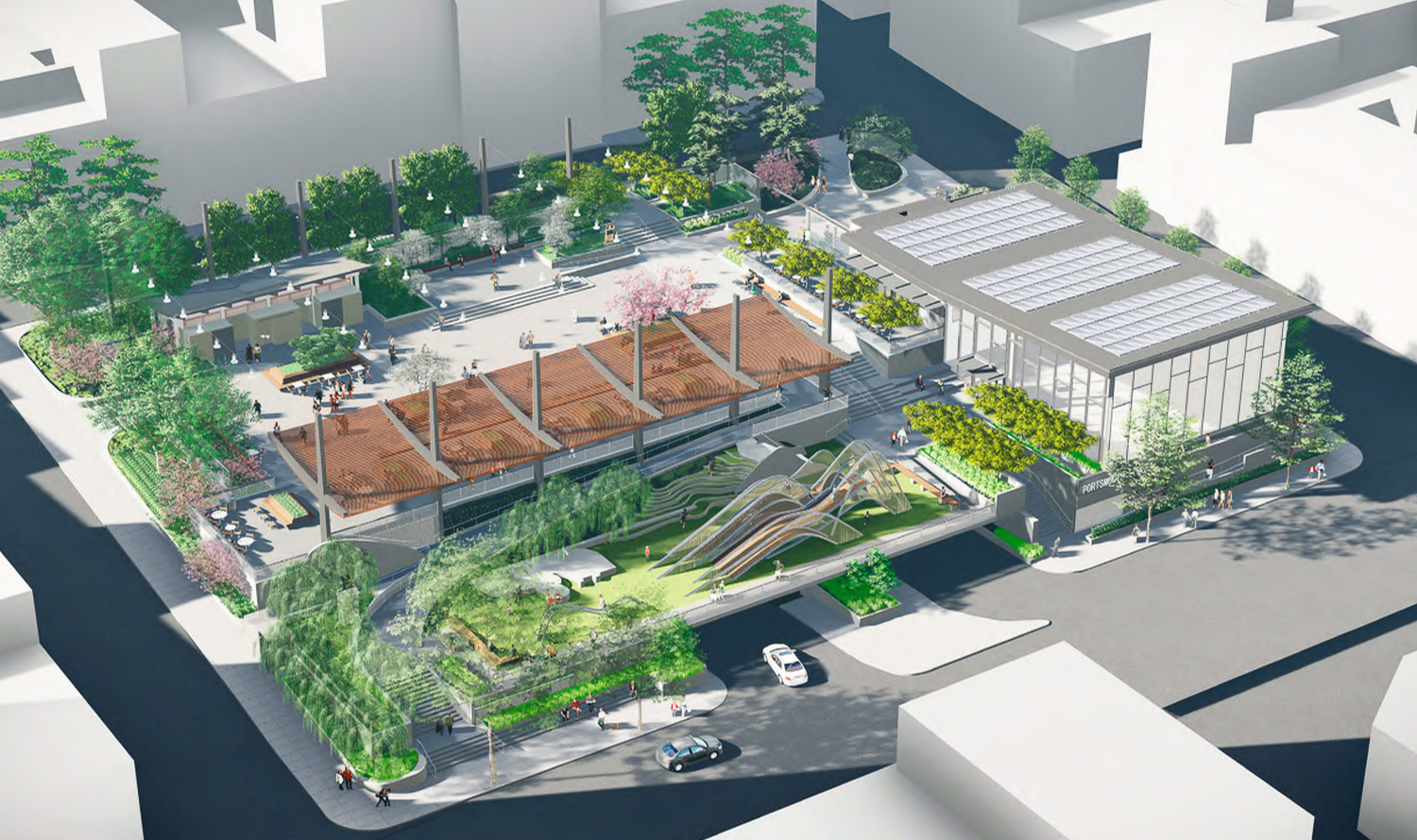
Portsmouth Square aerial overview, design by SWA and MEI
A representative for the city’s Recreation and Parks Department told the Chronicle last year that construction on Portsmouth Square is expected to start by late 2023. Staging and equipment movement is expected to last two months, followed by the demolition of the pedestrian bridge and removal of existing recreational and landscaping features. For more information about the Portsmouth Square renovations, see our previous reporting here.
Subscribe to YIMBY’s daily e-mail
![]()
Follow YIMBYgram for real-time photo updates
Like YIMBY on Facebook
Follow YIMBY’s Twitter for the latest in YIMBYnews


The quicker we can get rid of these Brutalist eyesores, the better. We need to stop saving these ugly monstrosities for the half dozen architecture nerds who want to geek out over them.
Brutal comment
It’s a great change, but why not turn the bridge into a mini High Line and incorporate it into a new design?
we would walk on the bridge when we were kids in school.
we still love the bridge today. the bridge brings a really nice touch to the park and hotel. one classmate lived one block away. and a few classmate’s parent’s had stores in the district.