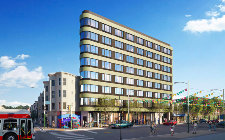
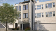
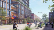
Updated illustrations have been published for the eight-story Flatiron-style apartment complex at 3230 24th Street in San Francisco’s Mission District. The new design comes as the formal planning applications were submitted to the city. Wong Logan Architects is responsible for the application and design.
The roughly 84-foot-tall structure is expected to contain 33,800 square feet, including 29,350 square feet for housing and 1,090 square feet for ground-floor commercial retail space. Parking for 12 bicycles will be included. Unit sizes will vary with 14 studios, 14 one-bedrooms, and seven three-bedroom residences.
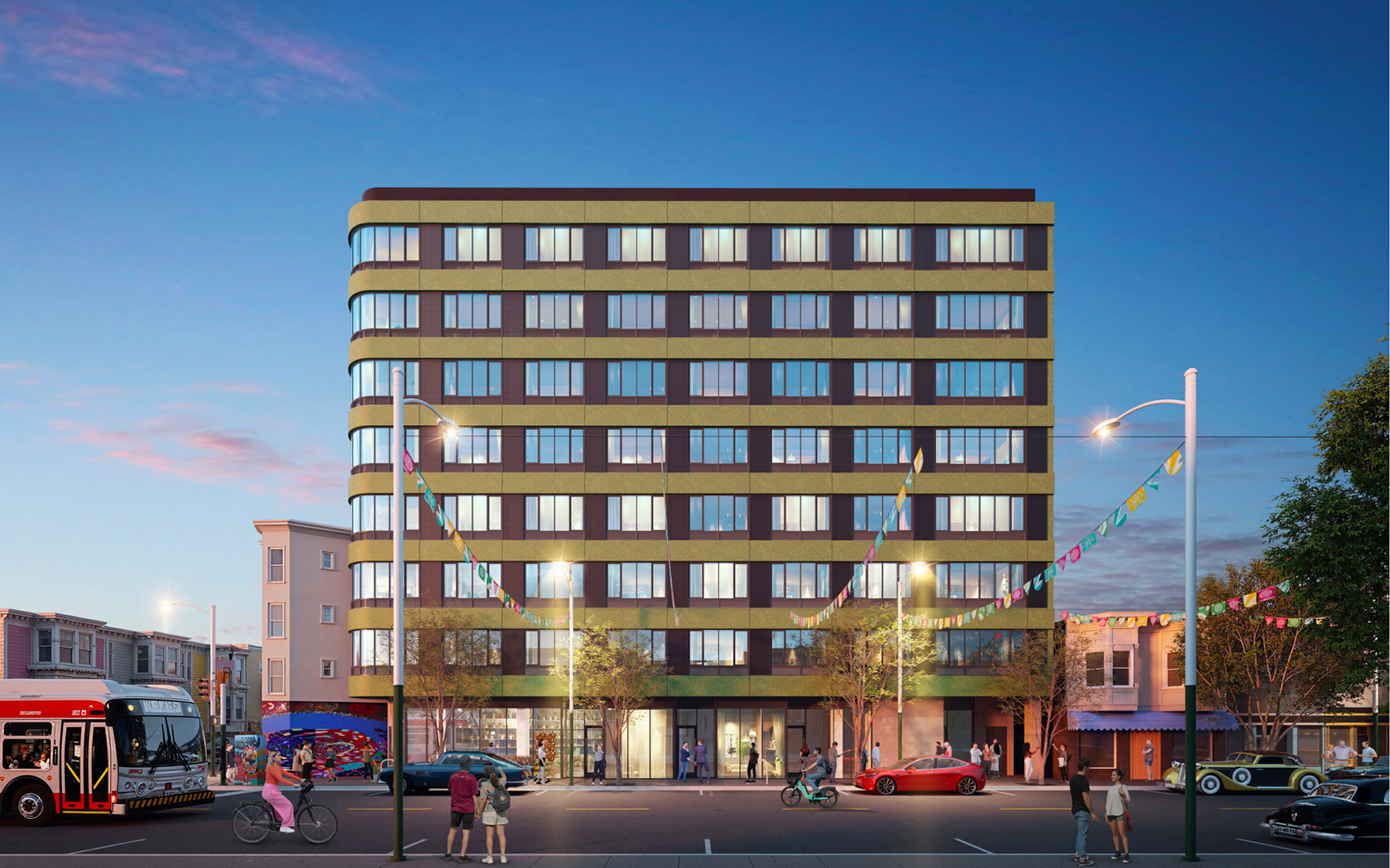
3230 24th Street, rendering by Wong Logan Architects
Of the 35 units, three will be deed-restricted as affordable for two very-low-income households and one moderate-income household. The application utilizes the State Density Bonus law and Senate Bill 423 to increase residential capacity and streamline the approval process. The application makes use of a 75% density bonus above base zoning, which would allow for just 20 units.
Berkeley-based Wong Logan Architects is responsible for the design. Illustrations show the updated design emphasizes the horizontal bands and the Flatiron’s rounded corners. Facade materials are not listed.
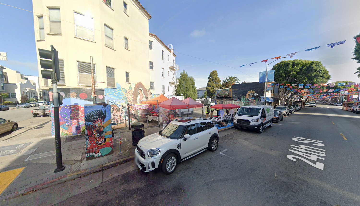
3230 24th Street, image via Google Street View
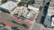
The 0.1-acre property is a triangular parcel, shaped by a former Southern Pacific Railroad right-of-way, at the corner of 24th Street and Capp Street. Future residents would be a block away from the 24th Street Mission BART Station and a Grocery Store along South Van Ness Avenue.
The estimated cost and timeline for construction have not yet been established.
Subscribe to YIMBY’s daily e-mail
Follow YIMBYgram for real-time photo updates
Like YIMBY on Facebook
Follow YIMBY’s Twitter for the latest in YIMBYnews
I’m surprised more faux-brick is not used in SF, especially in the mission where they are trying to make things look more humble. Everyone likes the look of brick.
Completely agree
It’s so disheartening to see designs consistently get worse with each iteration. No doubt financing an blah blah blah, are to blame for all of the value engineering. The color palette and horizontality of the windows are really unfortunate.
This rendering and updated design makes the building look dated already. I definitely like the previous scheme better
Y’all are crazy, this building looks nice.
I agree. I like the simplicity of this building. Who cares, more housing!
Put up any pile of garbage It’s OUR city now😀
Horizontal banding? OK. But the high-contrast gold? Not so much.
Agree with the comments supporting the current design. I think it’s important for there to be variation in architectural styles. Given costs, a lot of designs look the same today. We should support the project and their decision to do something a little different.
Different doesn’t mean good and same isn’t always bad (not that I care to see one more multi-colored, LEGO block style, 5:1 go up). Totally agree we should encourage some tasteful variation in architectural styles but should also be able to crit things that feel out of character or look cheap (esp when there’s a ton of cheap stuff going up all over the place).
Where is the basement*? A building like this will be here for upwards of 200 years.
The problem with “city design” is “city planning” is controlled by the ‘planning department.’
*If one would like to know the advantage of such – check out Cole Hardware on College Avenue in Oakland.
Agree with posters who say the previous facade design was better – it was more of a clear and simple (but modern, updated) reference to older warehouse buildings you can find in the Mission and SOMA districts. This iteration, with its horizontal banding, looks more like its referencing something like the Streamlined / Art Moderne style of the 1930s — which you can find a little bit of in SF in places, but it’s pretty rare here (there’s lots of it somewhere like Miami (but it would likely be white, with touches of black, pink or turquoise).
Ultimately either facade design version for this project is substantially better than the typically overly-articulated / agitated massing (often festooned with gratuitous material mixes or bad bay window reinterpretations) seen on many multi family facades in SF of late.
Make it Mission Style – not Bauhaus.