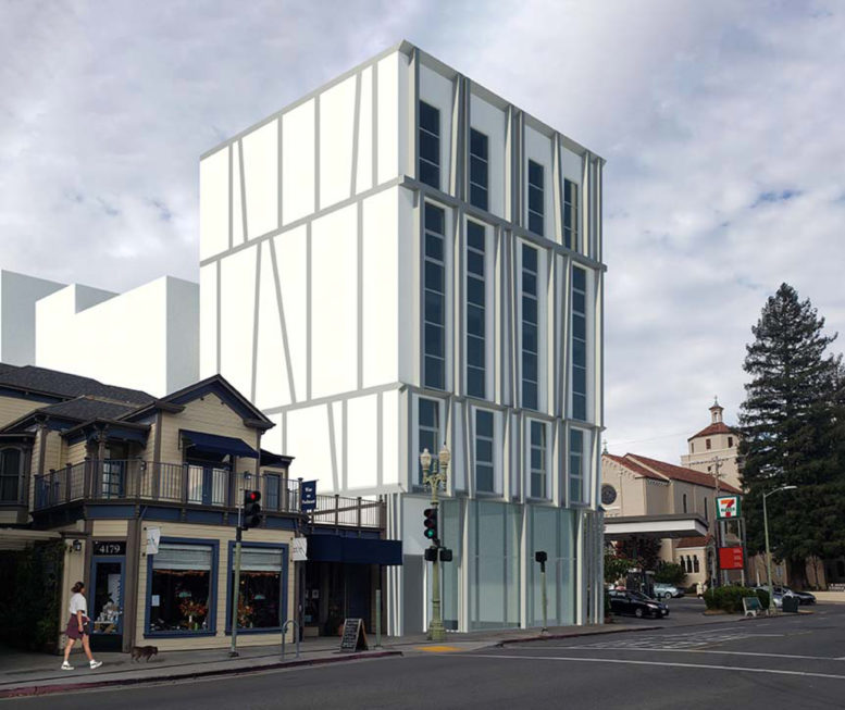
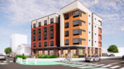
New plans have been revealed for a five-story residential infill at 4185 Piedmont Avenue in Oakland, Alameda County. The proposal will create 14 new homes along the buzzing commercial Piedmont Avenue neighborhood and ground-level retail. Kava Massih Architects is the project architect.
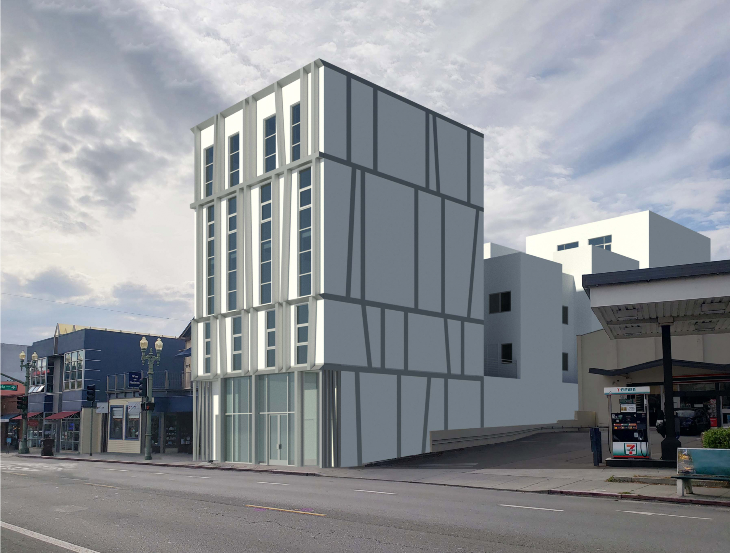
4185 Piedmont Avenue, rendering by Kava Massih Architects
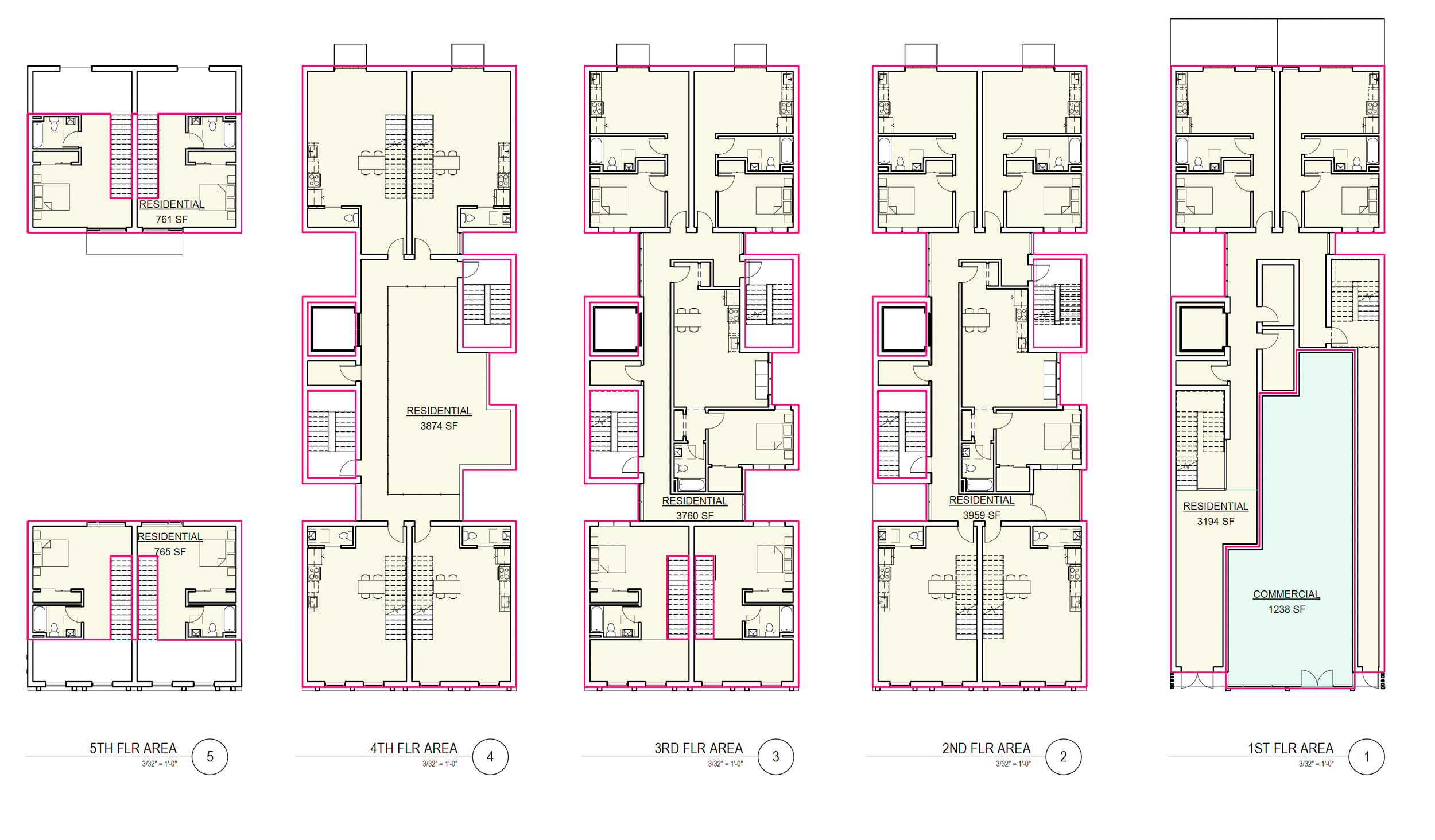
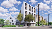
4185 Piedmont Avenue floor plans, illustration by Kava Massih Architects
The 55-foot tall structure will yield around 17,550 square feet with 12,670 square feet for residential use, 1,150 square feet for commercial retail, and 1,240 square feet of open space. The open space will be split between several private balconies and two backyard spaces for the two ground-level units. While only some residents have private open space, all residents will be able to access to fourth-floor open space
Of the 14 apartments to be included, there will be eight one-bedrooms and six one-bedrooms with lofts. The plan also uses the State Density Bonus to increase the residential capacity by including two very low-income affordable units. The applicant is hoping to utilize incentives and concessions to build as proposed.
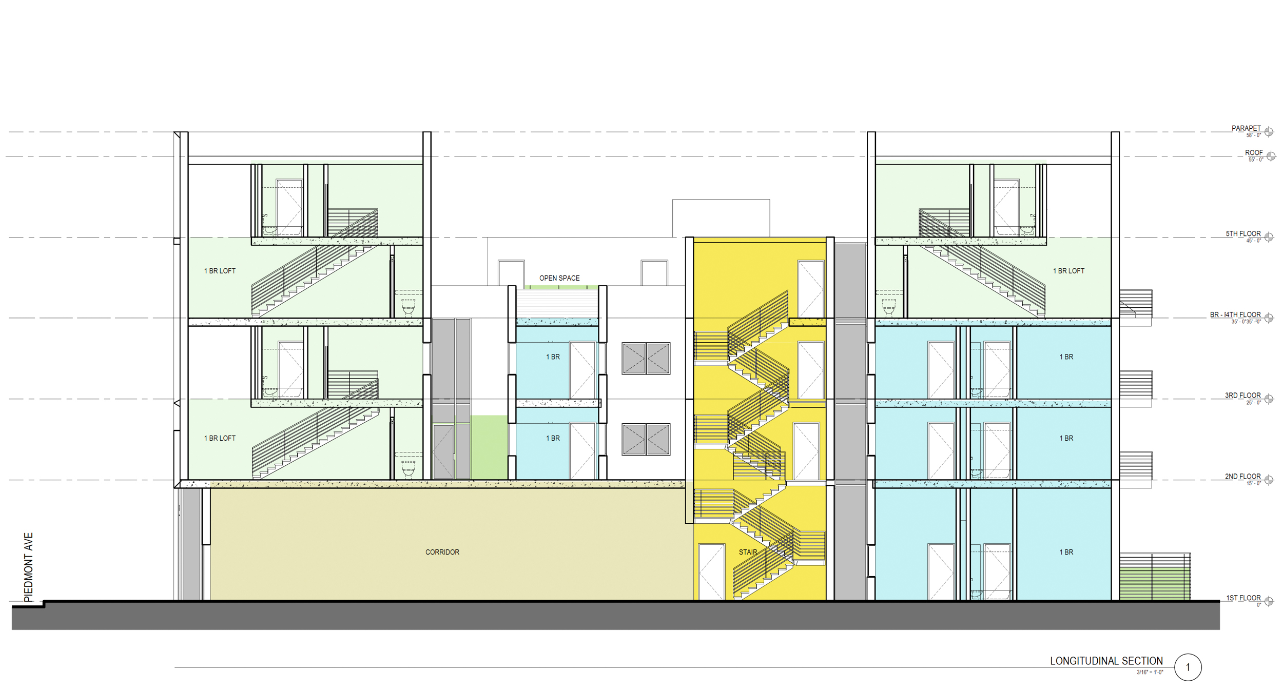
4185 Piedmont Avenue vertical cross-section, rendering by Kava Massih Architects
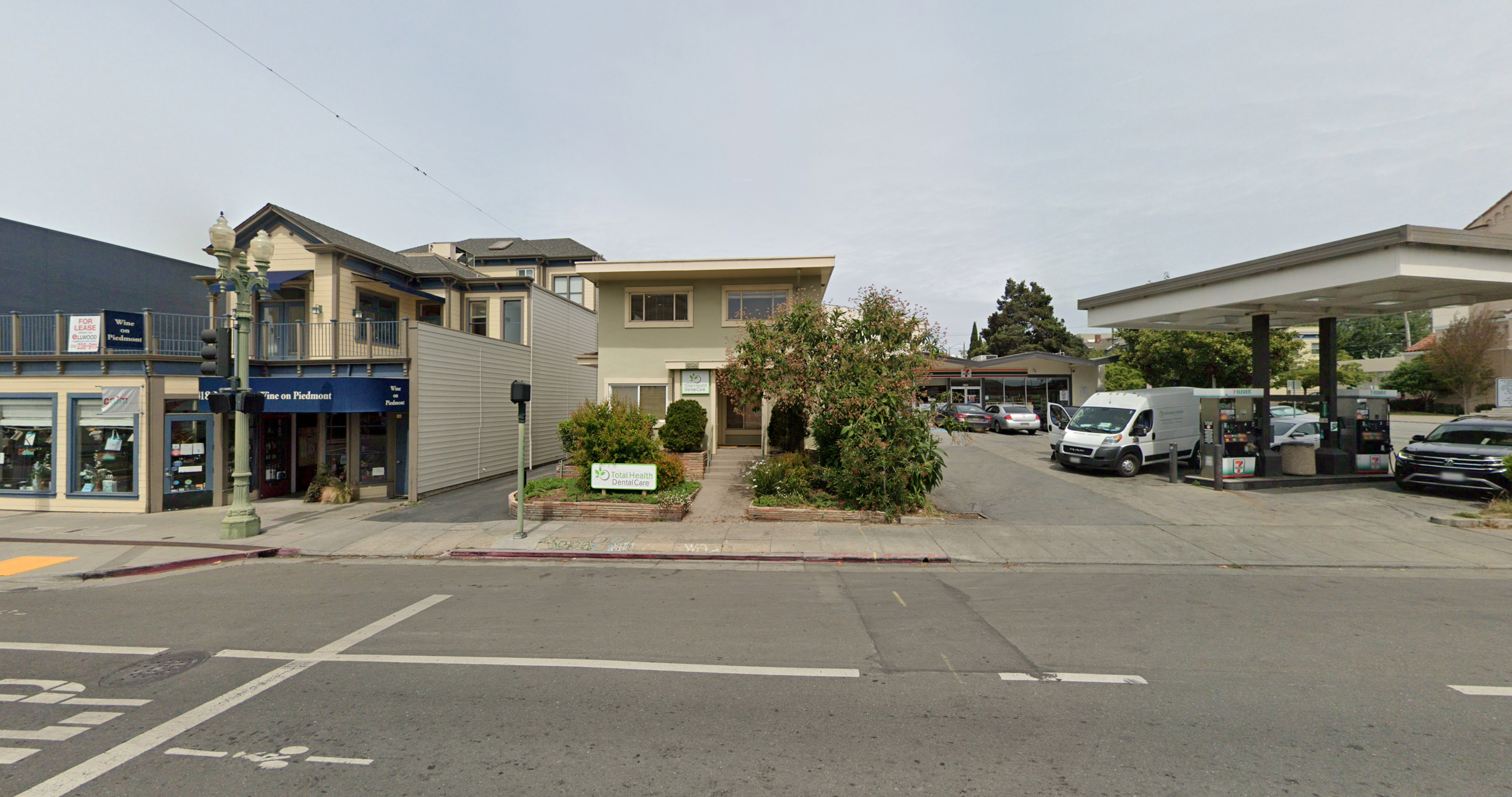
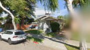
4185 Piedmont Avenue, image via Google Street View
Kava Massih Architects is responsible for the design, with exterior beams used to decorate the facade, while the structure itself is divided by the courtyard to crate two five-story massings, one facing Piedmont Avenue and the other facing the rear yard.
The property is located by the corner of Piedmont Avenue and Ridgeway Avenue. Demolition will be required for the two-story commercial structure, and the rear-lot surface parking. An estimated timeline for construction and completion has not been established.
Subscribe to YIMBY’s daily e-mail
![]()
Follow YIMBYgram for real-time photo updates
Like YIMBY on Facebook
Follow YIMBY’s Twitter for the latest in YIMBYnews

Nouveau Tudor?🤦🏼♂️
This is why peeps don’t like new buildings.
looks more like a cold storage warehouse….the Tudor would have a front gable…maybe some clever brickwork….some charm. This is like a charmless ice box.
Agreed.
I understand the need for housing but this is HIDEOUS. Why couldn’t it have been designed with the surrounding area in mind? It’s cold, sterile looking, unwelcoming, and stands out completely amongst the neighboring buildings. Not to mention a gas station 7-11 next door…
Tudor style would fit way better.
Talk about out of character for the neighborhood! And, the tenants will be living right next to a gasoline station and all those fumes. Whomwould want to live there?
Just awful!
This building does not have a single redeeming feature. Just awful urban infill proposal. It does not enhance the Piedmont Avenue experience. It actually does the opposite.
It is one of the ugliest building designs ever. It looks as if someone just took a ruler and drew some lines. No rhyme or reason. The back of the building is okay but what is the architect trying to do with the front? What is their vision? it is haphazard and cheap. The gas station next to it has a better design.
Why would the City of Piedmont allow this? Why don’t these developers at least make an effort to build something compatible with the neighborhood? Who wants that ugly monstrosity sitting in their neighborhood. These developers are totally ruining the vibe and flavor of Oakland, especially North Oakland and Piedmont areas. I hope it doesn’t get approved. And they think they’re doing us a favor by offering 2 low-income units in the monster. We need to find a way to stop this, but I guess it’s the greedy cities that are going along with this. More empty condo buildings and more people living on the streets. Total tall, out of place monstrosity that doesn’t belong in the neighborhood.
Is it still legal to build in Oakland without making it accessible at all! No elevator. No laundry space that I can see. Hideous hideous
There is an elevator connecting all floors
And here I was thinking Trachtenberg held the monopoly on fugly
What an ugly, jarring looking building! It doesn’t blend in at all. The stark white and total lack of anything to soften its boxy look, ugh! Is it to be market rate? Any low income or “affordable” units?
This is just hideous!!
Ugly so ugly! Where is parking & what will be impact on surrounding streets? How long will construction last & what will increased trades
people parking do to an already difficult/compacted neighborhood in which to find parking? Is anything about this project ‘green’?
In a word….Ugly.
I would be uneasy living up against a gas station in a city with a deplorable history of fire containment. Too bad that awful, grimy gas station couldn’t be rolled into this development.
That’s a pretty awful design. The owners and architects couldn’t come up with anything at all better?
No. Just No. there is nothing about this building that fits the existing atmosphere of Piedmont ave. Way too tall. And that design is hideous.
I mean, I am a Yimby through and through, but this building design is enough to turn me
Into a Nimby. There’s got to be a way to do better than this?
I’m all about the YIMBY ethos. And then I see this. Come on. We can (and must) do so much better.
Does Oakland not have anyone I’m in the building permit department with a sense of aesthetic?
This will be such an eye-sore on an otherwise charming Avenue. So sad…
worst looking thing I’ve ever seen
Would not be out of place in Riyadh. Doesn’t fit here.
No parking, no elevator, no charm.
Why does Oakland seem to get failed architects to design their buildings? This is horrible. Yes, we need housing. But this is ridiculous.
Looks cheap. But don’t expect cheap prices.
Set back the upper floors, putting the open space in the front area, no net loss of units. This is too intrusive and ugly.
To the writer who accused the city of Piedmont regarding this hideous building, piedmont Ave is in Oakland. Let that city know your objection
Ugly. Look down the street for residential buildings that are a better fit for the neighborhood.
YIMBY, but with better fitting design. It will be an eyesore in the neighborhood. Even the Kaiser buildings at the other end of Piedmont Ave look better than this! It needs to be re-designed to be more compatible with the look of the neighborhood.
I’m speechless, otherwise I would rant for an hour or two. This soulless box does not relate at all to the environment around it. It’s an affront to the architecture that exists nearby, The Piedmont Theater for one, and the building that houses Wine on Piedmont.
Are they serious?? Or is this some fake proposal for the city to be able to meet the state’s housing requirements?
Maybe not fake but they are obligated to comply with state housing requirements and this would help the city do that. They could have made it less ugly. My God. They could have reduced the gigantic facade.
Astonishingly ugly and incompatible with the neighborhood. Don’t let it happen!
I don’t know, I kind of like it. That area could use more density anyway.
It looks modern, or dare I say, futuristic. Which, as a Star Trek fan, I am all for it. Also, that that location, is right across from Fenton’s and the movie theater. This will also help to improve access to housing, which the Bay Area desperately needs.
This is the ugliest building I could imagine.. No windows on either side- why? I thought the gas station side might be in anticipation of another building replacing the gas’s station. But no windows on the other side as well. It doesn’t fit into the street’s aesthetic – but its just the worse looking building just on its own. How could anyone approve of this?
There are a number of zoning constraints that don’t permit windows on the side of the building. In the past, urban infill
buildings were a big brick box with a few wells for light and air. Maybe this will entice the Guggenheim to open a gallery?. I think we are all being a bit provincial and haven’t really considered the fact that the Bay Area is losing every support industry from retail to hospitality because we continue to isolate ourselves in some idea of the past. The makers and the pioneers, except in med, bio, and tech have gone elsewhere. The wealthy and educated are happy to stay in the bucolic suburbia, but we’ve got a problem here and the city is doing what it can to help provide new housing both affordable and market rate. Would this “industrial” looking condo development with affordable housing be so different than the refurbs in Williamsburg, Brooklyn or in other areas? Are we holding onto a notion of the bungalow past when it doesn’t support our communities? Has anyone that’s commented here ever traveled to a European city? And do you imagine the future context to be the 7-11 gas station and that blue building next door? Should we establish historical standards on a street that has nothing to start with? I think this looks a bit Viennese and so perhaps it is a bit out of conteXt, for now. Also, these drawings are initial thoughts on massing, density, etc. When a tailor cuts your suit, they start with muslin. It’s about like this or that. We should be more tolerant of those that do the creating, at least they’re doing something to transform our dire dire housing situation.
I don’t love the image but am glad you state alternative ways of looking at it.
Anyone who has followed any project that goes before the Planning Commission knows there is a Design Review process and this would not be approved as currently shown.
This looks very very bad. And Im not NIMBY: with State Density Bonus, Id like to see a bigger building with more than 14 units.
Has this been through the city’s design review process?
It is butt ugly. What is the process to oppose the architectural style?
Horrible design. Completely without charm. Do not build it.
Horrendous
Obviously the developer of this pustule of a project is starting out with the oversized and most revoltingly offensive design possible for the Piedmont ave neighborhood to swallow-in the hopes that the often aesthetically and spatially challenged Oakland city planning dept will accept their next offering of a slightly less obtrusive, but almost as grotesque and outsized design. This will be a fight to maintain the design integrity of the neighborhood, cause if we green light this monstrosity of a project or anything close -MORE WILL SURLY FOLLOW, until we can no longer recognize our beloved Piedmont Ave!!!!
Back to the drawing board! Where are the windows? There could be nice views even on the 3rd fl and above. The style of balcony is like those that have failed. Take the character of the neighborhood into consideration… green space to share too!
If they don’t change the design, at least they could paint the exterior with a more neutral color closer to those of the surrounding buildings. It looks awful.
People, please check the “Objective Design Standards and Streamlined Project Review” for approval of residential, mixed-use, and commercial building types that Oakland has adopted. This holds to be more efficient, predictable, and equitable? The real problem may be California legislation (SB 35 and SB 330) addressing the housing shortage within the state.
Put the lower parts in front, the taller parts in back!
Hideous! Awful! Ugly!
The overwhelming opinion of the neighborhood is it is an offensive eye sore. I and others are not against in fill building. Better in fill than urban sprawl but this monstrosity has no charm is totally out of character.
Sounds like you’re against this infill housing. Dense urban development by the way is, by definition, not sprawl.
this has been thoroughly discussed. Why does Piedmont get to exclude certain utilitarian architecture and the rest of us not? The redeeming feature of this building is that the façade is at least straightforward and honest that these are mid-priced apartments that put function over glamor. The sides of the biolding would have been more “honest” if they had been left plain. The token and inept “decoration” are as annoying as a dining partner with ketchup on their face. My wish all along has been that they should get support from arts supporters and put murals up there, as many otherwise “ugly” older buildings have done in Oakland.
Looks like this “thing” is about to topple over any minute. To say the least.
This is a hideous and overpowering facade!! Who in their right mind approved this?
To add to my comment. I don’t mind modernizing Piedmont Ave, but this white block of concrete is void of any “cool” aesthetic
The last thing this stretch of Piedmont Ave. – home to the elderly, caned and disabled – needs is another driveway letting out with no vehicle in sight until one is in front of the driveway. Nope, nope and yet again nope. Will fight this plan tooth and nail.
What are you even talking about. Here’s a proposal for infill apartment housing that will enliven the area and promote public transit. How is this worth your ire?
Did you even read my comment? You’ve got a blind driveway emptying into a crosswalk here. This stuff is already a problem on this stretch of the Ave. Yeah, it’s ugly and yeah it’s “infill housing”, but it is carelessly planned a block from a school in an area filled with seniors. Just no.
See you at the hearing.
That is an extremely wide driveway exit from the adjacent gas station. That is hardly a good reason not to build new housing in a busy neighborhood.
I think that the building is fine and fits in with the wide range of architectural styles and non-styles of building that currently exist in Piedmont Avenue, especially the block just down the street opposite Barney’s Gourmet Hamburger restaurant. Calls for 17th-century Tudor are totally unrealistic and would be more “out of character” than this innovative proposal. Also bear in mind that this is not what you would actually “see” from street level. Let’s get this built and more importantly, get the ground floor retail occupied at a reasonable rent/lease level.
We need more housing ugly or not. Get some local kids to do a mural on that huge exposed wall. Yeah, I think that gas station next door with your problem… I wouldn’t movie
The 5-story apartment building at 4141 Piedmont Avenue (across from Barney’s Hamburgers and just down the street from the proposed building) is a good example of a design offering both wonderful sunlight along the SW side (i.e. the “blank wall” side of the proposed building at 4185) plus a parking spot for every resident.
I think there could be a much better design for this proposed new building that would have more consideration to real life practicality and quality of life for all. If not parking for all residents, could there perhaps be a pull-in spot for emergency vehicles and for unloading groceries and supplies?