A preliminary review package has revealed plans for a dramatic rehabilitation of the iconic Bank of Italy Tower at 12 South 1st Street in Downtown San Jose. While the structure is currently actively operating as an office building, the ground level remains vacant. Plans include modern office space, outdoor terraces, retail, and a music venue. Design is by Bjarke Ingels Group and RMW Architecture, with Urban Community and Vancouver-based Westbank as developers.
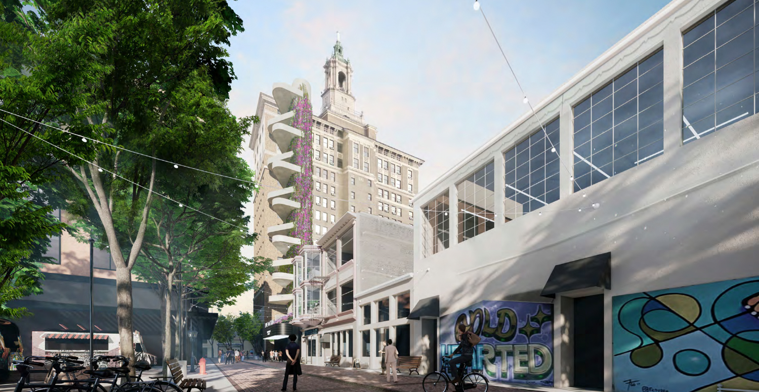
Bank of Italy exterior from Fountain Alley and 2nd Street, rendering by Bjarke Ingels Group
The Bank of Italy opened in 1904 in San Francisco by San Jose-born Amadeo Pietro Giannini. The San Jose skyscraper opened in 1926 as the second home to the first branch of the business. Henry A. Milton is responsible for the design. The Bank of Italy would soon become Bank of America, and the firm maintained its occupancy of the skyscraper up until 1970.
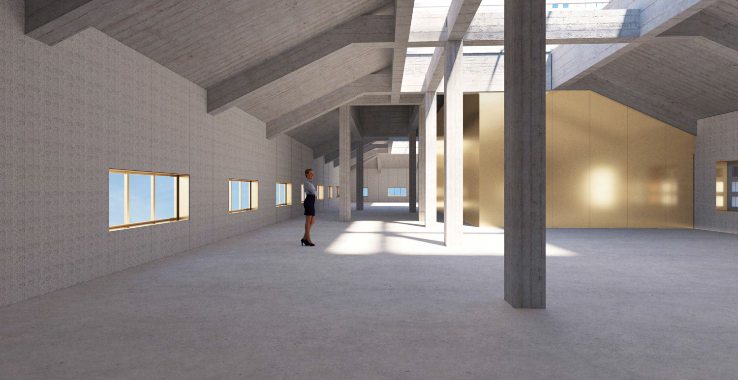
Bank of Italy proposed Attic Office, rendering by Bjarke Ingels Group
The ground level includes a cafe, office lobby, and a portion of a three-level event space with lounges and a mock-speakeasy bar. The venue spans from the basement up to a mezzanine level. A food court will also be opened in the basement, accessible from the cafe’s spiral staircase. A restaurant with a 1,970 square feet open-air terrace will be opened on the mezzanine level. The office space begins on the second floor and rises from there to the 13th. Topping off the building will be an observation space, though it’s unclear who will have access. Office employees will be able to access a 3,820 square foot amenity terrace on the second floor.
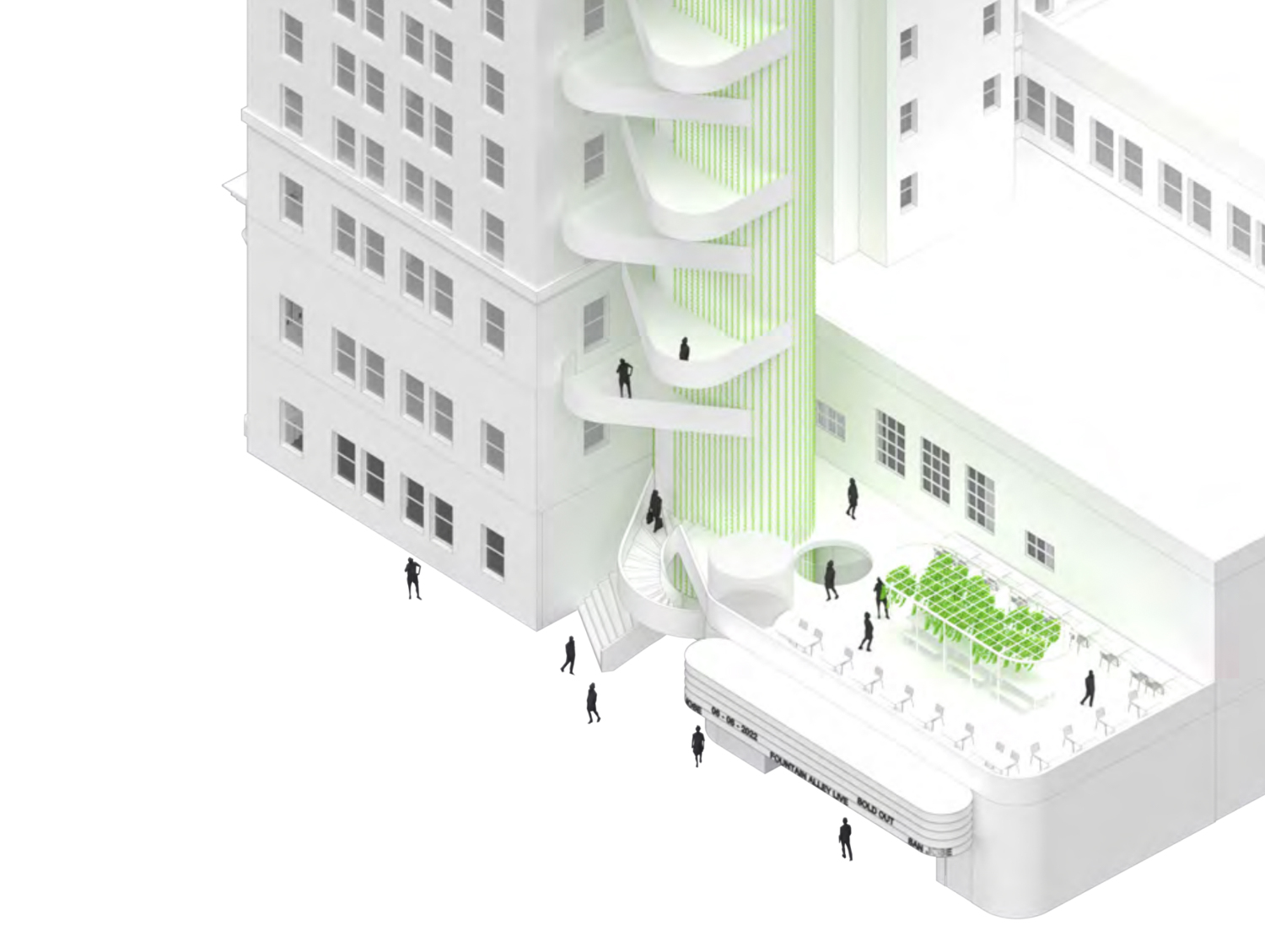
Bank of Italy adjoining fountain alley, rendering by Bjarke Ingels Group
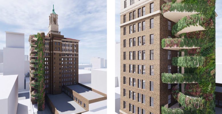
The ‘exterior enhancements’ include a code-required second egress stairwell on the rear of the structure to maximize interior space. This feature provides an opportunity for each office level to have an open-air landscaped platform.
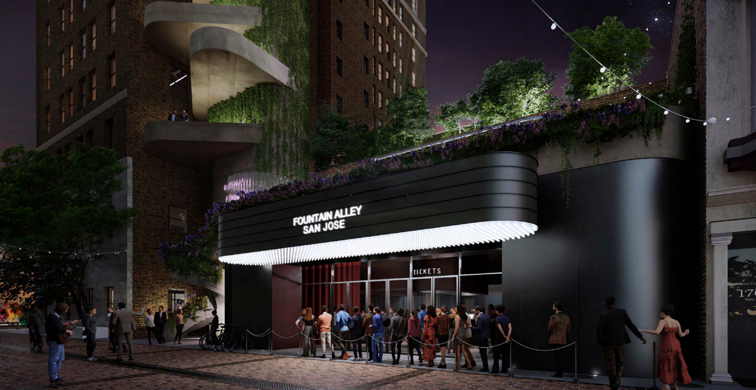
Bank of Italy’s Fountain Alley with an entertainment retail tenant, rendering by Bjarke Ingels Group
For any project that adds to a landmark, the addition must fit well. While looking for different material approaches to best respond to the historic tower, the designers have provided four distinct options. These include concrete, copper cladding, light or naturally toned terracotta, and a green living wall.
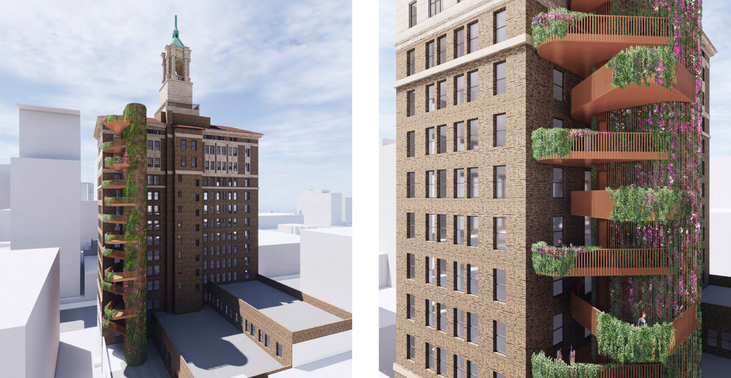
Bank of Italy exterior egress stair core with terracotta and planting, rendering by Bjarke Ingels Group
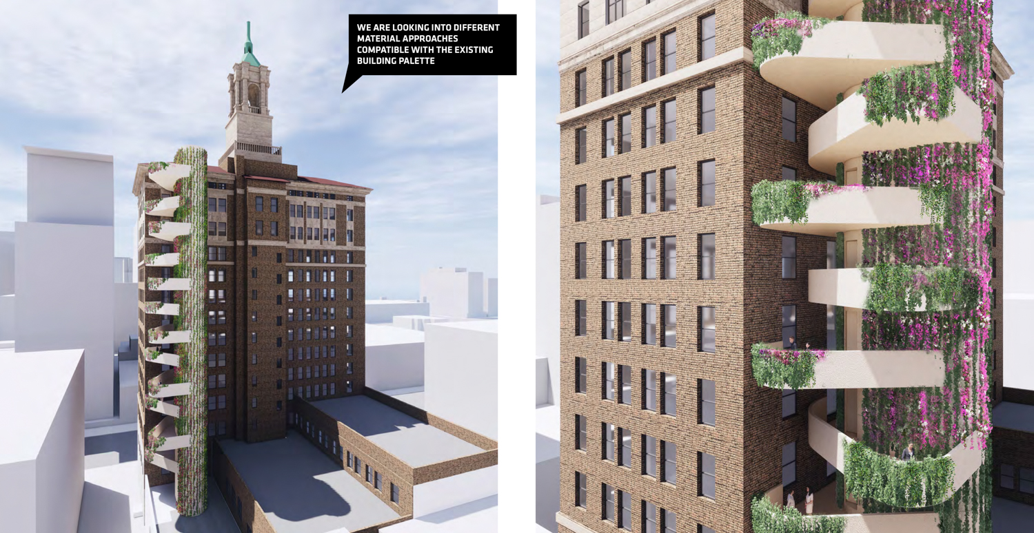
Bank of Italy exterior egress stair core with white stucco siding, rendering by Bjarke Ingels Group
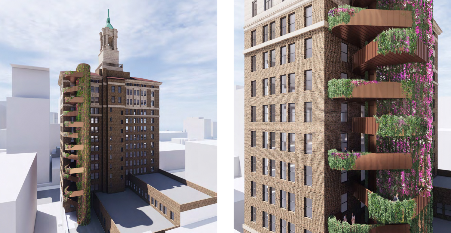
Bank of Italy exterior egress stair core with copper siding, rendering by Bjarke Ingels Group
The development complements the proposed 35 South 2nd Street tower, as covered by SFYIMBY yesterday. Both curvilinear structures are designs by Bjarke Ingels Group and RMW.
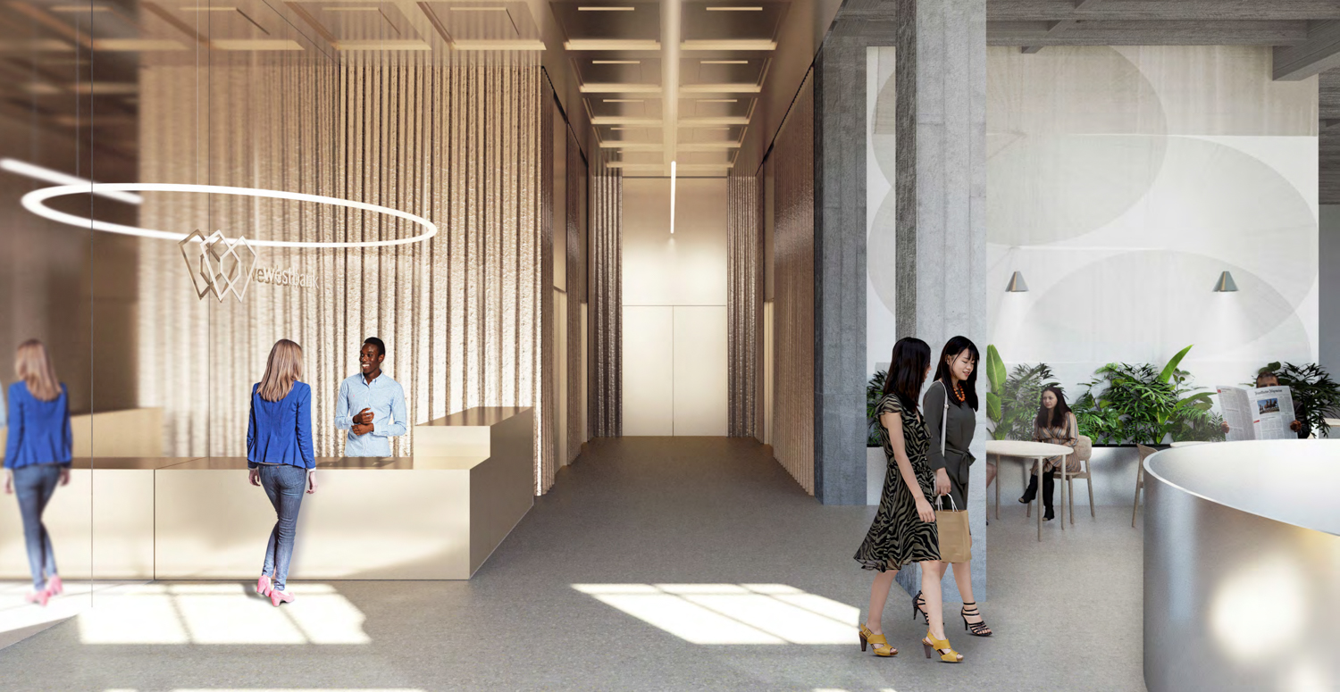
Bank of Italy office lobby, rendering by Bjarke Ingels Group
An estimated completion date has not been announced. The permits, filed by Build Group and RMW, are currently under technical review by the city.
Subscribe to YIMBY’s daily e-mail
Follow YIMBYgram for real-time photo updates
Like YIMBY on Facebook
Follow YIMBY’s Twitter for the latest in YIMBYnews

The greenery is UGLY. It reminds me of the TV show “Earth after humans” wherein vegetation overgrowth covers just about everything. The greenery looks too artificial and out of place. Just restore the facade to its original spendor and concentrate on the interiors.
As a life-long San Jose resident, I fondly remember the bright green neon light on top of B of A buildng. I hope restoration of the light is part of the project!