Renderings have been revealed alongside new permits filed for 11-17 Cypress Street in San Francisco’s Mission District. The plan will create three new homes in the backyard of an existing apartment building close to the 24th Street BART Station. Sausalito-based Cofi Hand Trust is listed as the property owner.
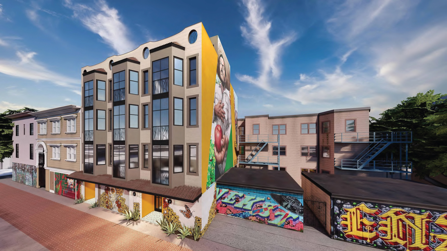
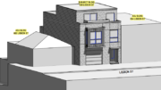
11-17 Cypress Street side view, rendering by EAG Studio
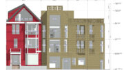
The roughly 50-foot tall structure will yield around 6,860 square feet, with 5,420 square feet for housing and 1,440 square feet for the ground-level garage. The three units will all have identical triplex floor plans, accessible from private stairways leading toward Cypress Street. Each unit will have a dining and living room on the second floor and three bedrooms on the floors above. Each unit will have access to two rooftop decks facing Cypress Street and South Van Ness.
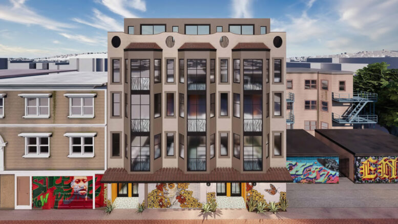
EAG Studio is the project architect. The studio has proposed a familiar apartment-style vernacular for San Francisco, including three three-level bay windows, Spanish-tile roofing over the ground level, and four large oval portals along the cornice. Illustrations show the structure decorated with murals at street level and the south-facing facade.
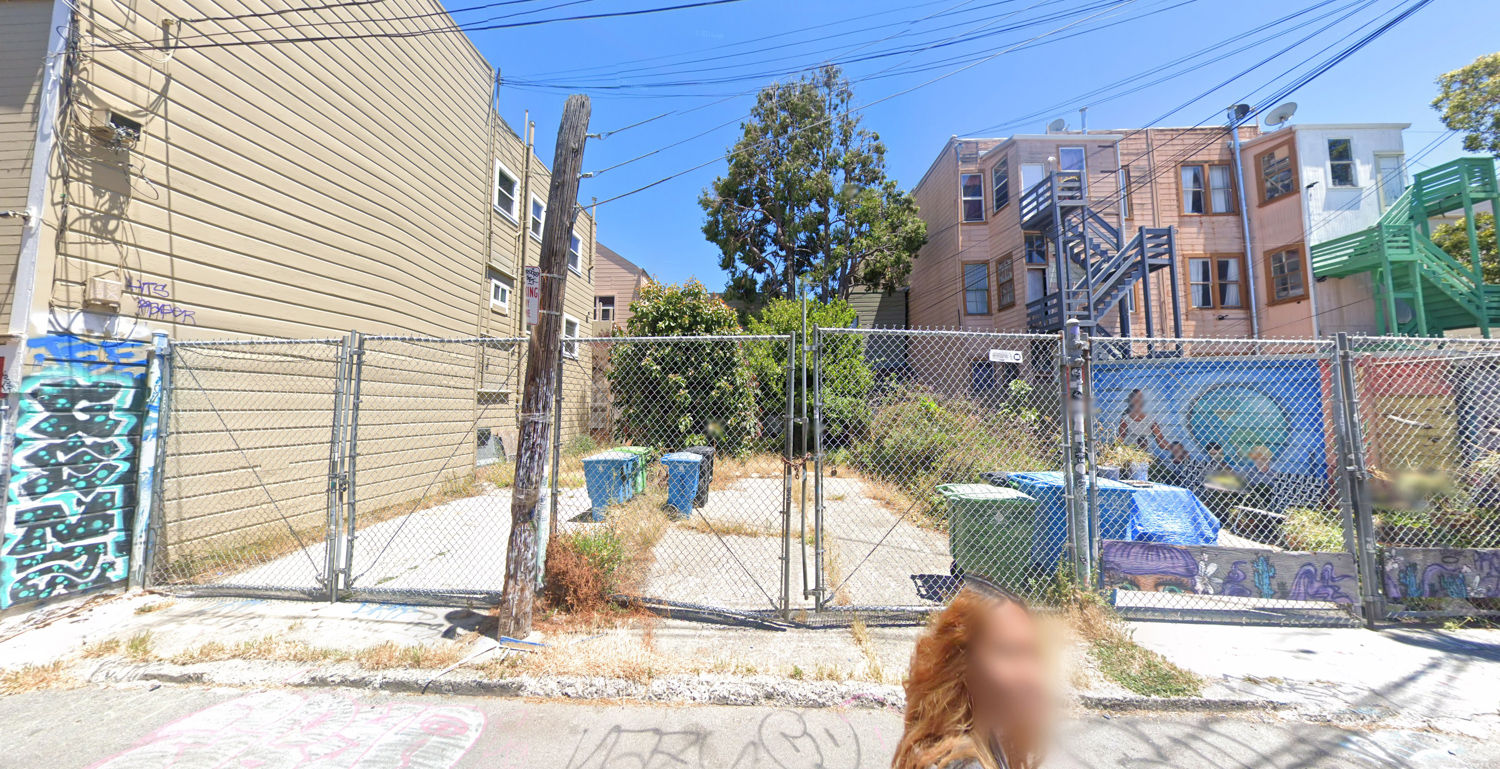
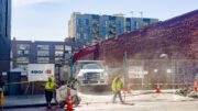
11-17 Cypress Street, image by Google Street View
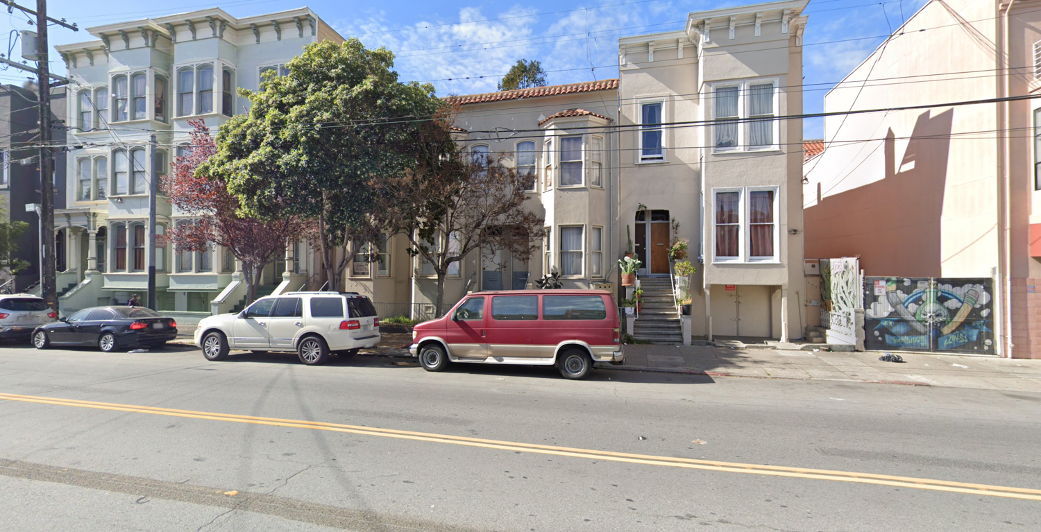
1312 South Van Ness, image by Google Street View
The project application has received support from Erick Arguello, founder of the neighborhood non-profit Calle 24 Latino Cultural District. The 0.12-acre parcel is located between South Van Ness Avenue and Cypress Street, on a property bound by 24th and 25th Street. The three-unit building along South Van Ness will remain undisturbed through construction. Residents will be a block away from the 24th Street BART Station.
Subscribe to YIMBY’s daily e-mail
Follow YIMBYgram for real-time photo updates
Like YIMBY on Facebook
Follow YIMBY’s Twitter for the latest in YIMBYnews

Mixed use please!
This one faces an alleyway, so not particularly visible to the main street. There are also a lot of vacant storefronts in this stretch of the Mission district… A lot more work needs to be done before we consider adding more commercial space such as reducing vandalism/theft and removing restricting regulations that make starting a small business in the Mission really challenging.
I assume those units are 3br? 1800sf each seems pretty damn large, given you could half each of those and double your unit count and still have sizable 1-2br.
From a design perspective, it’s trying really hard to do something special on a dollar, but it just looks like a cheap 1970s building remod IMO. I have noo doubt they’ll put gates on those alcoves. Regardless, happy for a parking lot to turn into housing.
I’m happy to see true bay windows though instead of the cheaper, boxy “modern interpretation” but yes, the design looks tired. That’s because it takes all its cues from the existing buildings nearby of which a majority were built in the early 1900s.
Looks very dated, looke 80s postmodernism. Nice streetscape and murals though.
Great that more housing is being made in a transit rich area. With so much public transit options why is there ” 1,440 square feet for the ground-level garage.” Couldn’t the space be better used for another unit for people instead of cars?