San Francisco’s Architecture Review Committee is scheduled to review the proposed reuse of 2 Stockton Street in the city’s Union Square neighborhood. The project would partially demolish the existing building, reskinning the exterior and adding four new levels of office space. Strada Investment Group is responsible for the development.
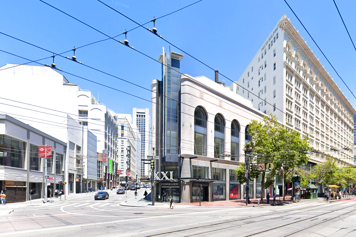
2 Stockton Street, image via Google Street View
The existing building is three floors over a basement on a trapezoidal lot. Its visible exterior characteristics date back to a 1995 remodeling with ground-level granite and the triangular glass and sculptural metal feature at the corner. The terracotta and tiling covering the second and third floors date back to the original construction circa 1937.
The redevelopment would increase the site’s gross floor area from 75,250 square feet to 117,260 square feet, increasing the height to 128 feet above street level. Of that area, 49,999 square feet would be for offices and 54,620 square feet for retail. 2,235 square feet would be used for parking 18 bicycles.
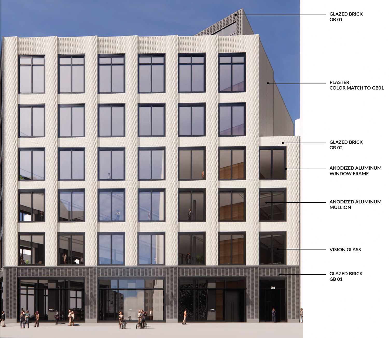
2 Stockton Street facade details, rendering by Gensler
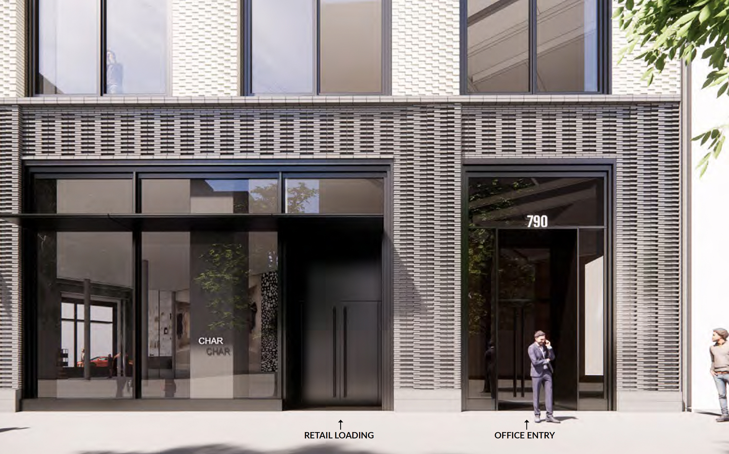
2 Stockton Street lobby entrance for the offices at 790 Market Street, rendering by Gensler
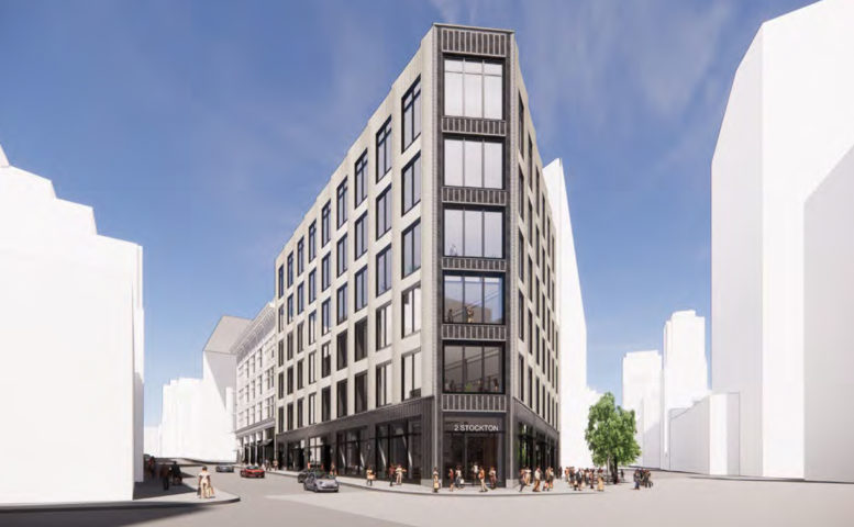
Gensler is the project architect. The exterior will be clad with glazed bricks. The base will be established by a darker grey brick, with the rest of the building covered with white glazed bricks patterned, with bay windows implied by raised bricks radiating from the corner of the trapezoidal lot at Market and Stockton Street.
The office portion will be given a separate lobby entrance addressed as 790 Market Street.
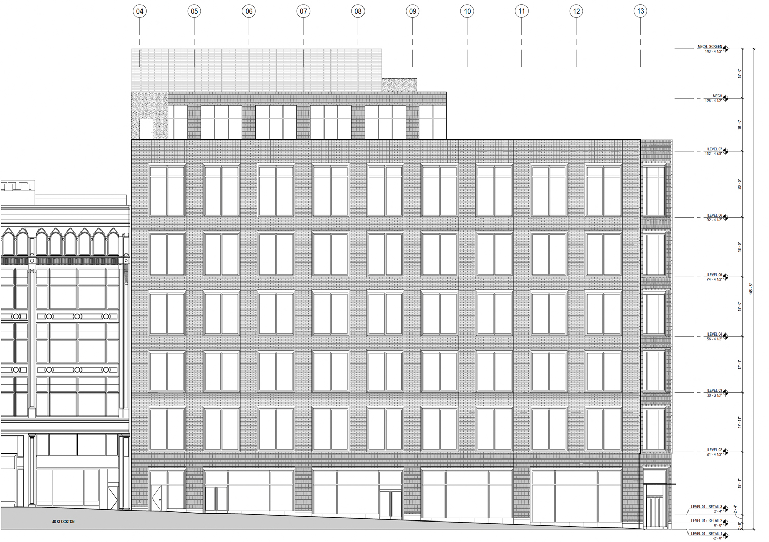
2 Stockton Street facade elevation, illustration by Gensler
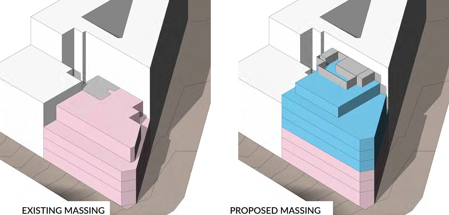
2 Stockton Street existing and proposed massing, illustration by Gensler
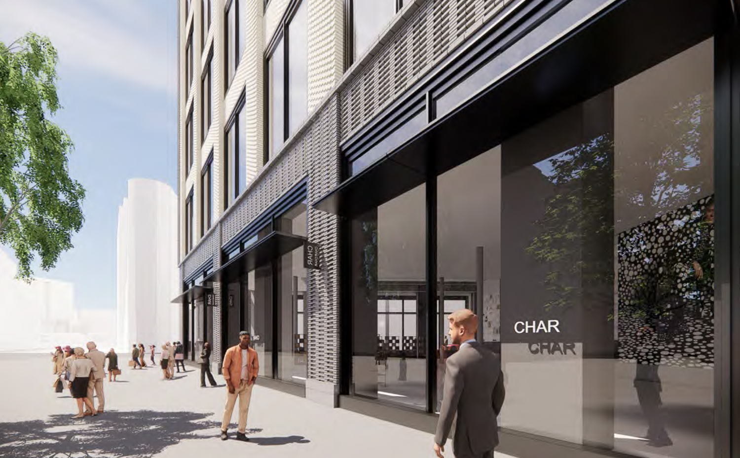
2 Stockton Street pedestrian activity outside of the retail front, rendering by Gensler
The application requires Downtown project Authorization, Conditional use Authorization, Office Allocation, and Variance and is currently undergoing an environmental review. The Planning Department is seeking comment from the Architecture Review Committee about the plan’s compatibility in the conservation district. Specifically, the committee is expected to comment on the massing and composition, scale, materials and colors, and the detailing and ornamentation with Strada’s proposal.
The meeting is scheduled for today, June 15th, starting at noon. For more information about the meeting agenda and how to attend, visit the city website.
Subscribe to YIMBY’s daily e-mail
![]()
Follow YIMBYgram for real-time photo updates
Like YIMBY on Facebook
Follow YIMBY’s Twitter for the latest in YIMBYnews

I’m not sure why it can’t just meet the Phelan Building all the way up. What’s the point of that notch out? It would look much better just to reinforce the street wall as much as possible and not show off the unadorned lot line wall of the Phelan Building? Take that to the review…
I agree, but at this point, I’ll settle for this proposal because it’s a quantum improvement over the existing kitschy structure.
I’m all for density, but I’m not sure why we’re building more office space in a neighborhood that doesn’t need it. Housing would bring more reliable foot traffic to the area. Not to mention this design is much more generic than what it replaces.
Thank you for the bicycle parking, if possible could there be more
Or, in your case, tricycles.
I like it as it is with the arches, but the new plans are nice okay. If they are going to reskin a building, I would vote for the California Savings building just down the street.
It reminds me of economic 60’s-70’s suburb architecture. Hopiing the textures will make it interesting. I’ll miss the old lines.
Very bland design for a key downtown intersection. Why not at least have a rounded corner at the Stockton/Market intersection?
If it looks this bad in the renderings, it will look even worse in real life.