A new construction application notice has been published for 76 Putnam Street in San Francisco’s Bernal Heights neighborhood. The plans will replace a vacant lot with a three-story single-unit home. David G. Upchurch is listed as the property owner.
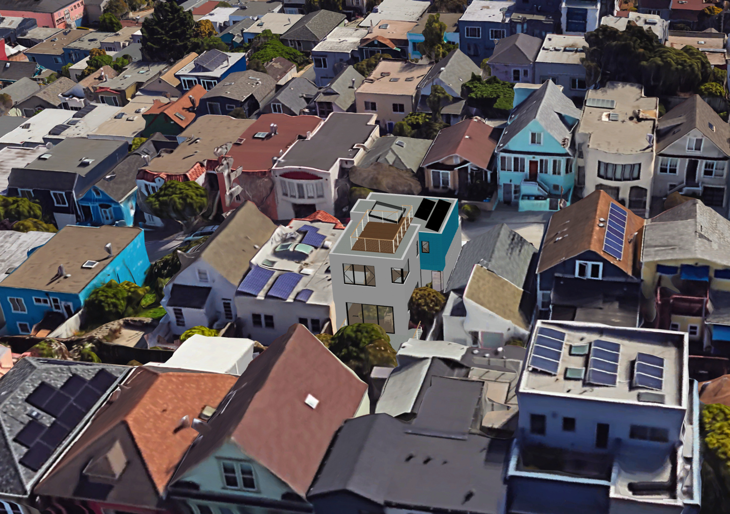
76 Putnam Street aerial view, rendering by Zack de Vito Architecture
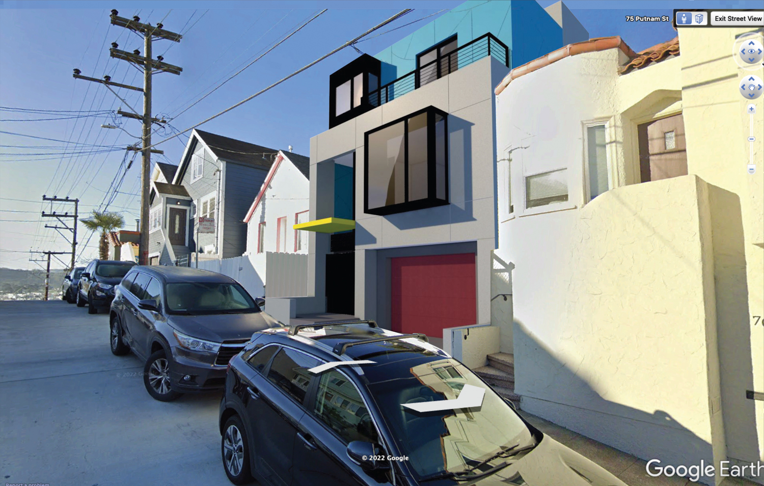
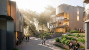
76 Putnam Street, rendering by Zack de Vito Architecture
The structure will rise 30 feet tall, with 1,450 square feet for housing and 625 square feet for the two-car garage. A backyard deck will retain two existing trees. Zack de Vito Architecture is responsible for the design. Facade materials will include cement plaster and patterned exterior panels. The illustration shows a fairly unattractive painters-tape blue for the top floor and a bright yellow awning over the entrance.
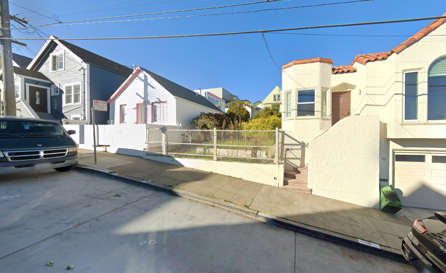
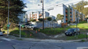
76 Putnam Street, illustration by Google Street View
City records show the 0.04-acre vacant property sold for $499,000 in February last year. New building permits were filed in August. The property is just 10 minutes from the Glen Park BART Station or 12 minutes from the 24th Street BART Station via bicycle. The estimated timeline for construction and completion has not yet been established.
Subscribe to YIMBY’s daily e-mail
Follow YIMBYgram for real-time photo updates
Like YIMBY on Facebook
Follow YIMBY’s Twitter for the latest in YIMBYnews

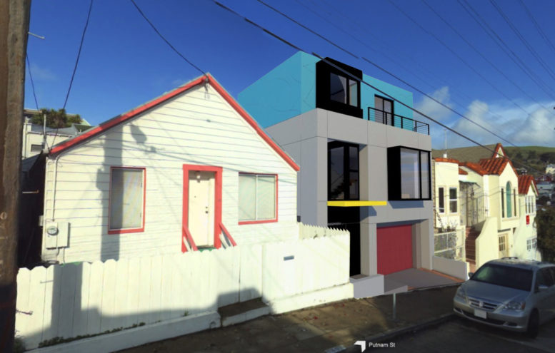
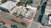
The painter’s-tape blue is fairly unattractive, but the aerial-view rendering shows three existing houses in the same block with overall paint jobs of nearly the same color. At least it will blend in.
I actually like the painter’s-tape blue, it looks good with the style and other colors of the house. With that being said everyone’s tastes are different and that is okay. The world would be boring if everyone liked the same thing.
Love the blue. So cute.
It’s not exactly in your backyard though, is it? This property has its own backyard for that matter. Yes, build! But I’m not sure why I should literally have to lose my teeny back walkway.. not even a yard! To tear down my small building for a massive structure. That’s not civil.
? They are not tearing down anything, it is an empty lot. No one is losing anything.
I like the set back in front. The colors could change and the hue of each color could be different in the final building. The back of the building is nicer than the front giving space and a light well for the neighboring house.