Building permits have been filed for the estimated $105 million reskinning and renovation of 77 Beale Street, to be renamed 200 Mission Street, in Hines’ headline-grabbing plan for the Atlas Block Campus in SoMa, San Francisco. Along with building permits, planning documents reveal new imagery and programming details for the mixed-use project. The Atlas Block includes the dynamic Foster + Partners-designed facade for 50 Main Street, the potential second tallest building for the Bay Area.
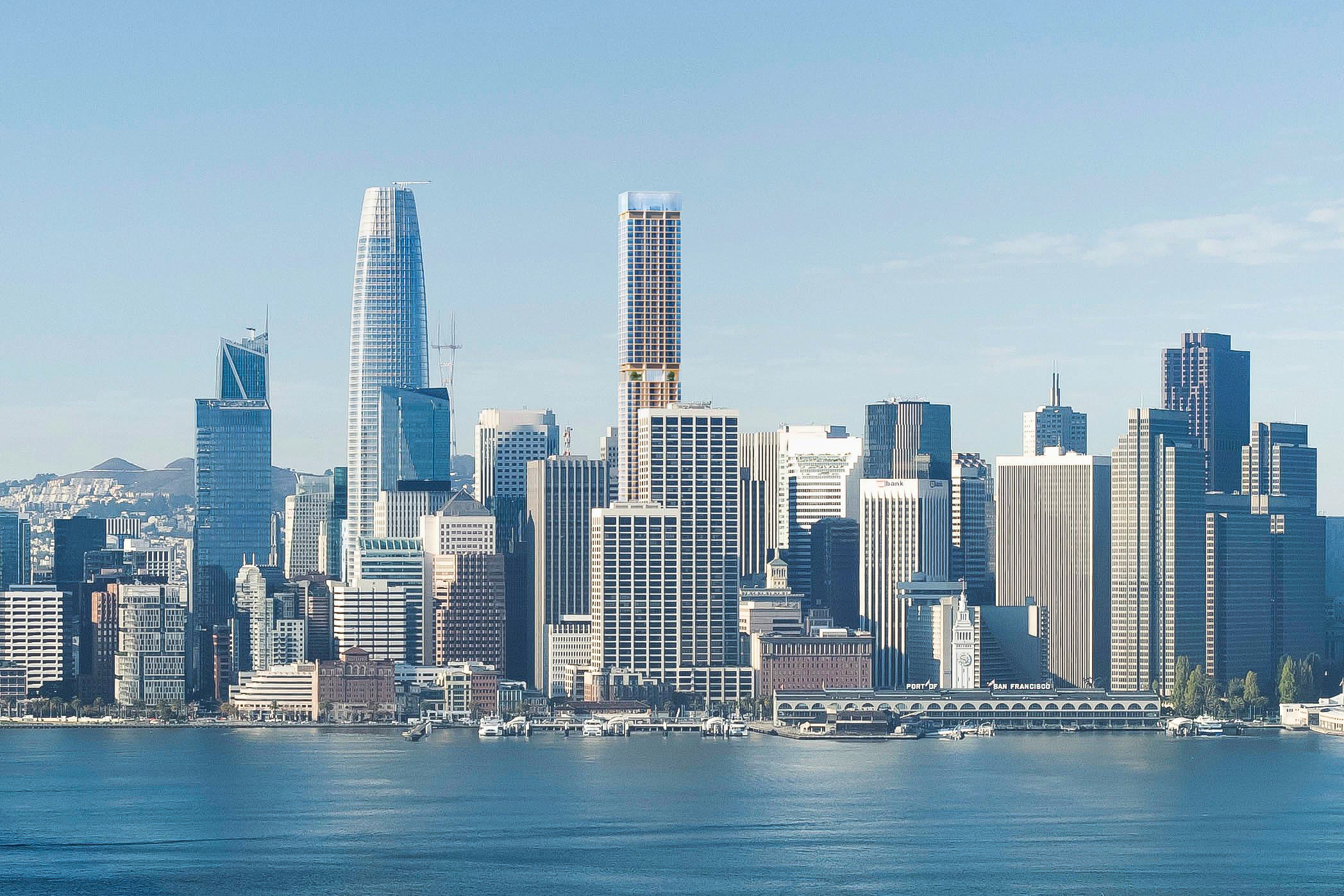
50 Main Street as seen in the proposed skyline, design by Foster + Partners, rendering courtesy Hines
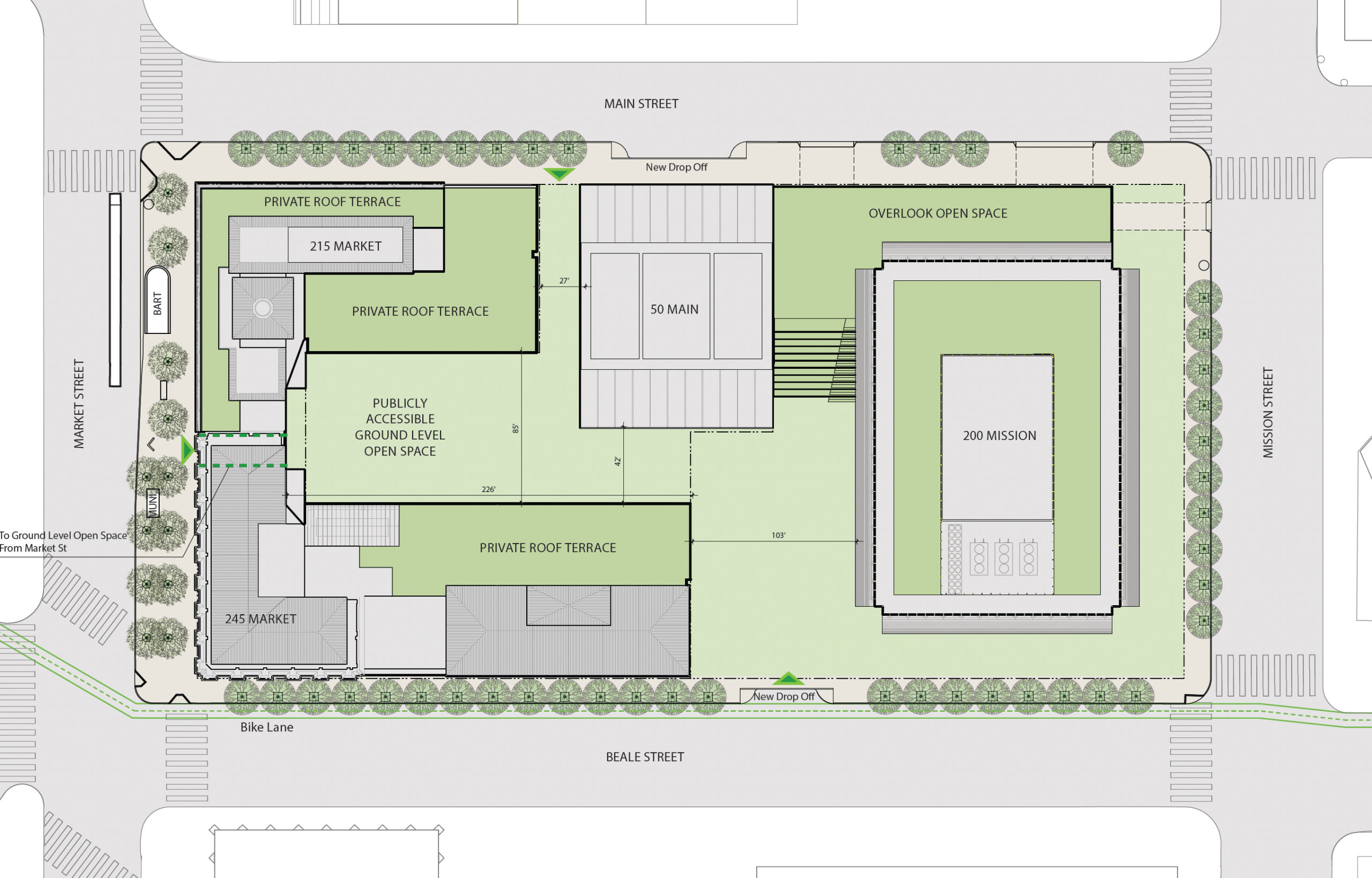
Detailed Atlas Block site map, illustration by Pickard Chilton
Overview
Hines’ plan reimagines PG&E’s former San Francisco headquarters as a mixed-use city block with a new residential supertall, offices, and a web of public open space connecting to the street. Construction is estimated to cost $372 million, while the total development cost will be much higher.
The overall proposal will finish with 1.6 million square feet of office space, nearly a million square feet of residential floor area, 200,000 square feet of parking for 683 cars, 37,400 square feet of commercial retail, and 54,000 square feet of public open space. Additional parking will be included for 1,333 bicycles.
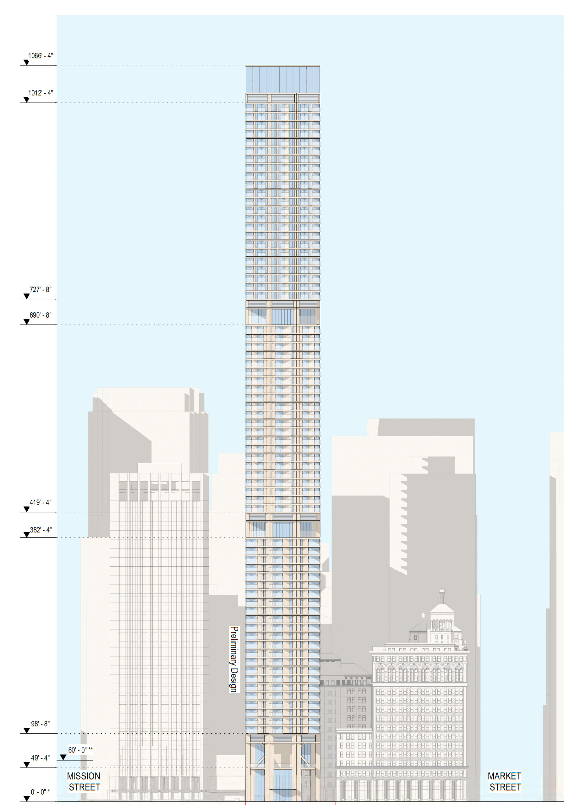
50 Main Street elevation, illustration by Foster and Partners
The tower at 50 Main Street is expected to rise 1,066 feet tall, creating 808 new homes, of which an estimated 161 units will be affordable. The apartments will vary in size, with initial plans for 225 studios, 379 one-bedroom units, 200 two-bedrooms, and four three-bedroom units to serve as the project’s crown jewel penthouses.
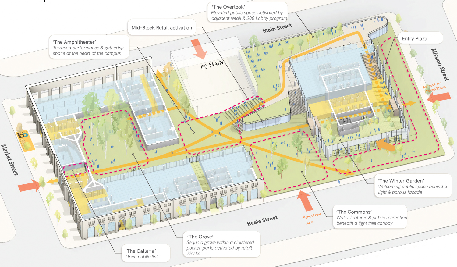
200 Mission Street Campus ground-level floor plan showcasing the public open space, rendering by Pickard Chilton
For the public, the most important aspect of the Atlas Block will be the foundation of public open space. Across the whole 3.5-acre property, 1.25 acres will become publicly accessible green space. PWP Landscape Architecture will be responsible for its design, aiming to bring together nature and urban life.
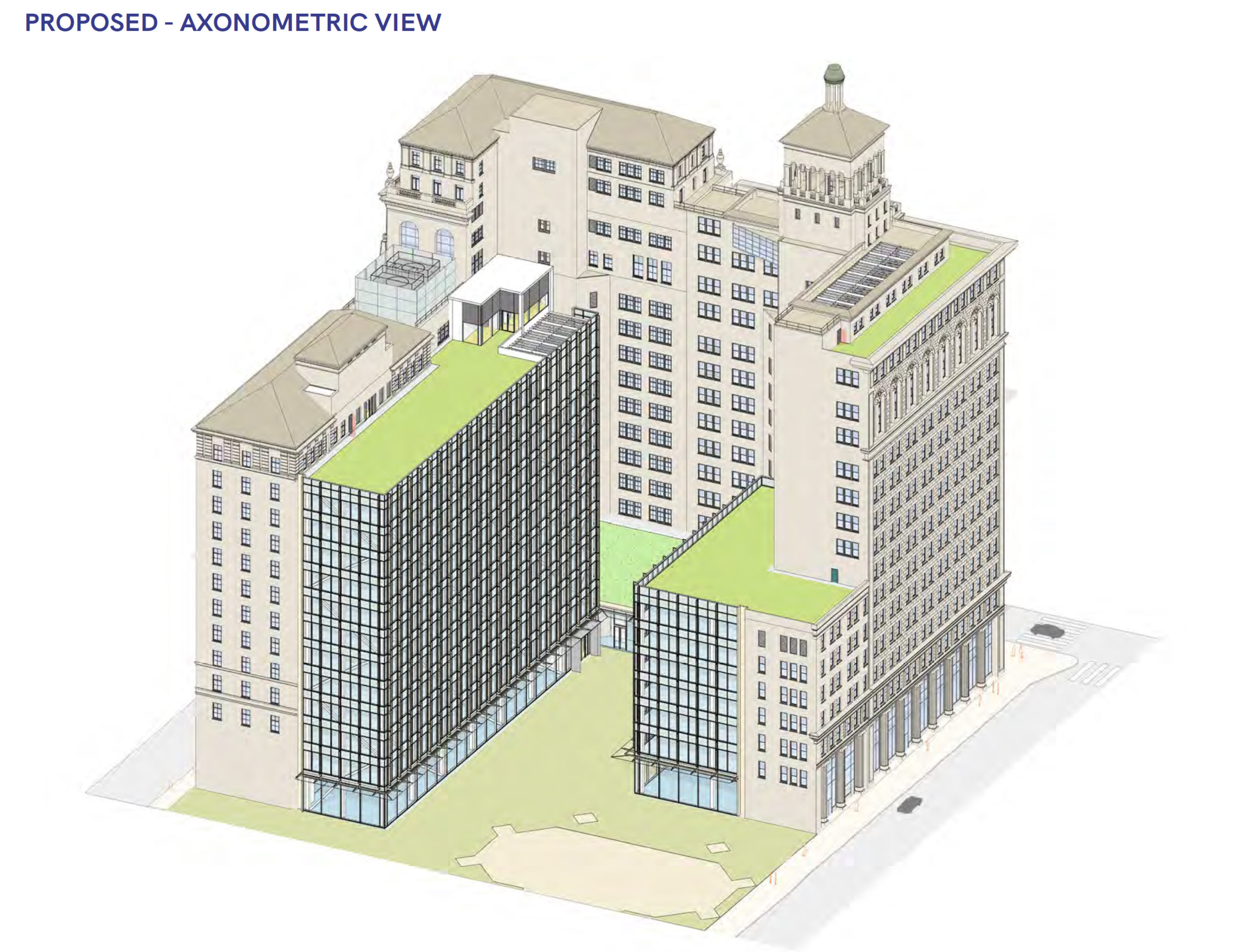
Historic Market Place component proposal, axonometric view by Pickard Chilton
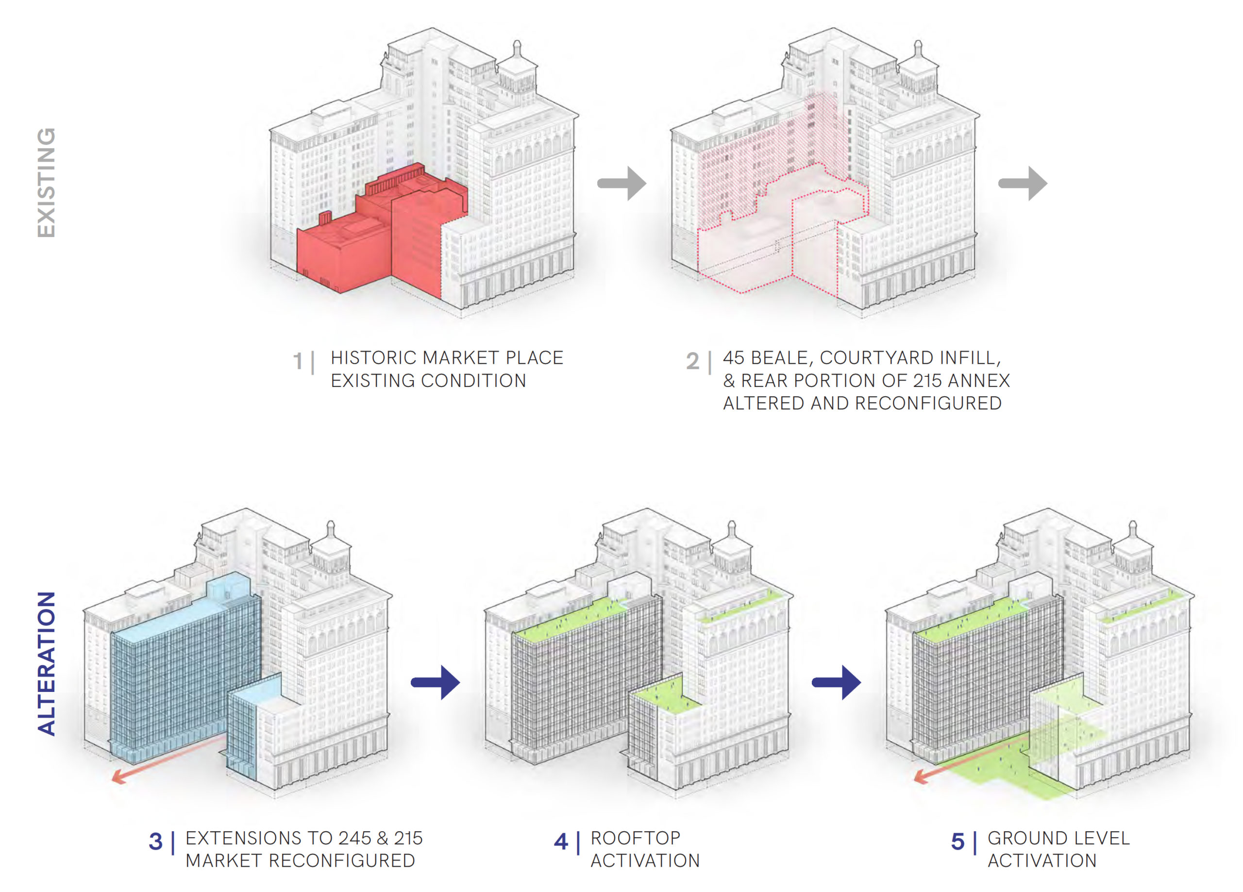
Proposed process for the renovation of the Historic Market Place component, rendering by Pickard Chilton
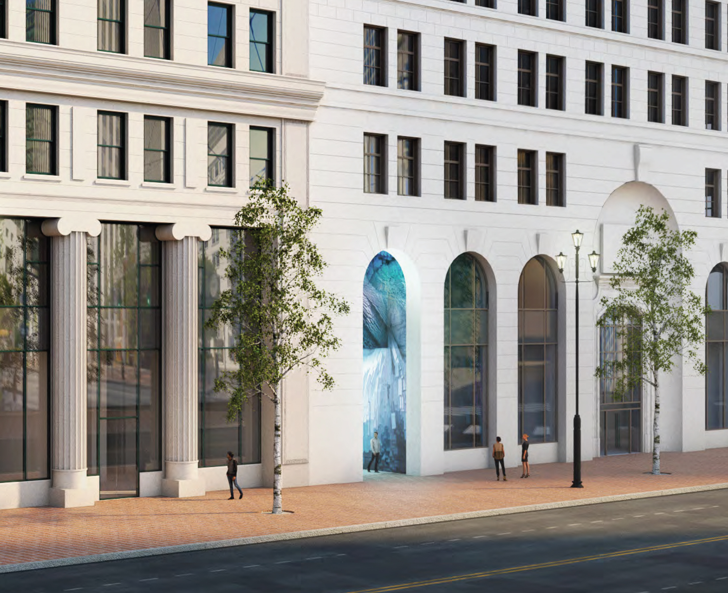
Historic Market Place development renovated entrance, rendering by Pickard Chilton
While plans for 200 Mission will redefine the 1960s-designed tower into a modern image, Hines is also aiming to revive a historic set of buildings to their former glory. The first of the two office projects will be the restoration and renovation of the 600,000 square foot office building at 215-245 Market Street. The Pacific Gas and Electric Company General Office Building and Annex were built between 1923 and 1925 in a Beaux-Arts style by the architects Bakewell & Brown. The historic facade and lobby will be retained, while the rest of the structure’s internal systems and technologies will be updated with state-of-the-art functionality and sustainability.
200 Mission Street
According to the new permits, work will include “replacement of facade, elevators, mechanical, electrical, plumbing, & fire protection(sprinkler system), seismic structural upgrades, [and ground] plane redesign.”
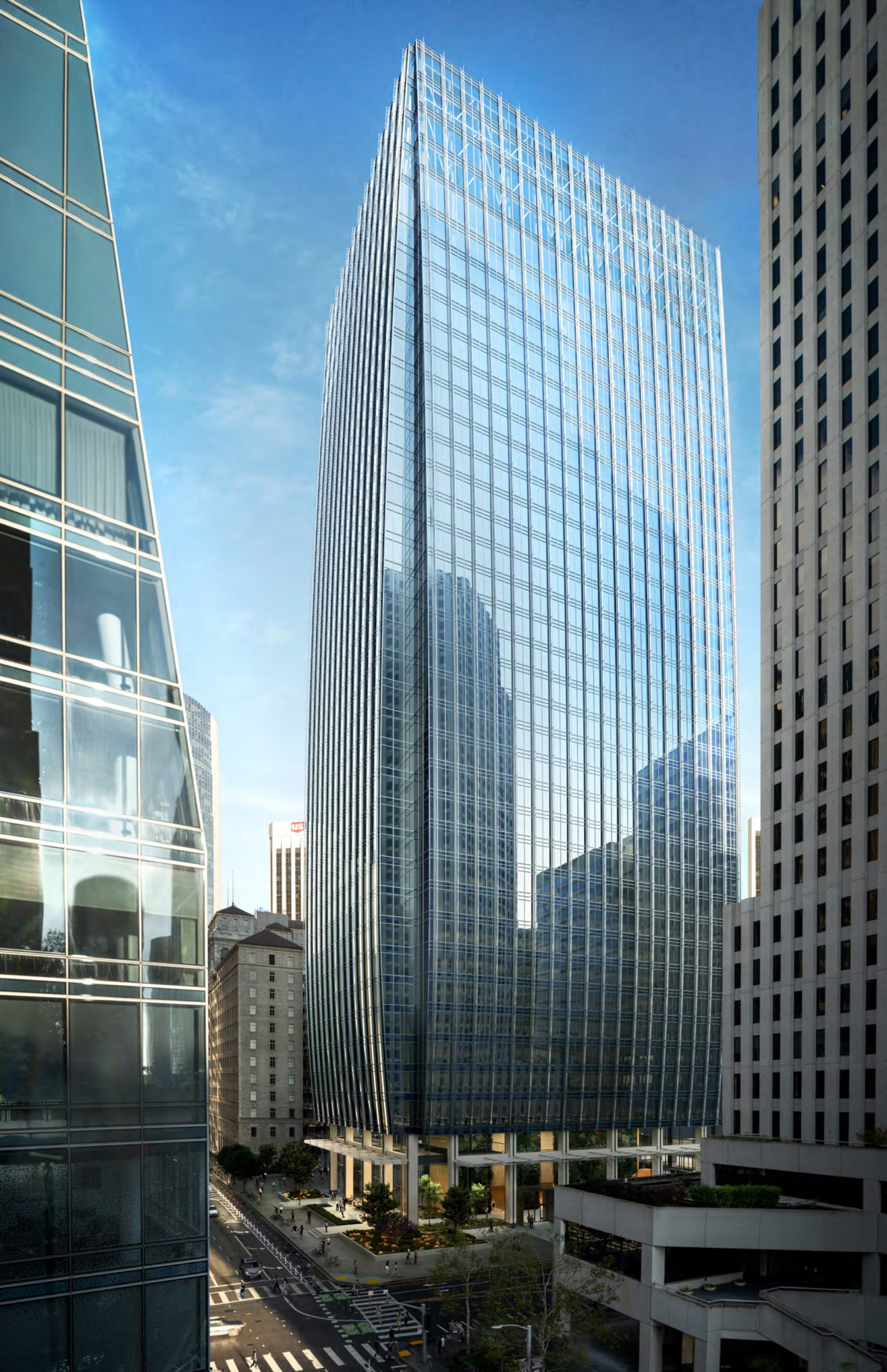
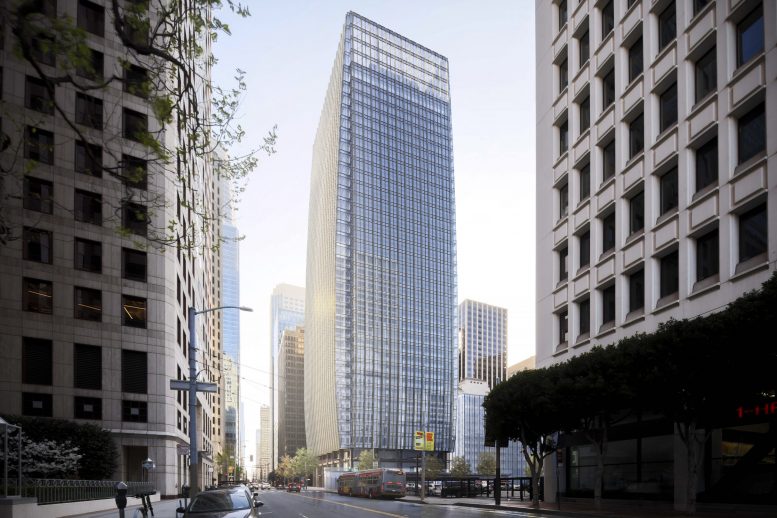
200 Mission Street seen from Salesforce Park, design by Pickard Chilton, Rendering by Steelblue
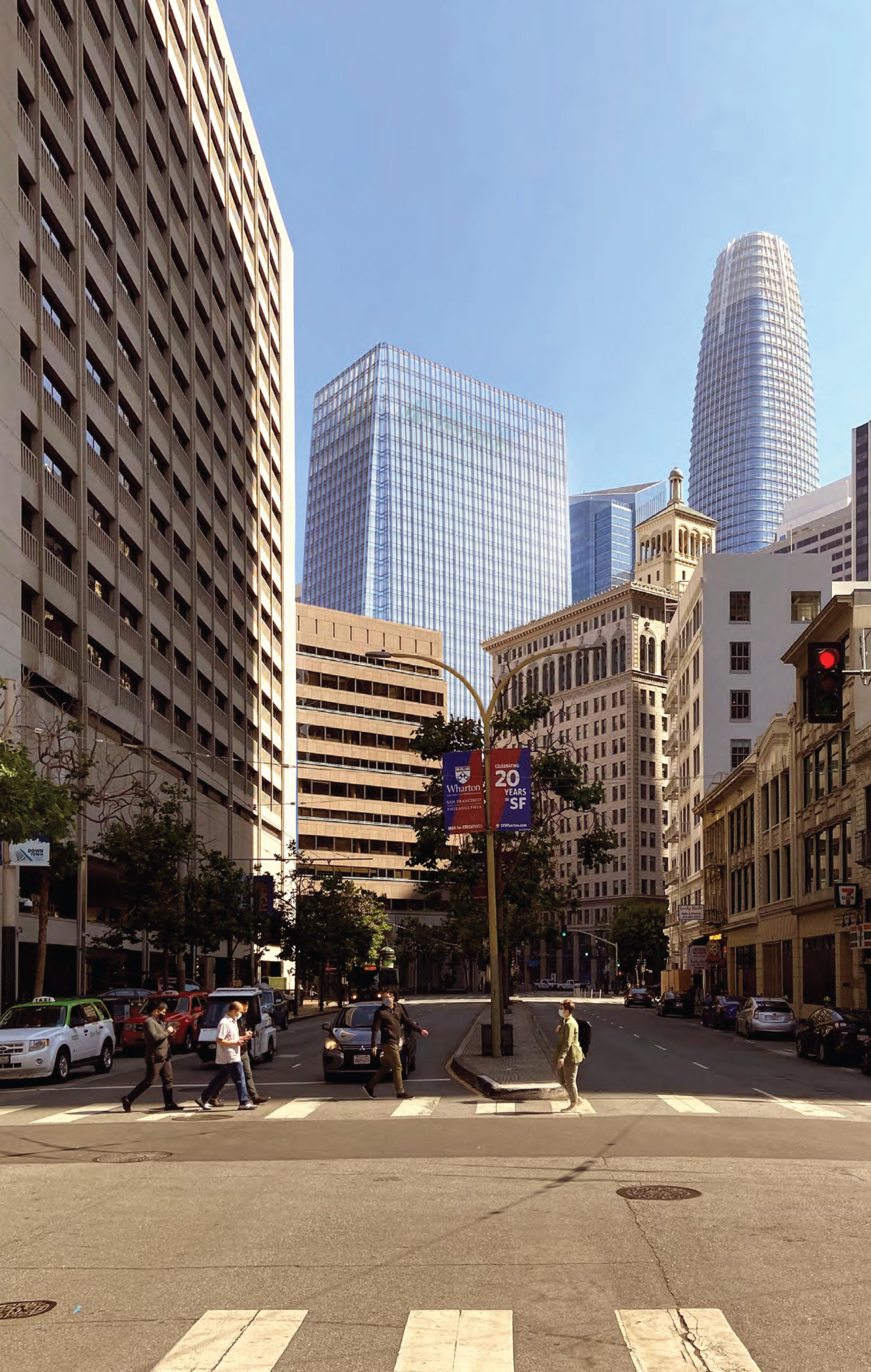
200 Mission Street seen from Drumm Street, rendering by Pickard Chilton
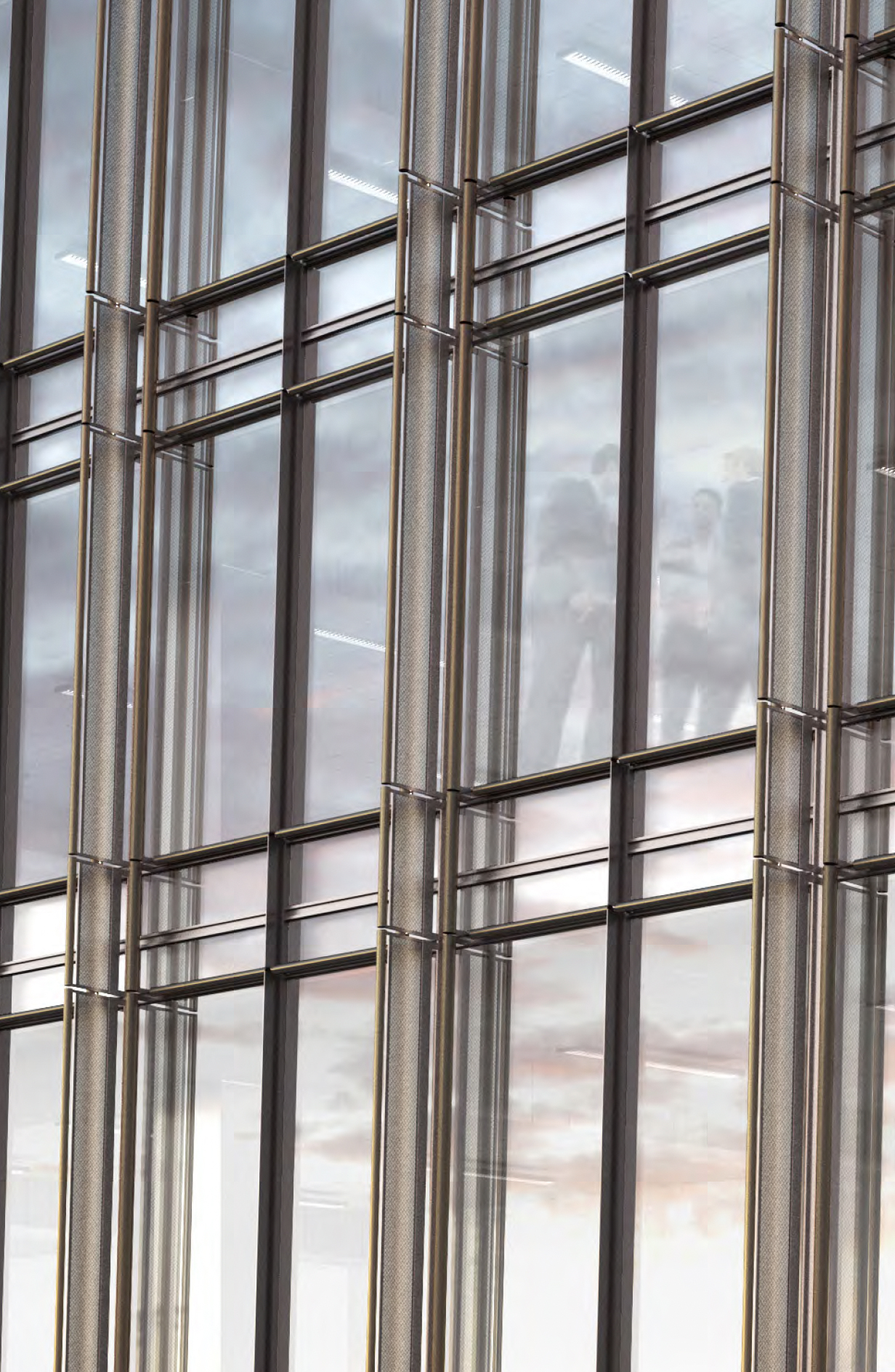
200 Mission Street facade details, rendering by Pickard Chilton
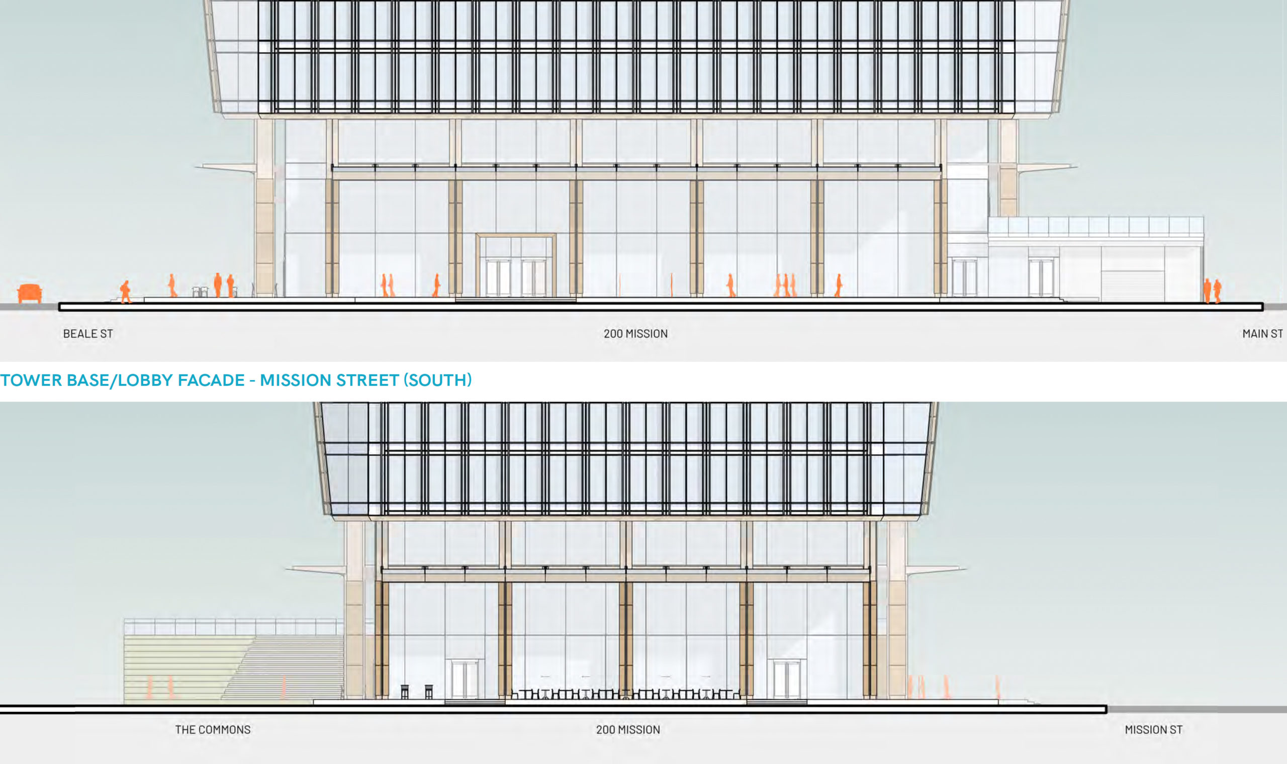
200 Mission Street entry, rendering by Pickard Chilton
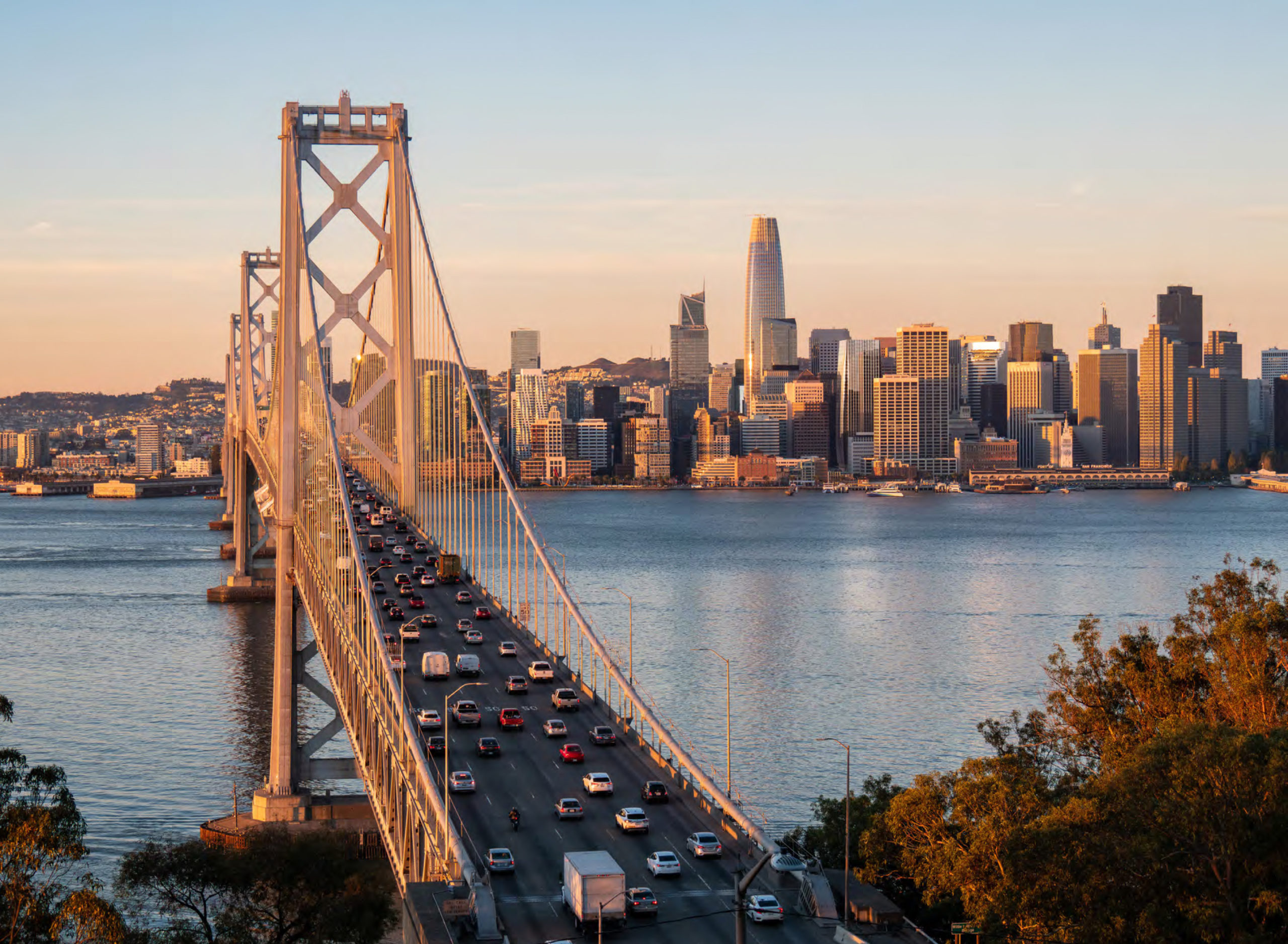
200 Mission Street seen from Yerba Buena Island, design by Pickard Chilton, rendering by Steelblue
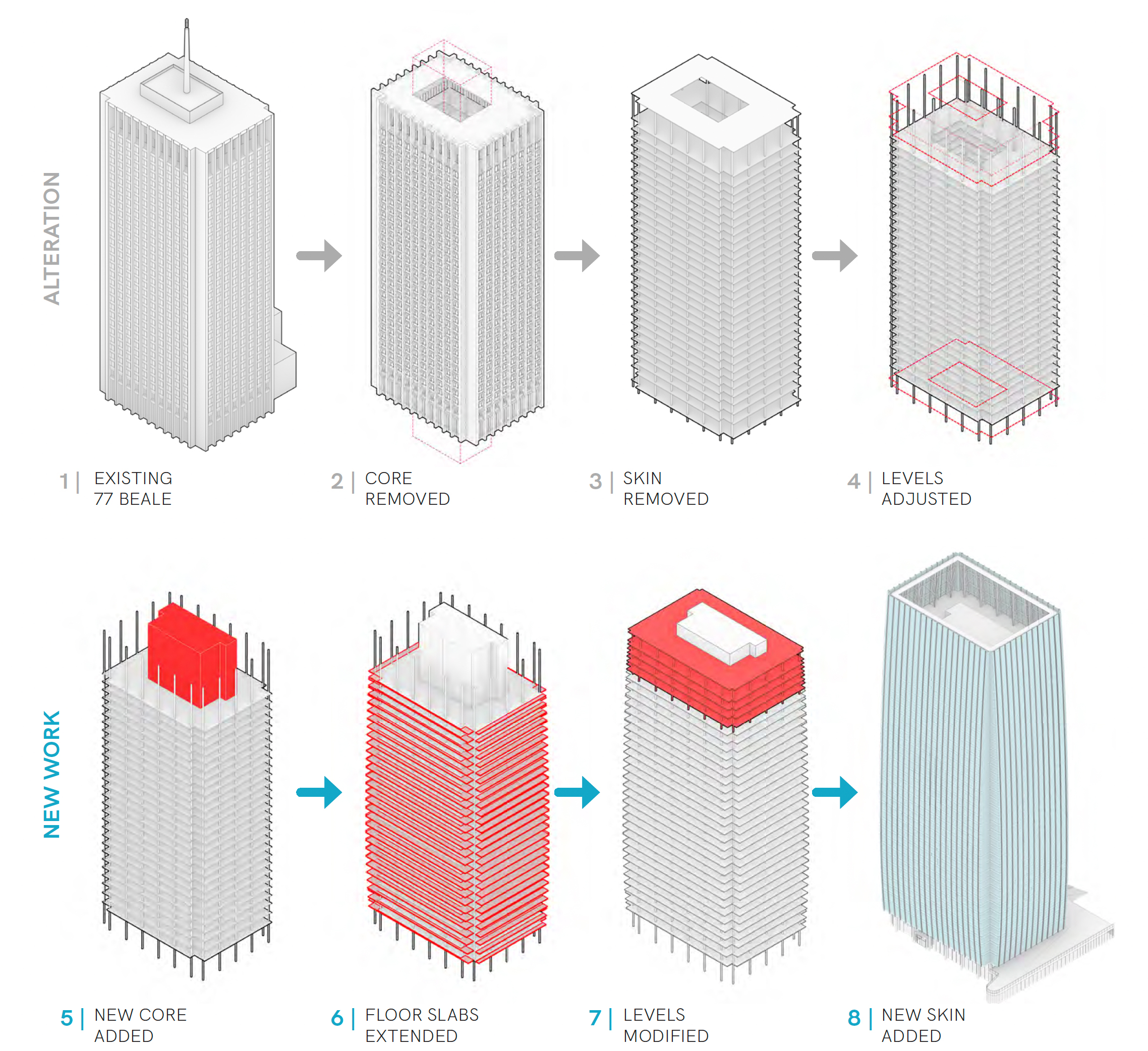
Illustrations for the reskinning and reshaping of 200 Mission Street, rendering by Pickard Chilton
As previously covered, Pickard Chilton will be the project architect responsible for reskinning the historic office building, designed by the 1960s by Hertzka and Knowles. The new design will bulge out from the original envelop with curtain-wall glass, adding nearly 25,000 square feet of new office space. The 34-story building will include over a million square feet of office space and is to be renamed 200 Mission Street.
Hines will also be seeking LEED Platinum certification. 200 Mission will include new MEP systems, modern glass technology, and facade-integrated solar panels, all to reduce energy consumption and increase natural light for office workers.
50 Main Street
New illustrations and elevations for 50 Main Street also provide insight into the facade, with fluted V-shaped bay windows creating a dynamic curtainwall. This contradicts the expectations of a box-like tower that preliminary renderings suggested. Illustrations show a transparent high-ceiling octagonal atrium at the street level, punctuated by two imposing pillars on each face. Notably, there are no columns on the corner, visualizing a dramatic engineering feature hoped to be achieved by the project team.
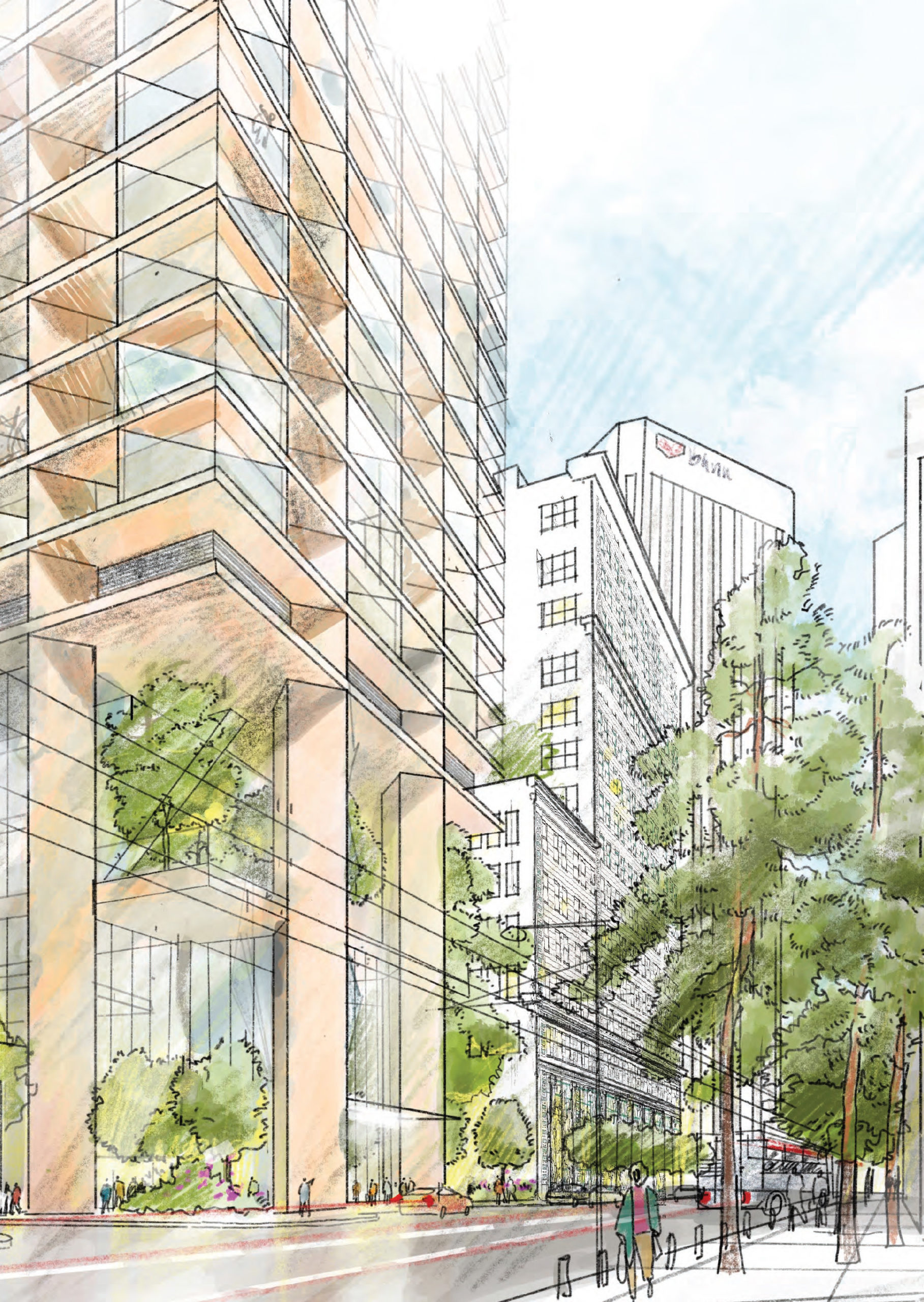
50 Main Street entrance, illustration of design by Foster + Partners
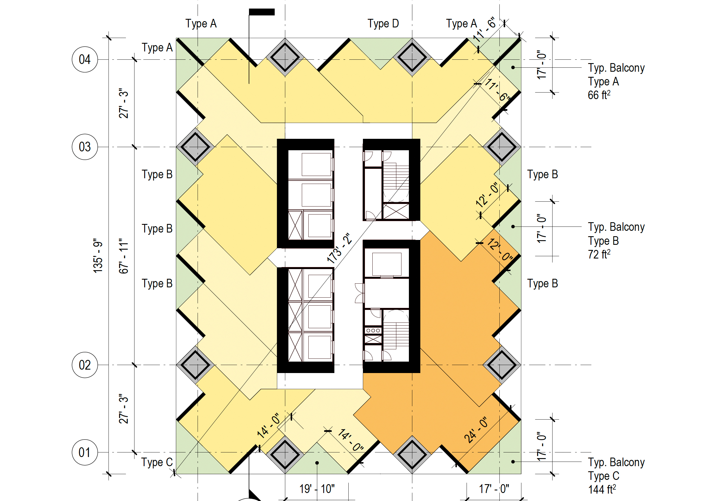
50 Main Street typical floor plan between levels 9-31, illustration by Foster and Partners
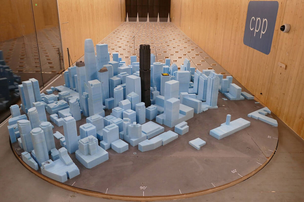
50 Main Street wind-testing model, image courtesy CPP
A recent article by Benjamin Schneider of the San Francisco Examiner in late January of this year reviewed the structural engineering of 50 Main Street. Ron Klemencic of Magnusson Klemencic Associates shared with Schneider, “We’re still in the formative stages of design, but there’s no question about what the foundation will be. We’re going to be on large diameter drilled shafts that extend roughly about 250 feet down to bedrock.” The caissons will extend into the bedrock, establishing a secure socket. The firm also made a point to clarify they were not involved with the city’s Millennium Tower.
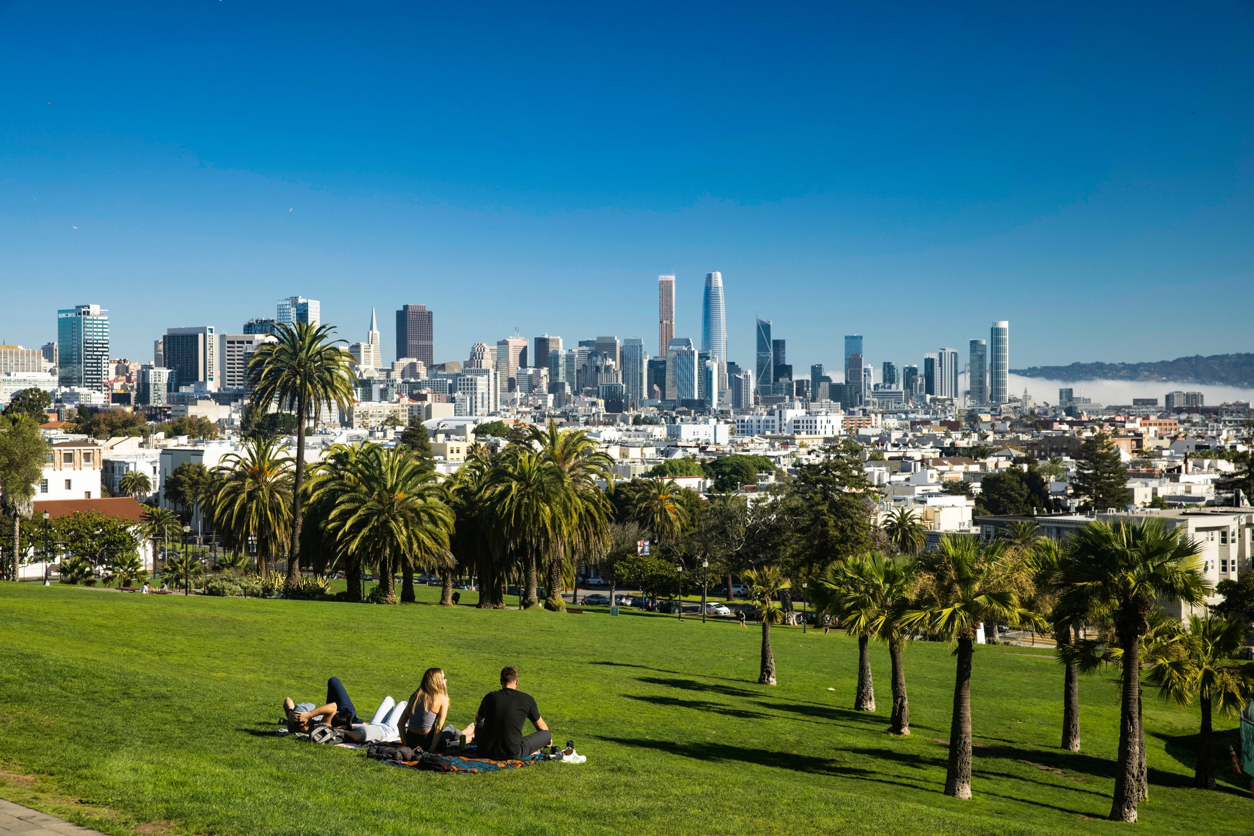
50 Main Street seen from Dolores Park, design by Foster + Partners, rendering courtesy Hines
Proposed to be four feet shorter than the Salesforce Tower, 50 Main Street is the most prominent proposed addition to the city’s iconic skyline right now. The team was able to propose a tower this tall, courtesy of the State Density Bonus, which allows for a waiver to surpass height limits to build more housing with affordable housing requirements. Hines has also applied for protection from the California Senate Bill 330, also known as the Housing Crisis Act of 2019.
Subscribe to YIMBY’s daily e-mail
![]()
Follow YIMBYgram for real-time photo updates
Like YIMBY on Facebook
Follow YIMBY’s Twitter for the latest in YIMBYnews

What’s with all the blocky building from Fosters & Partners. It’s a shame to see this next to the beautifully tapered Salesforce tower by Pelli
My understanding is that the slender supertall renderings are just intended to show the maximum envelope of the building under the Density Bonus, and not really a finished design. That said, given how small the footprint for that site is, it seems like there wouldn’t be much opportunity for design variety without giving up some residential units, which would defeat the purpose of the bonus.
I like the new supertall’s contrast with Pelli’s Salesforce tower. I’m surprised the housing component will be rental instead of condo, but that can always change depending on market conditions.
That marker rendering looks like 1973.
I like it.
50 Main street looks terrible. Extremely ugly.
50 Main is gorgeous! Curtain wall system is awesome. A spectacular addition to the skyline.
Thank you Hines and Foster!