Plans have been filed for a new three-story residential infill at 1300 C Street in Mansion Flats, Sacramento. The proposal will replace a vacant retail structure and surface parking with 126 apartments. SKK Development is the project applicant.
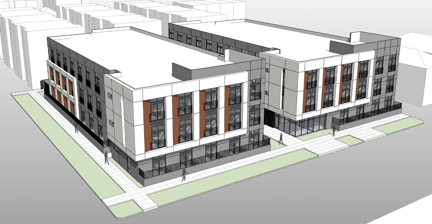
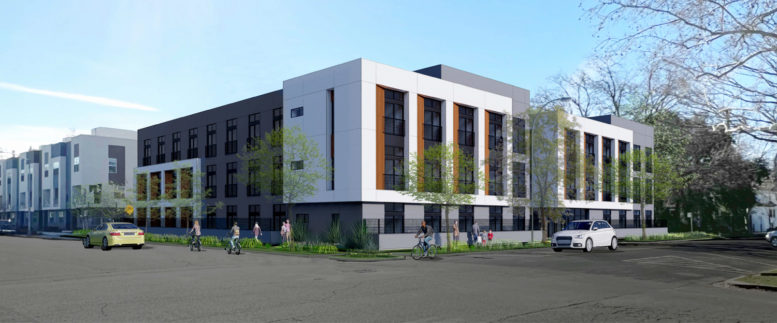
1300 C Street aerial view, rendering by 19six Architects
The 36-foot tall structure will yield around 51,600 square feet. Every unit will be a studio with in-unit bathrooms and a window facing outwards or to the inner open space. Amenities will include a fitness center, lobby, and inner courtyard.
Nearly a dozen trees will line the housing block, including five existing trees. Planters will decorate the pathway from the street to the interior courtyard. Lounge seating and tables by the barbeque grill will provide space for outdoor dining. Yamasaki Landscape Architecture has designed the open space.
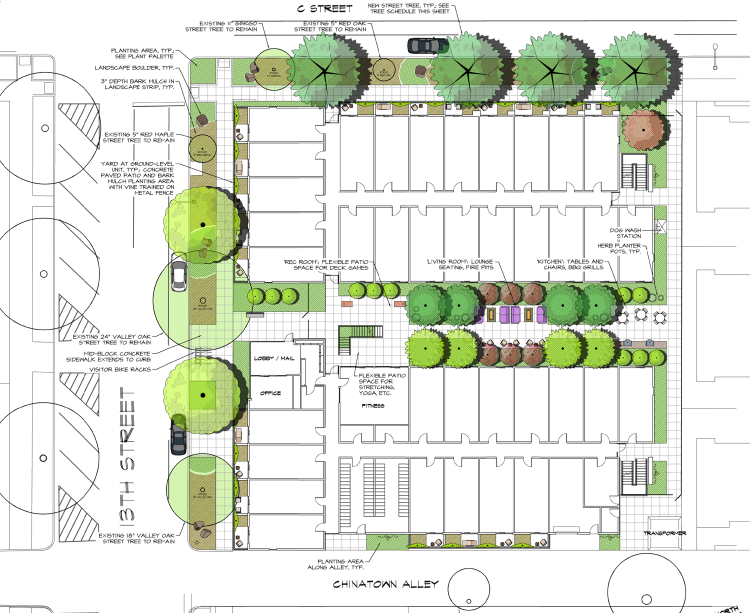
1300 C Street landscaping map, illustration by 19six Architects
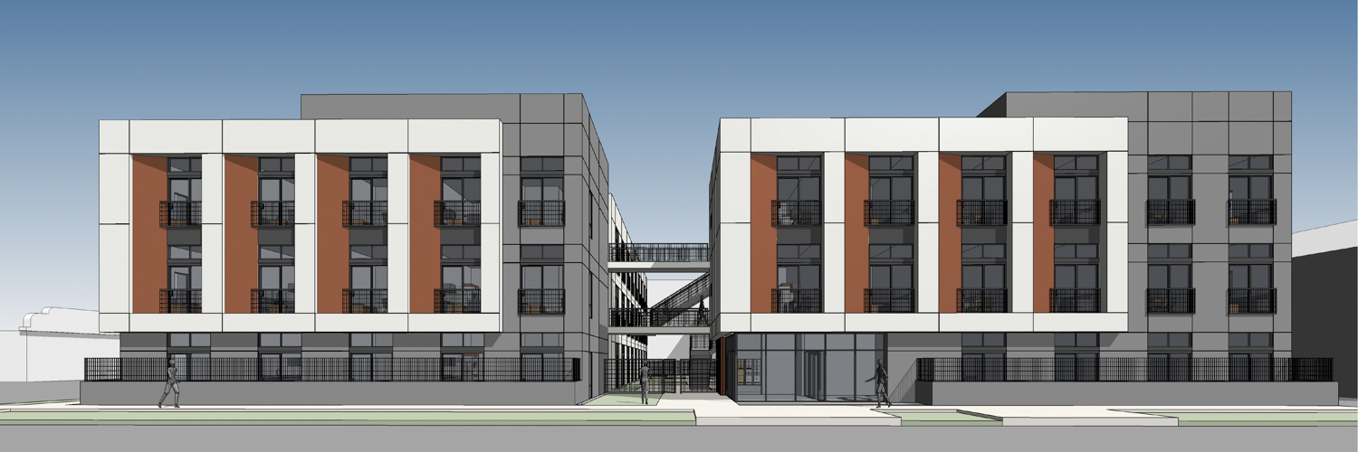
1300 C Street street view, rendering by 19six Architects
19SIX Architects is responsible for the design. The infill style maximizes residential capacity by not including vehicular parking. The rectangular massing is decorated with double-height bay windows inset to a bulky white articulation. Facade materials will include plaster, metal panels, and aluminum storefronts.
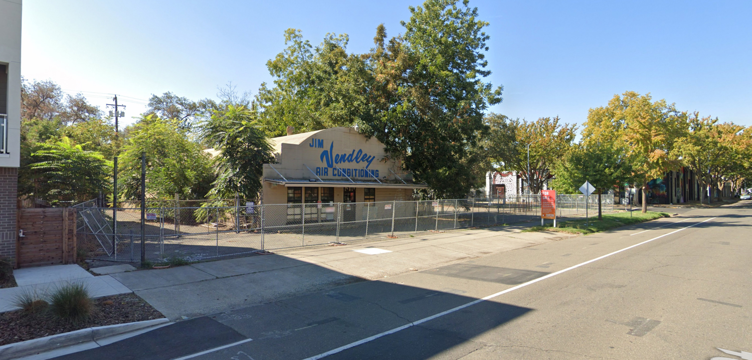
1300 C Street, image via Google Street View
The property is located along 13th Street between C Street and Chinatown Alley. Future residents will be close to the John Muir Children’s Park and a light rail station on 12th and D Street.
BKF Engineers is consulting on civil engineering. City records show that the property sold in May of last year for $1.5 million. The estimated timeline for construction and completion has not yet been established.
Subscribe to YIMBY’s daily e-mail
Follow YIMBYgram for real-time photo updates
Like YIMBY on Facebook
Follow YIMBY’s Twitter for the latest in YIMBYnews


I wish there was better connectivity at street level. The privacy walls surround almost the entire development at the sidewalk, making this building seem hostile and unwelcoming to outsiders.
That’s a good point. Also, as a transit crank, I really want to like the absence of vehicle parking, but there are very few amenities (especially grocery stores) in the vicinity, so people will want to have cars and will end up fighting for street parking.
Agree
This is just another ho-hum project from SKK Development. As Matthew stated above, the street activation is terrible. Also, I am getting tired of these low-rise boxes.
Although Mansion Flats is a relatively quiet neighborhood (accept for the druggies and crazies), I think it would welcome a project that adds a couple restaurant and retail spaces, along with a small grocery store. I would rather that the first floors have two or three spaces that engage the public, instead of wall-to-wall apartment units.
To improve the design: First, we need more height. I’m sorry, 3 floors is just anemic. At the very least, this project should have 4 floors. (Again, the first floor should be reserved for restaurant, retail, and grocery spaces) I like the idea of smaller units, but why not add more, so we can achieve 5 or 6 floors? Additionally, these boxy projects suggest “urban” styling, but they really are just suburban apartment complexes. Truly urban projects have designs that stand out (tastefully) instead of just blending in. In addition to more street activation greater heights, I want Sacramento developers to start incorporating curved lines, zig-zags, etc. in their buildings. (I am begging… Please, anything but a boring old box.) This building is in the “Developer Modernist” style that got old 10 years ago. I know why developers love the style… It’s cheap! Speaking of “cheap,” I can see the tell-tale signs of value engineering in the renderings – No more stucco and cementatious panels that exhibit paint leaching the first rainstorm. Sacramento projects must have better design.
I get it… Construction costs are ridiculous. But it may be time to wait until prices come down, because I can’t bear to see another one of these forgettable, low-rise, boxy, and cheaply-styled projects get built.
So well put! It’s not even a four over one, and it should be a five. Mansion Flats is pretty isolated, so ground-floor retail is critical here; and midtown rents are so high that we need greater density. There’s really no excuse for this ho-hum design.
Nearby resident, not thrilled with the design. Density is needed but this seems extreme. Better street-level activation would be nice. Limited nearby amenities mean street parking, already an issue, will become mortal combat. Only 64 bike racks for 126 units. No on-site laundry. Limited interior outdoor space. Do 100% of the units need to be 1-person micro studios? Feels like a subsidy grab.
I don’t understand how you could describe this low-rise as bringing ‘extreme’ density in the same sentence as saying “density is needed.”
Andrew, I’m not opposed to a 4- or 5-story building. I believe the area is zoned for height, could be wrong.
I appreciate and agree with the comments on these projects. But is there a way this site can share about projects before they have been approved?
It seems like a good fit.