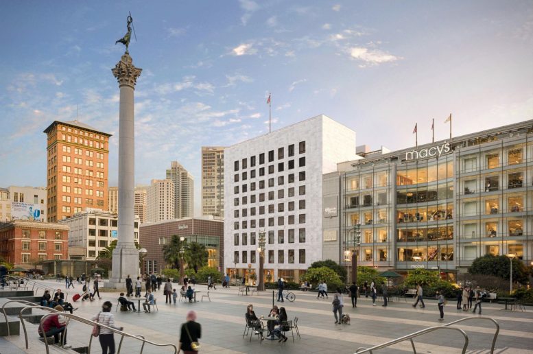
Updated renderings show a significant design change for the redevelopment of I. Magnin Building at 233 Geary Street, reducing the alterations to the marble facade. The development will transform the 11-story department store into a mixed-use building with retail, offices, and apartments overlooking Union Square in San Francisco. Sand Hill Property Company is responsible for the development.
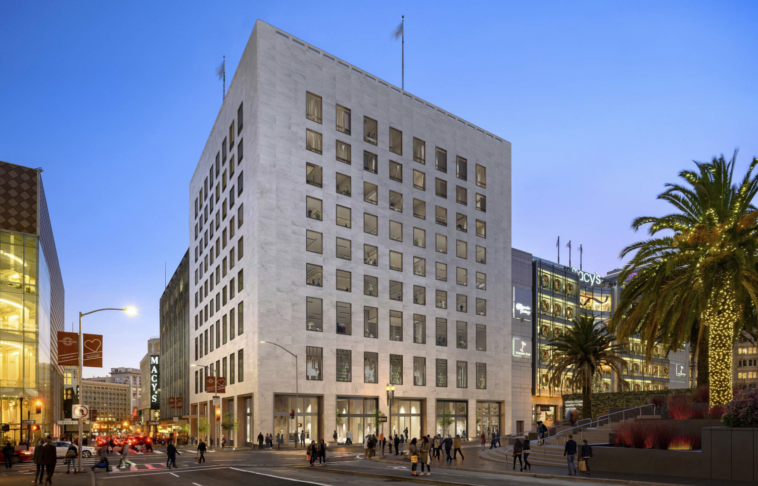
233 Geary Street, rendering by Handel Architects
The iconic building has loomed over Union Square since 1905, originally as the Beaux-Arts Butler Building with medical and commercial offices. In 1946, the structure was remodeled with white marble cladding to become a single-use department store. While earlier plans were to reimagine the building gold-tone-framed windows and a glass crown, new plans show the facade alterations will be minimal.
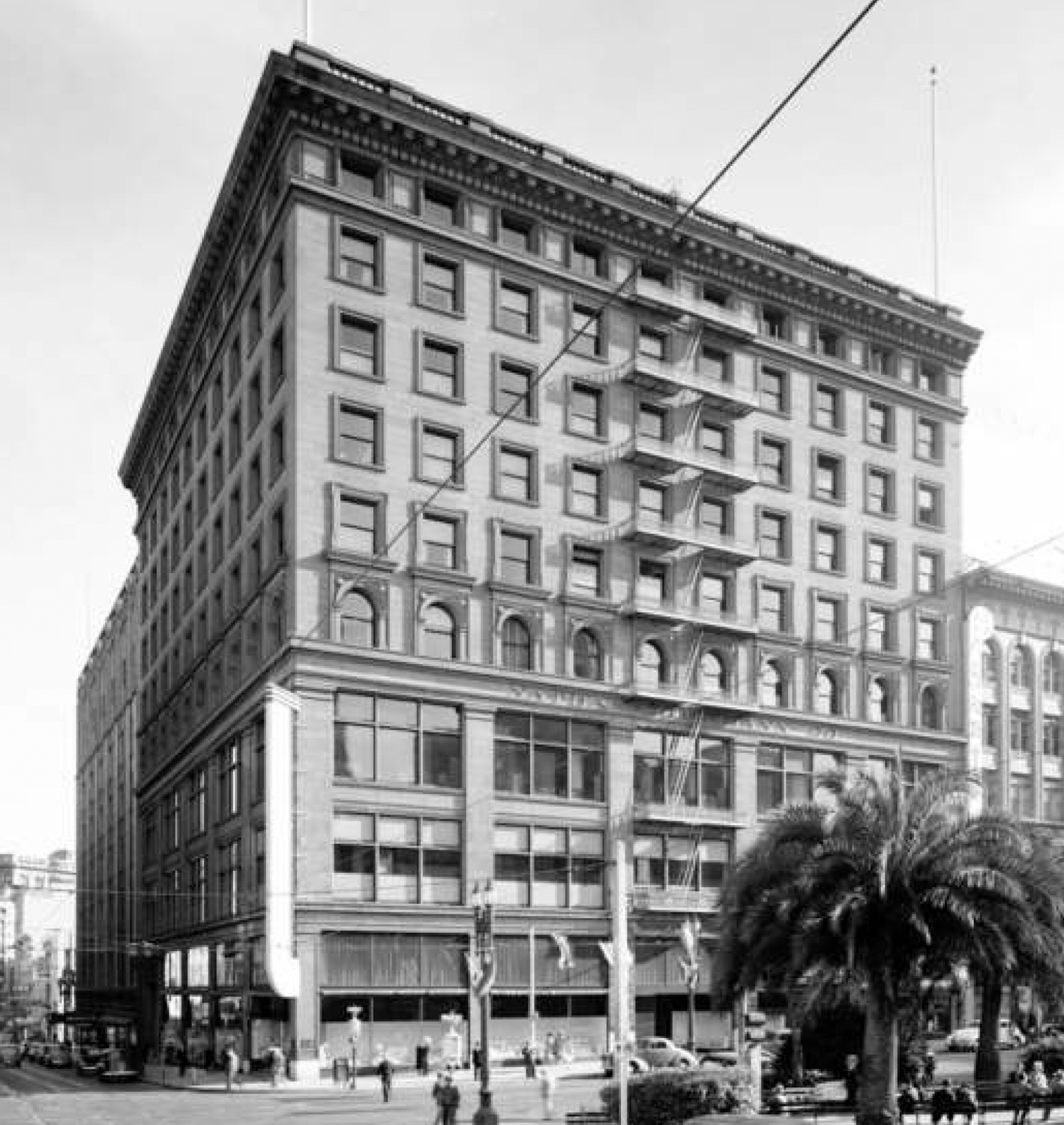
The Butler Building at 233 Geary, image via Handel Architects
The 178-foot tall structure will contain 229,940 square feet, with 63,240 square feet for retail, 81,470 square feet for commercial offices, and 49,700 square feet for residential use. The development will create 21 apartments ranging in size with 3 one-bedrooms, 15 two-bedrooms, and 3 three-bedroom units. Retail space will be introduced between the basement and third level, offices will be on levels four through seven, and apartments on levels eight to eleven. Rooftop terraces for the residents and office employees will be included on the peak.
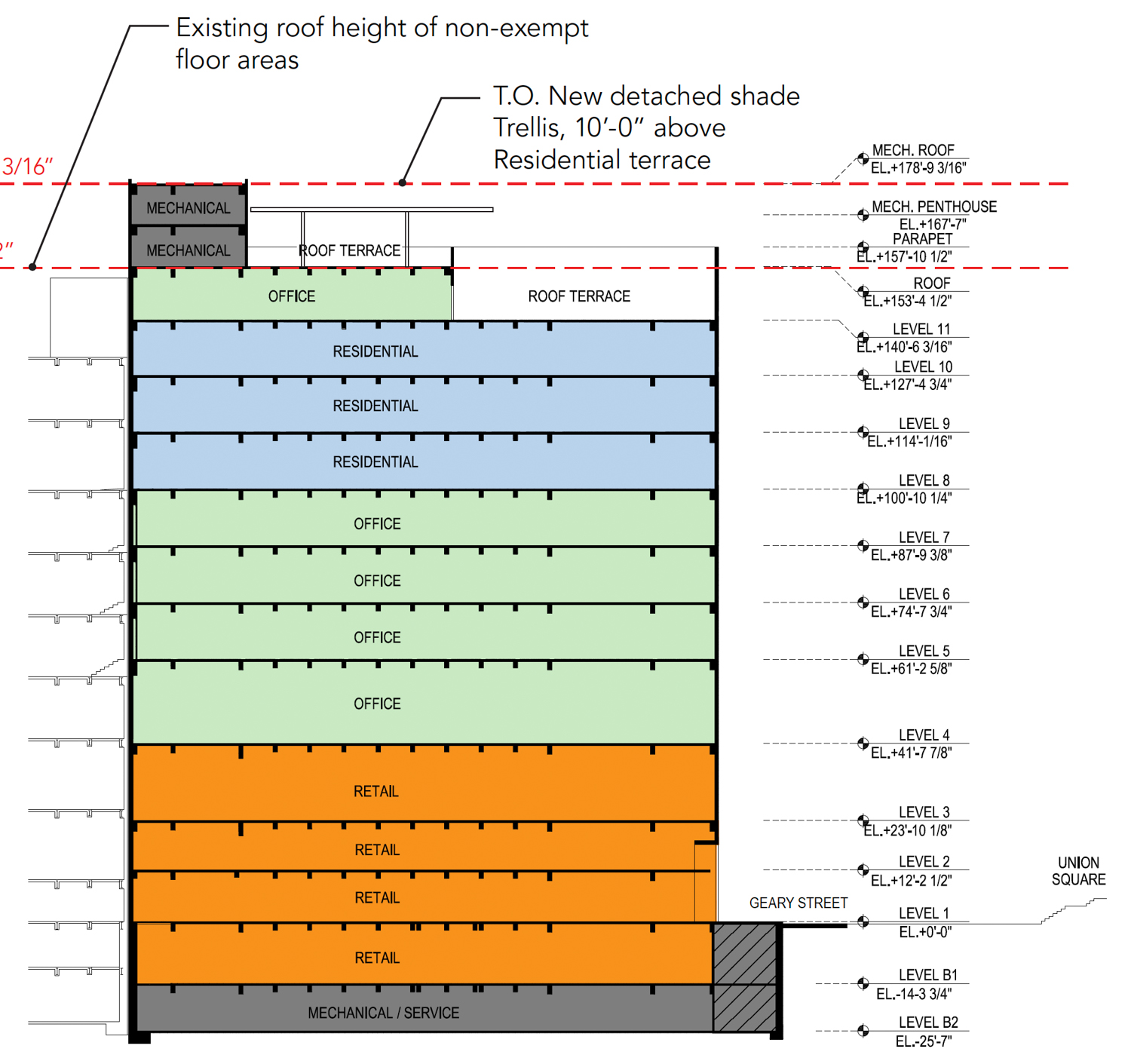
233 Geary Street floor use elevation, rendering by Handel Architects
Handel Architects is responsible for the architecture. Page & Turnbull is assisting Handel as the preservation consultant.
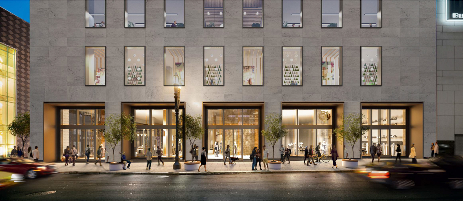
233 Geary Street pedestrian activity, rendering by Handel Architects
Since the updated design removes top-floor windows previously proposed, the largest facade alterations will be limited. The windows will be replaced by subtle bronze framing, and the resident-level windows will be openable. The existing Macys signage along the parapet will be removed, and the street-level entrance will be reimagined, setback into the building with bronze metal panels.
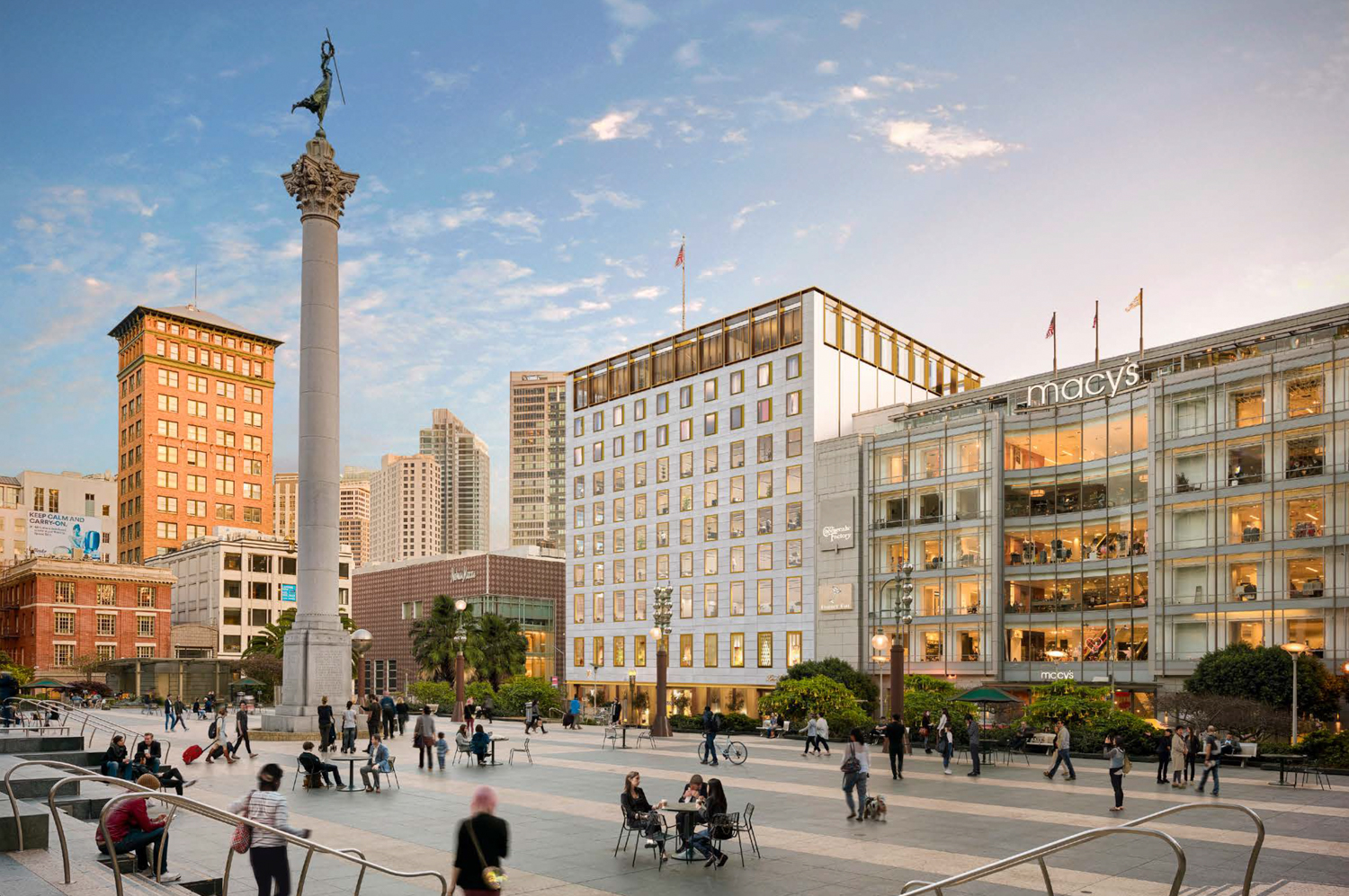
Prior design iteration for 233 Geary Street, rendering via Handel Architects
The property sold in 2019 for $250 million. The renovation is expected to last 18 months, with previous estimates for construction to begin by the end of the year.
Subscribe to YIMBY’s daily e-mail
Follow YIMBYgram for real-time photo updates
Like YIMBY on Facebook
Follow YIMBY’s Twitter for the latest in YIMBYnews


Do you lighted to see that they’re going to keep the marble cladding. It was a bad idea to remove it.
Please get rid of the pop-ups or at least put them somewhere where they’re not right in the middle of the article that you’re trying to read: thanks!
I liked seeing the original Butler building and also the difference between the prior design and the current one.