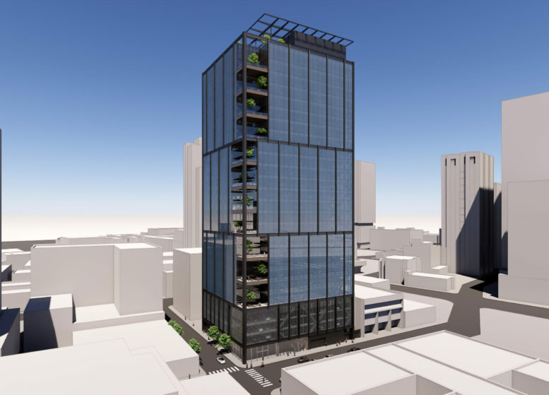
New renderings have been revealed for the 26-story office tower at 1919 Webster Street in Downtown Oakland. The new design by Gensler contrasts a dark blue curtain wall skin with black metal mullions, with corner terraces offering an open space for future employees with panoramic views south of the city and Lake Merritt. Ellis Partners is responsible for the development as the property owner.
The 407-foot tall tower will yield 628,060 square feet, with 516,960 square feet of offices, 3,460 square feet for ground-floor retail, and 107,730 square feet for parking. The 154-car garage will be on the basement floor and on levels two through four. Additional parking will be included for 54 bicycles.
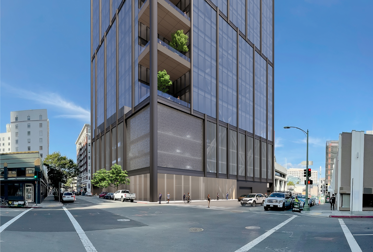
1919 Webster Street pedestrian view, rendering by Gensler
Gensler is responsible for the design. The exterior facade is articulated into three smaller forms, each with vertical mullions to distinguish each section visually. According to the project design review, “The materiality of the building, in general, is contemporary and high quality. The base of the building is architecturally distinct from the tower portion of the building above, which uses facade elements to reinforce its verticality.”
At the building’s southern corner, the mullions will give way to eleven furnished balconies with planters. On the building rooftop, a communal roof deck will feature dining space, seating, greenery, and an outdoor bar with furnishing to be provided by the owner. The landscape architecture will be done by Surface Design.
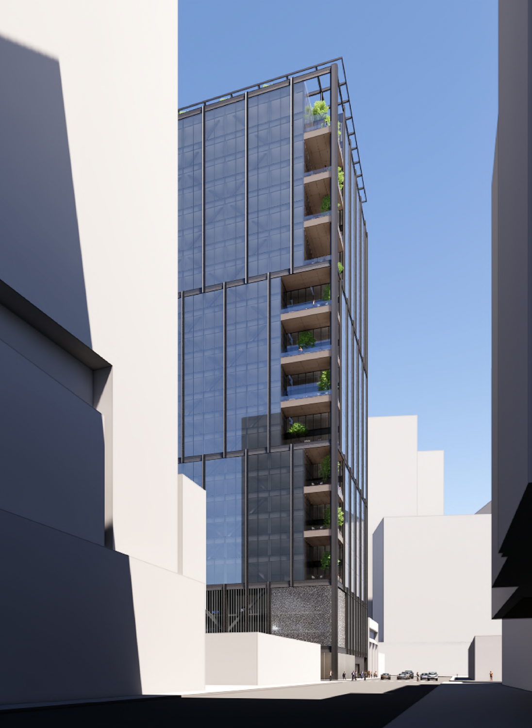
1919 Webster Street view from along Webster Street, rendering by Gensler
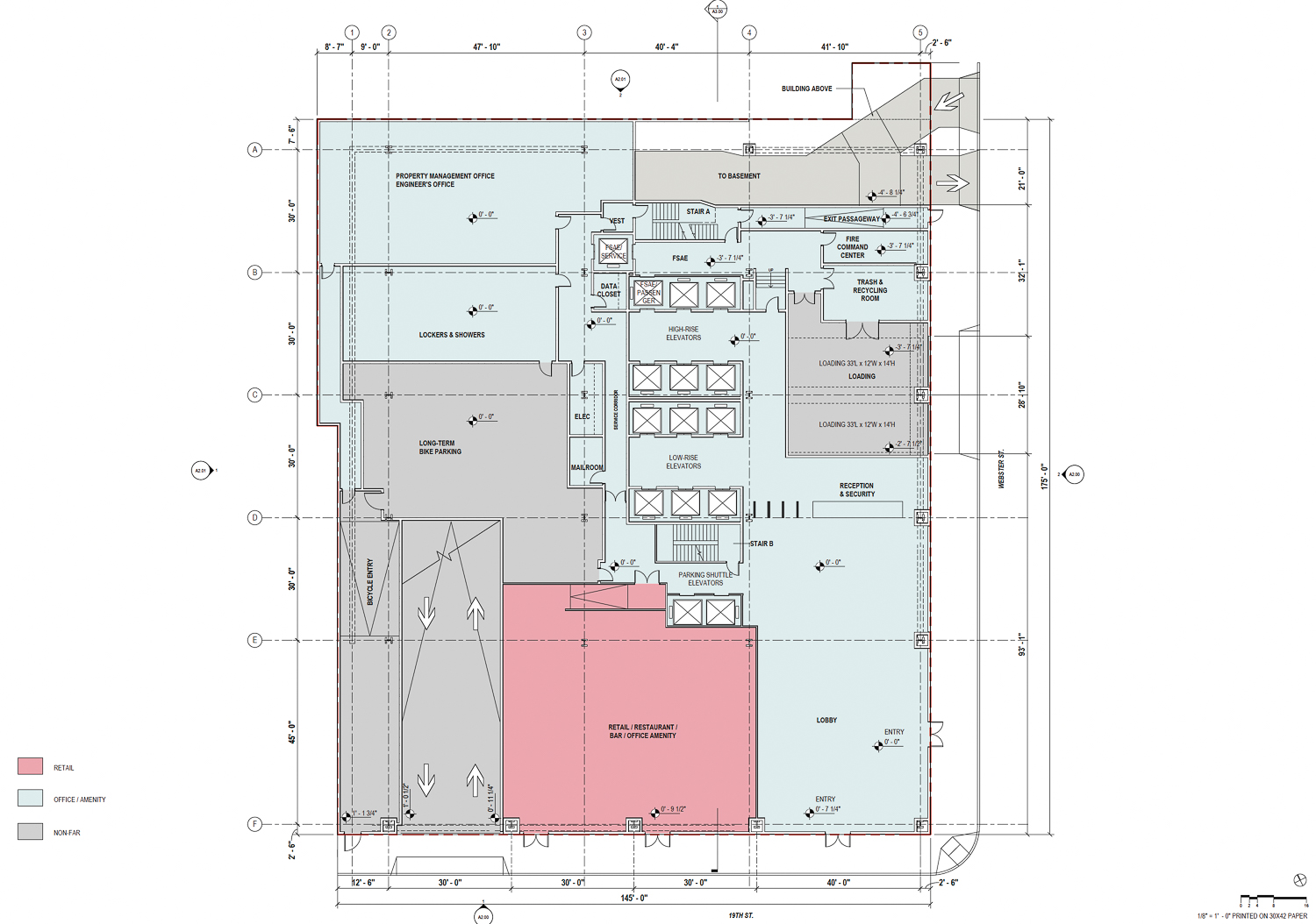
1919 Webster Street ground-level floor plan, illustration by Gensler
BKF is the civil engineer, Magnusson Klemencic Associates is the structural engineer, and Meyers+ is the mechanical, electrical, and plumbing engineer, i.e., the MEP.
Demolition will be required for the existing surface parking lot and a six-story building. Ellis Partners and the Boston-based International Real Estate Corporation purchased the lot in April 2021 for $23.5 million as a joint venture. The previous owner, PG&E, sold the lot as part of a move to downsize office space and move out of their San Francisco headquarters and into 300 Lakeside Drive later this year.
The former PG&E San Francisco Campus is now proposed to become Atlas Block, with Hines, the project developer, tapping Foster + Partners to design the project’s crown jewel, a supertall apartment building. Though the project has received some resistance from the planning department, it is proposed to be the second tallest building in the Bay Area and the fourth or fifth tallest residential tower in the country, depending on the future of 45 Broad Street in New York’s Financial District. The FiDi tower has been on hold for two years.
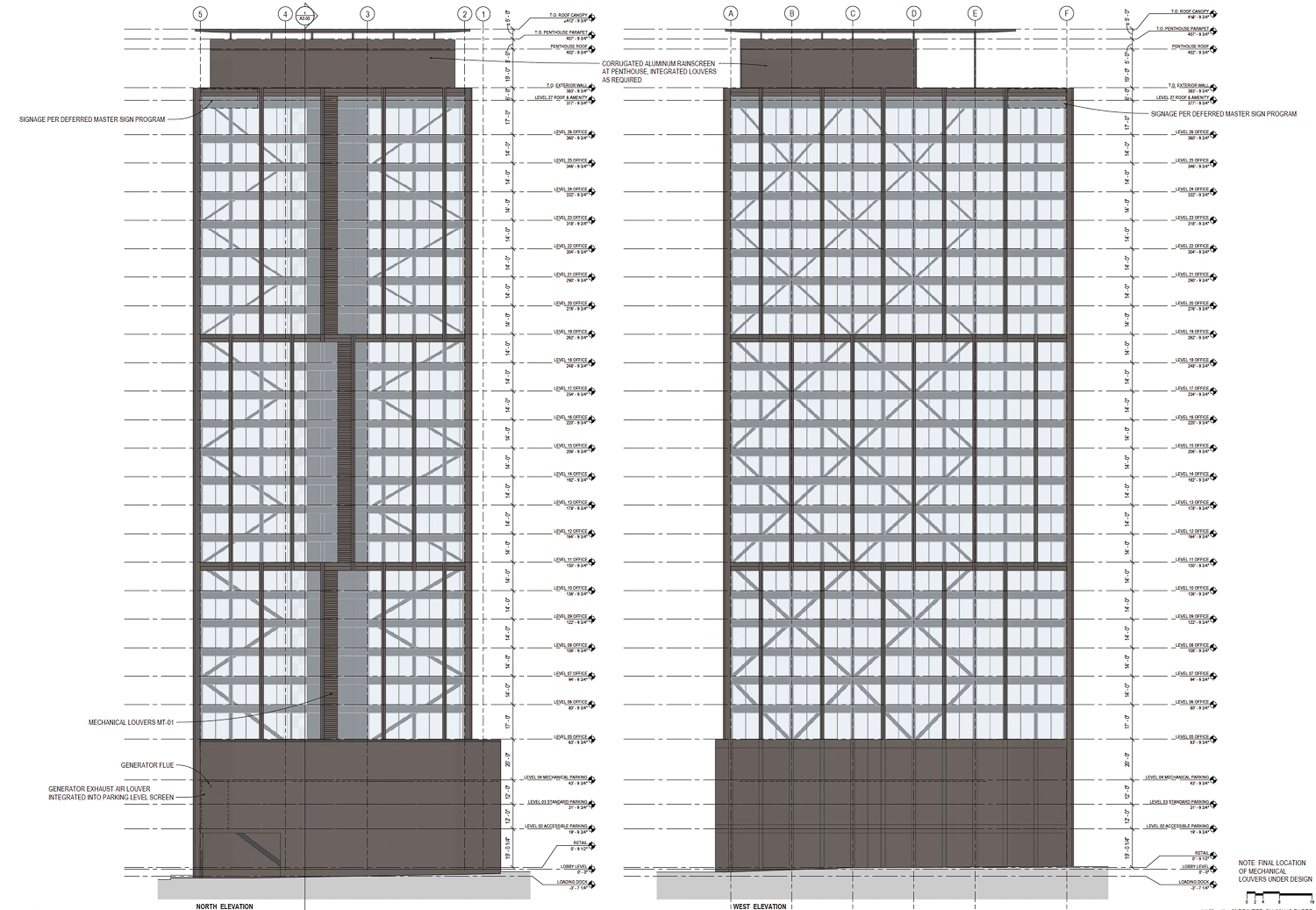
1919 Webster Street vertical facade elevation, image by Gensler
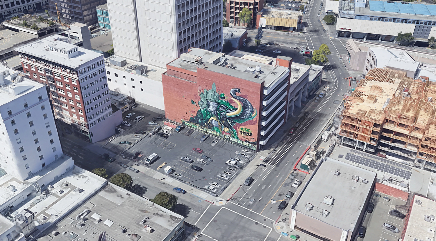
1919 Webster Street, image via Google Satellite
Future employees can find Lake Merritt two blocks to the east or the 19th Street BART Station two blocks west. Employees will also have nearby access to AC Transit bus stops and Bus Rapid Transit along Broadway.
The project’s development and environmental review permits remain under review, with a timeline for construction not yet revealed.
Subscribe to YIMBY’s daily e-mail
Follow YIMBYgram for real-time photo updates
Like YIMBY on Facebook
Follow YIMBY’s Twitter for the latest in YIMBYnews

A very visually interesting and aesthetically pleasing skyscraper design with a lot of green energy and design initiatives worked into the office tower. A very well done design that will be a beautiful addition to the downtown Oakland skyline. The permanent removal of a hideous surface parking lot is also a major win.
“Green energy and design initiatives” for a building with a god awful above ground parking podium encouraging driving. Vertically it may be somewhat interesting, but where the building meets the sidewalk is terrible. It’s nothing but blank walls, screens, and a garage door. There’s no active uses fronting the sidewalk. It’s dead space now and looks like it would remain a dead space from a streetscape perspective. The base really needs to be improved.
That building is way too dark for California, it would fit in better in New York or Chicago.
It’s gorgeous and would soon become a visual landmark.
Looks like Darth Vader’s headquarters.
Agreed—the base is blank. The existing parking lot and mural draws more active pedestrian activity than this building’s ground floor will.
I like the top but I agree with Aaron, that the bottom is fairly ugly and somehow doesn’t fit. I am not sure what they can do to make it more attractive. Maybe a huge corner lobby, With a coffee shop/lunch cafe. One of the benefits of working in downtown Oakland, in the past, was all the little cafes which were relatively inexpensive and within walking distance.
Is that a parking podium on the first few floors?!?! BOOO! HISSS!
To Whom the Parking Garage May Concern:
If you live or work in and around downtown Oakland, you’ve seen the small piles of shattered glass that appear down the length of a sidewalk, one after another after another and never realized what they were. Well, each pile used to be the rolled-up window of a locked car. Each pile cost the owner of that car an average of $500 to replace. Rather than increasing parking requirements in new commercial buildings, the City’s solution is to paint more curbs red and change parking signs to those that say, “Tow Away Zone” or “2-hour maximum” and these really new and beautifully painted parking signs up and down Broadway and into Jack London Square that say things like, “Smash and Grab Zone” or “Do Not Leave Valuables in Vehicle.”
Hey Libby, downtown Oakland is not Bishop Ranch! As each year goes by in fact, it looks more and more like the Tenderloin. Riding a bicycle every day from Dublin Bart to Bishop Ranch along the well lit, well maintained and scenic scenic Iron Horse Trail is a totally different propostion than to ride a bicycle from West Oakland Bart along 7th St and up Broadway to 19th and Webster. The Oakland bicycle lanes are hardly scenic, they are poorly lit and barely maintained—not to mention it is a visual nightmare morning, noon and night. Commuting in and out of downtown Oakland is SAFEST BY AUTOMOBILE.
And to Ellis and the other developers, the vast majority of your building occupants will drive their cars to and from work in your builidng. So leaving them no choice but to park on the City streets is a failure on your part. Focus your attention on the safety concerns and needs of those entering and exiting your building according to the present realities in downtown Oakland. Put the bike racks where they belong, outside the building. Downtown Oakland NEEDS MORE NOT LESS SECURED COVERED PARKING SPACES for those who live and/or work there!