Less than a month after YIMBY covered new renderings, the Oakland Design Review Committee is scheduled to review plans for 1919 Webster Street in Downtown Oakland. The meeting, scheduled for today at 3 PM, will review plans for two projects rising either 280 or 400 feet high. Ellis Partners is responsible for the application.
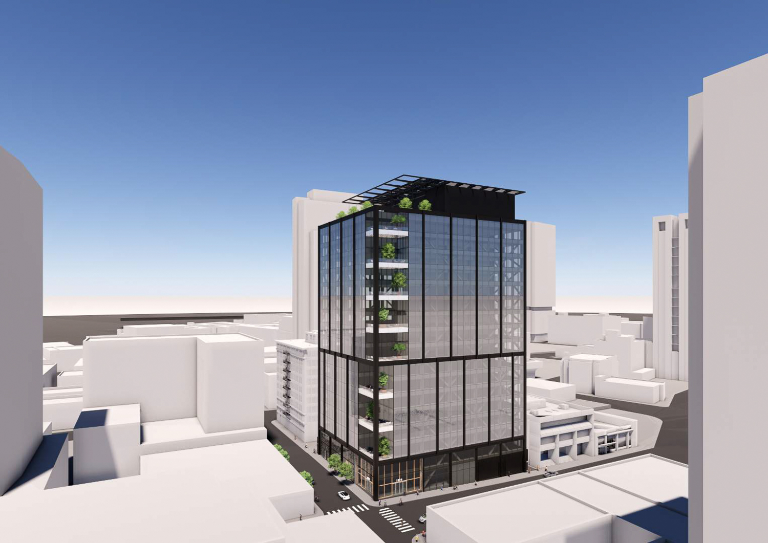
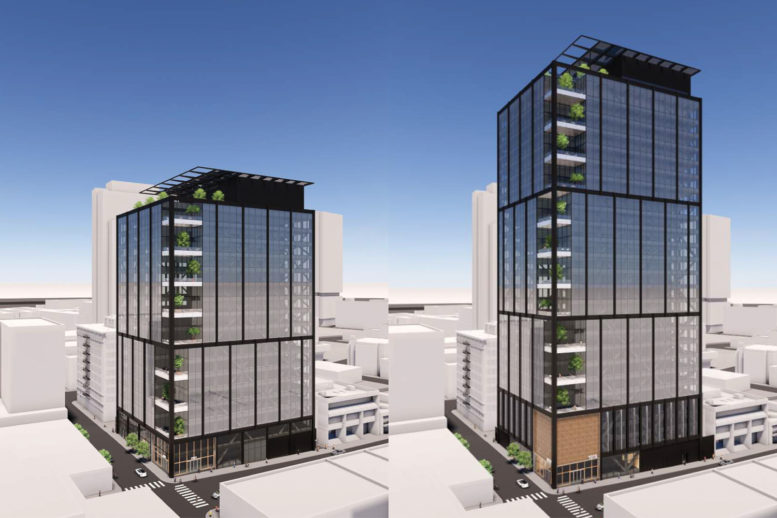
1919 Webster Street shorter proposal, rendering by Gensler
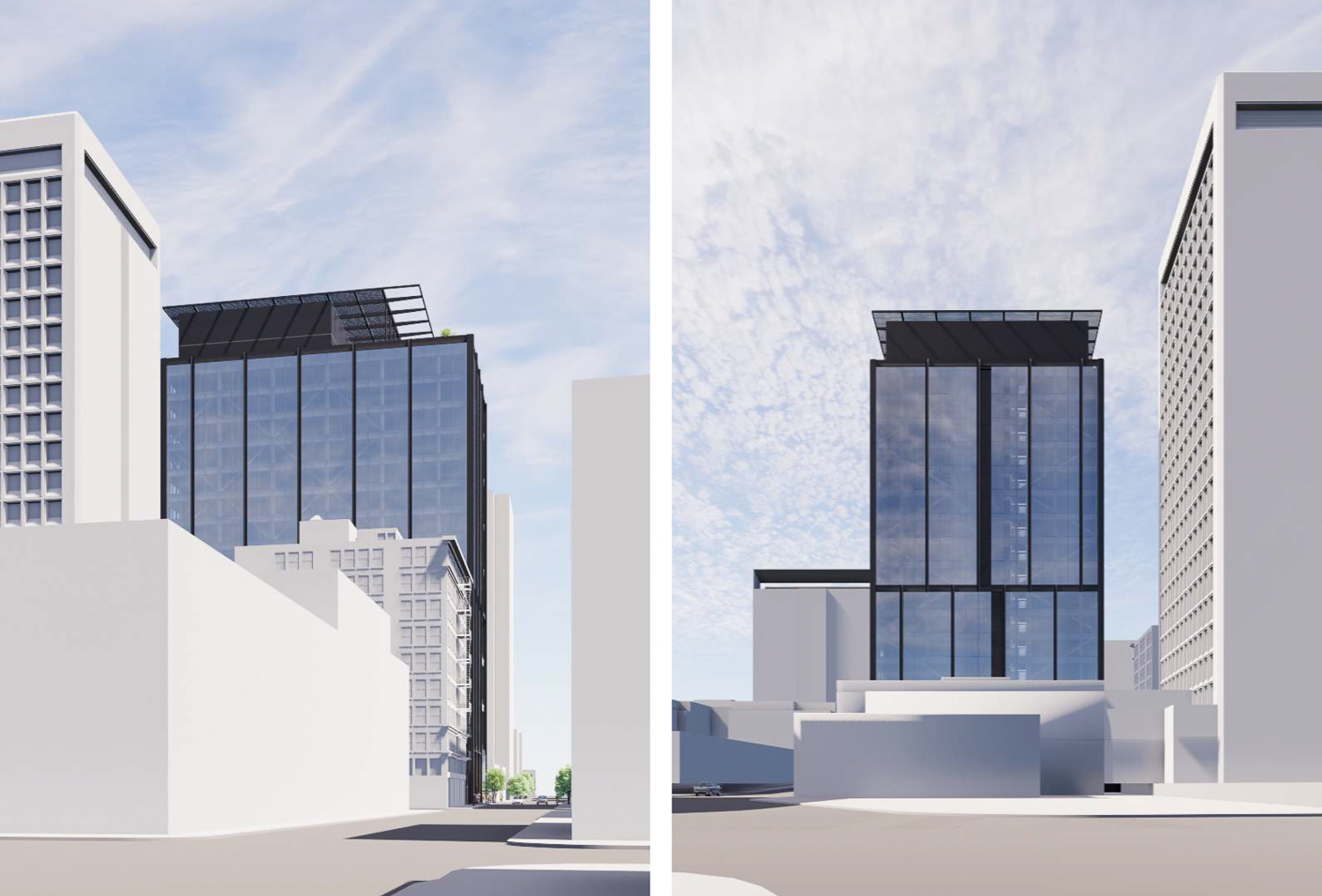
1919 Webster Street shorter proposal perspectives, rendering by Gensler
The 283-foot tall proposal will yield 422,930 square feet with around 393,470 square feet of office space and 3,375 square feet for ground-level retail. The property will feature terraces on every other floor, starting on the third floor and culminating with an 8,800 square foot rooftop deck. 24,985 sq ft lot. Parking will be included for 30 cars in one 15,200 square foot basement garage. Long-term space for 63 bicycles will also be provided.
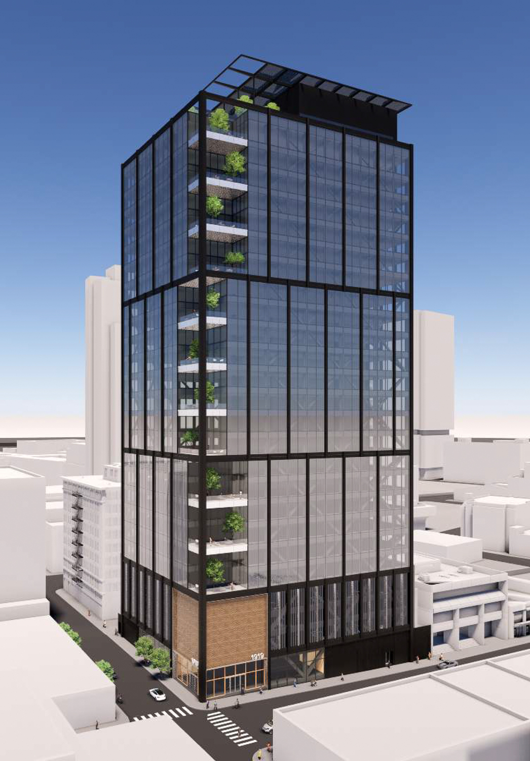
1919 Webster Street extending 400 feet tall, rendering by Gensler
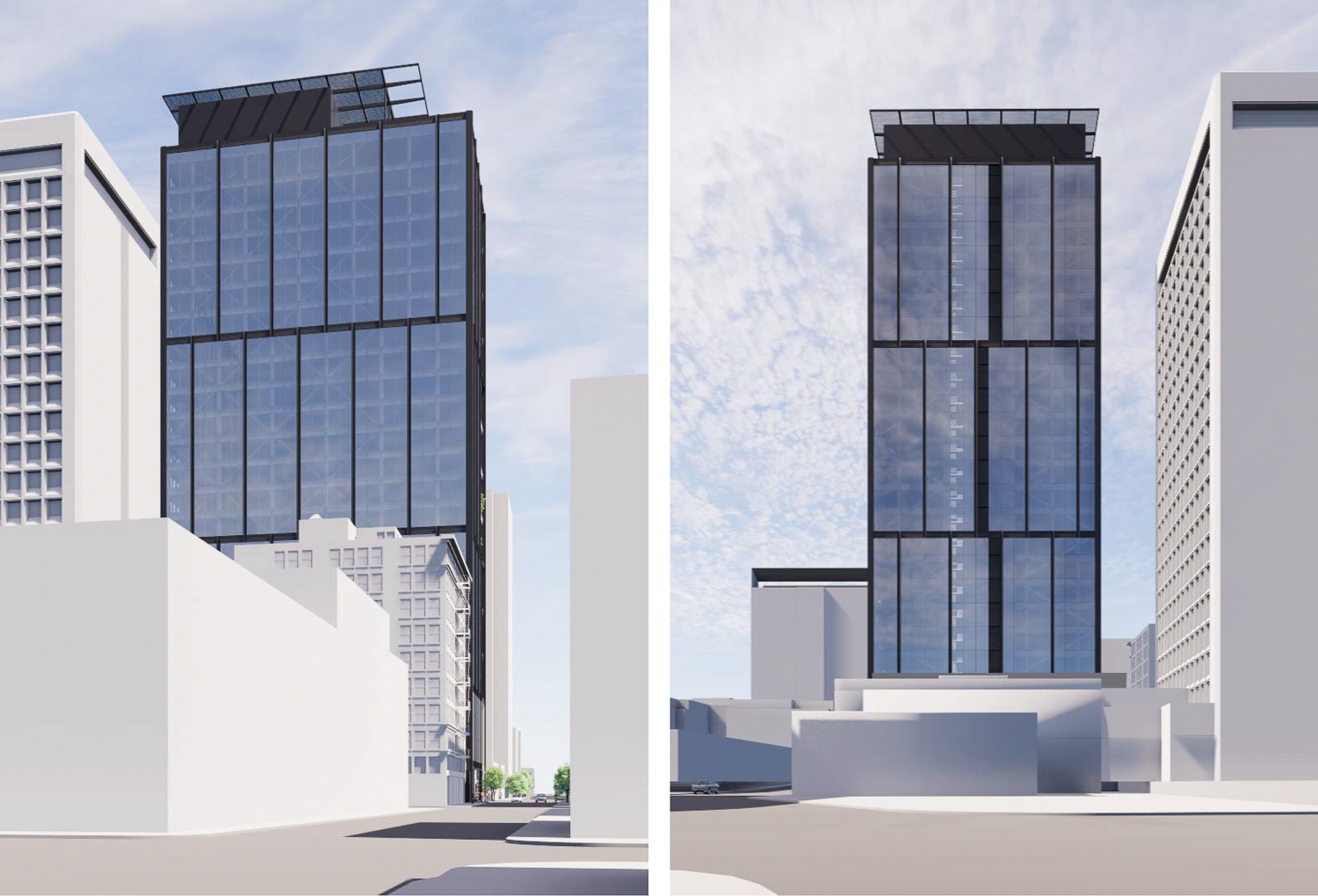
1919 Webster Street taller proposal perspective, rendering by Gensler
The 400-foot iteration for 1919 Webster yields 612,650 square feet with 518,330 square feet for offices, 2,000 square feet for ground-level retail, and 92,320 square feet for the 158-car garage spanning a basement up to level four. Open space will be featured in terraces starting on the fifth floor, with an 8,800 square foot rooftop terrace as a shared amenity. Long-term storage will be included for 82 bicycles.
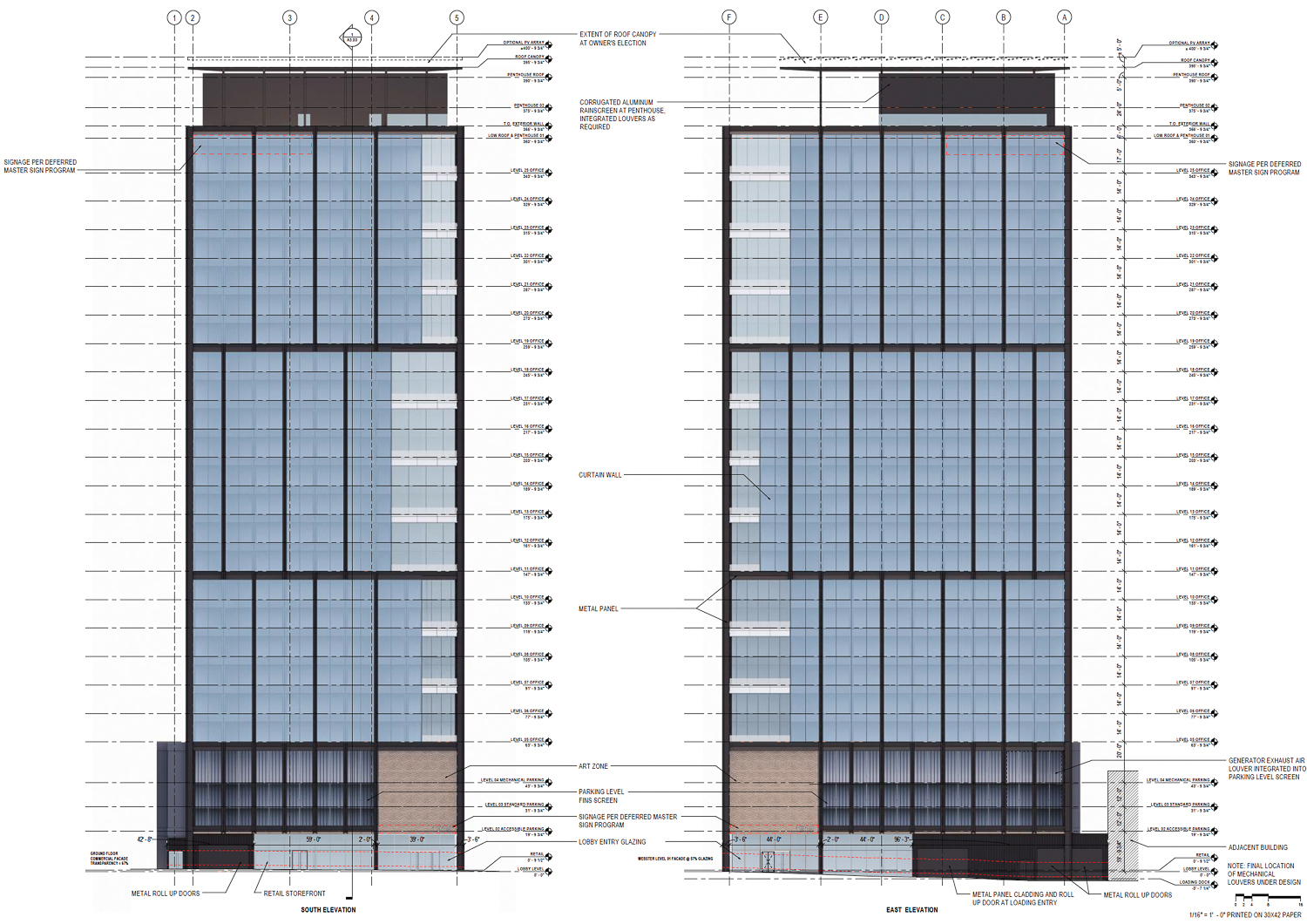
1919 Webster Street facade elevation from the taller proposal, rendering by Gensler
Both iterations feature roughly the same design by Gensler. The design takes inspiration from the city’s historic architecture, inspired by the variation of facade materials, play of shifting fenestration, and strong horizontal tops. This inspiration is melded with the city’s classic modern style with simple abstract forms and curtain-wall glass.
The final design incorporates the material variation in the base. The tower will have a shifting pattern design dividing the building into two or three massings, depending on which proposal iteration is built. The project rises at the northern corner of the Webster and 19th Street intersection, with the looming edge carved out to include deeply recessed green terraces.
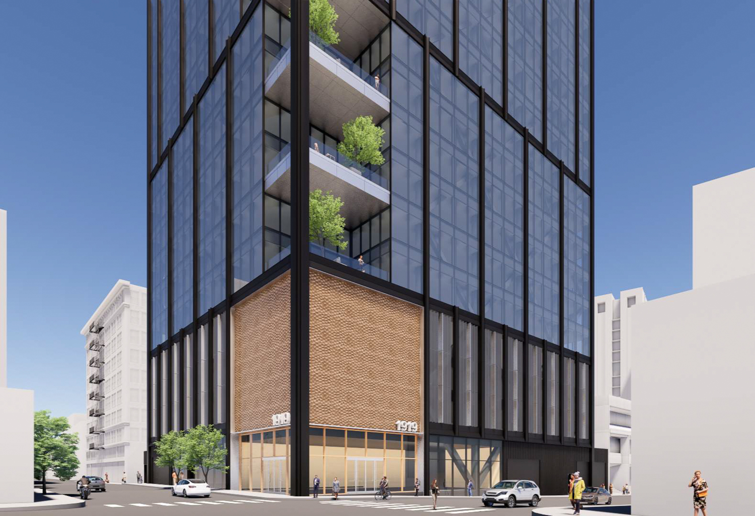
1919 Webster Street taller proposal base, rendering by Gensler
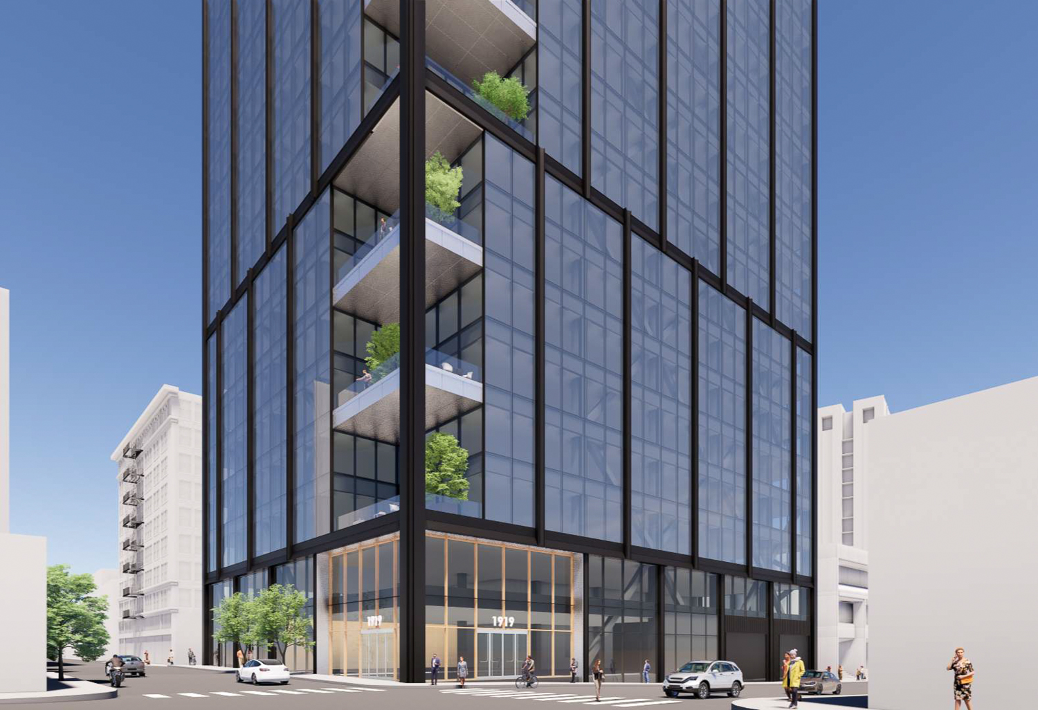
1919 Webster Street base from the shorter proposal, rendering by Gensler
At the base, the taller version will feature a three-story art space above the entrance. The above-grade garage will be covered with air louvers integrated into a protective screen. These components are not included in the shorter version, which reduces the garage capacity to be exclusively below ground.
One of the issues that city staff expect to be discussed in the Design Review meeting is the base details. As written in Design Review Conformance documents, “more detail on the base of the building is required for staff to discern if the proposal conforms with CBD design guidelines.”
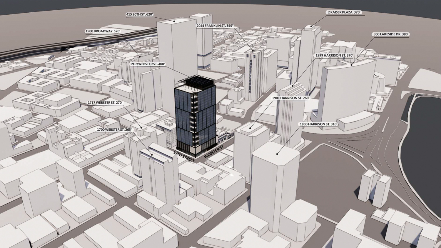
The taller 1919 Webster Street plan around additional existing and proposed projects, including 415 20th Street, in Downtown Oakland, rendering by Gensler
BKF is the civil engineer, Magnusson Klemencic Associates is the structural engineer, and Meyers+ is the mechanical, electrical, and plumbing engineer, i.e., the MEP. Surface Design is the project’s landscape architect.
PG&E sold the lot, a six-story office building and surface parking, in April of 2021 for $23.5 million as the troubled energy company downsizes office space and moves out of the headquarters from 200 Mission Street and 77 Beale in San Francisco. PG&E will move into 300 Lakeside Drive this year, while Hines pushes forwards plans to build the city’s second tallest tower at 50 Main Street.
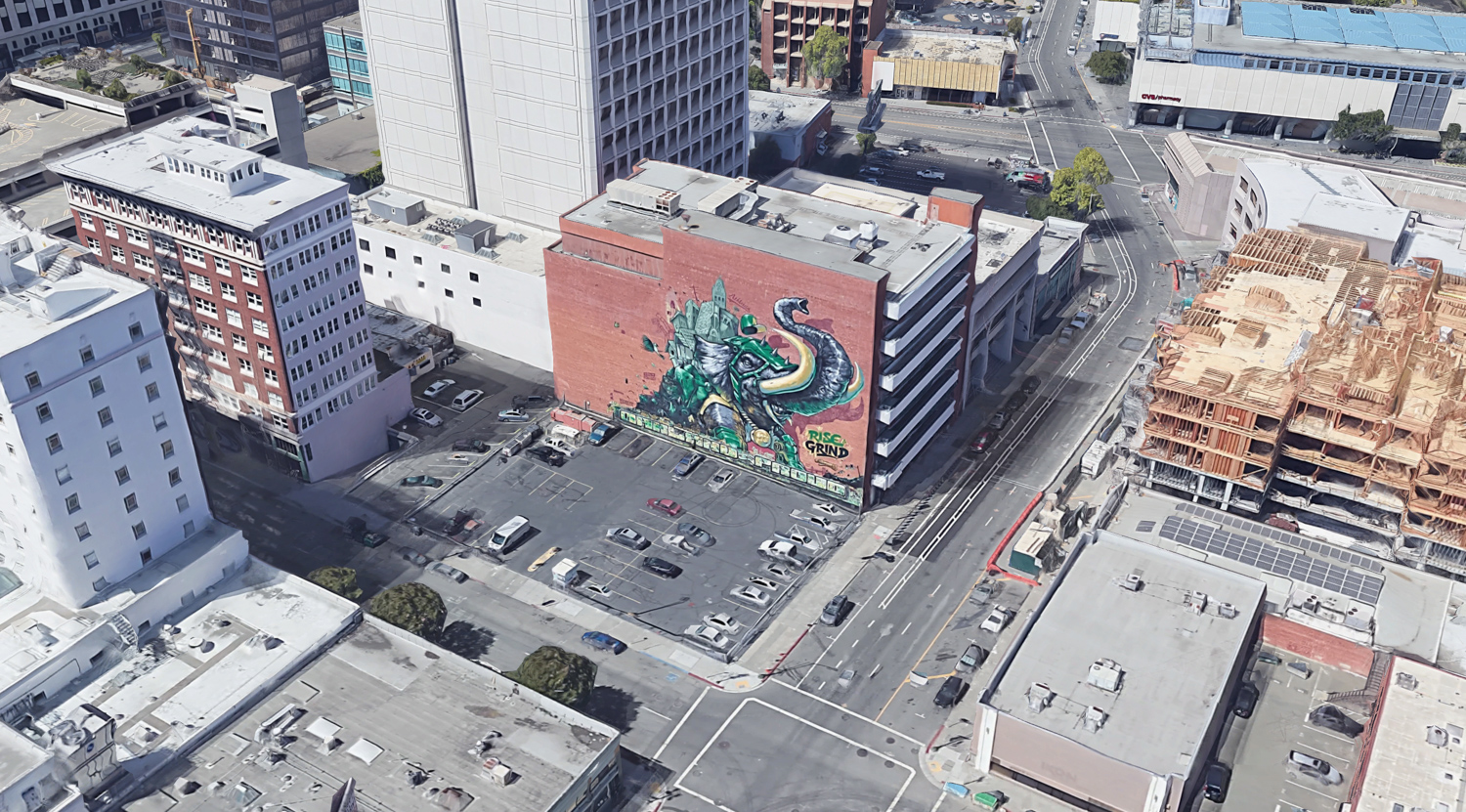
1919 Webster Street, image via Google Satellite
Today’s meeting is for the city to receive public testimony and comments on the design by Gensler and Ellis Partners. It is scheduled to start today, May 25th, at 3 PM. For more information about how to attend and participate, see the city website here.
Subscribe to YIMBY’s daily e-mail
Follow YIMBYgram for real-time photo updates
Like YIMBY on Facebook
Follow YIMBY’s Twitter for the latest in YIMBYnews

400 ft. Much more aesthetically pleasing and better for the future.
The design of the 400′ tower is much more balanced; however, they should include more retail and/or community space on the ground floor as 2,000 SF is pretty minimal in that urban setting.
Architecturally, both solutions are mundane and uninspiring. This is average Gensler architecture at best, especially when compared to the Hines proposal on 20th St. The shorter option is ill-proportioned with the larger floor plates. Even the taller solution looks squat due to the larger floor plates. Neither solution does much to enliven the streetscape with over half of the ground floor being office lobby or mechanical. The upper floor parking levels don’t add much above the street level. Why can’t developers dig a hole and bury the parking instead of creating blank garage facades? It makes what should be a vibrant urban environment very empty and dull.
Totally agree with JohnReading.
The existing mural (see last photo of google street view) is way more artistic and interesting than Gensler’s design.
THIS IS A MONOLITHIC BOXY NIGHTMARE OF A BUILDING ITS BULKY AND WOULD BLOCK OUT THE SUN. IT HAS HAPHAZZARD TERRACES AT ONE CORNER OF THE BUILDING. IT HAS NO SETBACKS, CURVES OR ANY OTHER ARCHETECTURAL ENHANCEMENTS TO SMOTHER ITS BULKY APPEARANCE. IT LOOKS LIKE A GIGANTIC 1960s JAPANESE HOUSE. I HOPE IT DOES NOT HAVE STRAW FLOORS.