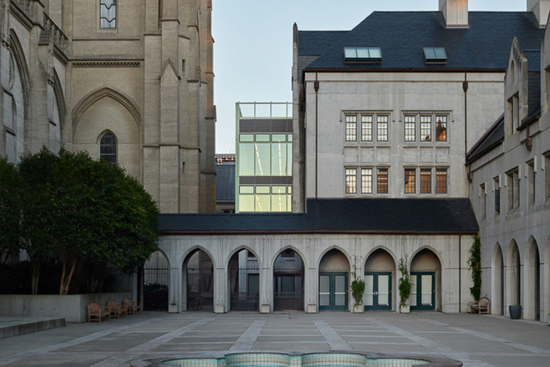
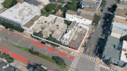
Crews have finished work on the new addition and renovations of the 58-year-old Cathedral School at 1275 Sacramento Street in Nob Hill, San Francisco. A two-story academic space designed by the Office of Charles F. Bloszeis is the first piece of modernist architecture for the historic urban campus. Truebeck Construction was the project’s general contractor.
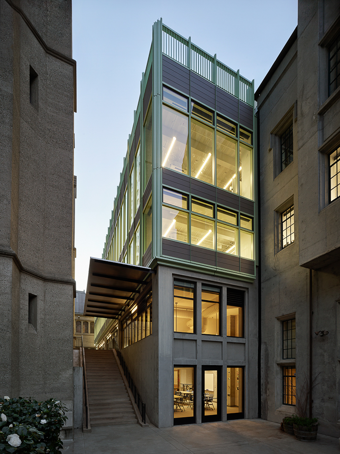
Cathedral School new building, photograph by Matthew Millman courtesy Bloszies Offices
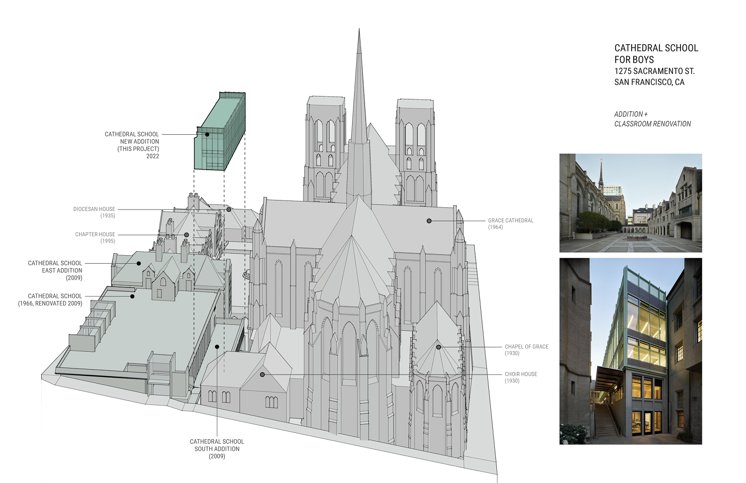
Cathedral School diagram, image courtesy Charles F. Bloszies Offices
The following description comes from the project’s press release announcement.
The 12,000-square-foot addition and renovation, designed by the architecture and structural design firm, adds a new modern element and creates valuable new spaces indoors and outdoors while reorganizing much of the school’s interior program. Key capital improvements include adding a 4,000-square-foot, two-story addition while reworking 8,000 square feet of academic spaces for the Cathedral School’s Lower School and Upper School.
With an especially challenging and intricate setting, the project required the existing school building to remain occupied and operational while work proceeded in a narrow footprint adjacent to the medieval Gothic-style cathedral, demanding precise and creative logistical planning as well as review by the San Francisco historic preservation community. The Office of Charles F. Bloszies FAIA collaborated with Truebeck Construction and school leadership, including the school’s Building and Grounds Committee led by Melisa Seward Block, chief finance and operations officer.
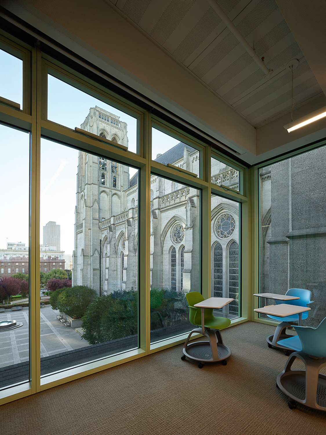
Cathedral School interior looking towards Grace Cathedral, photograph by Matthew Millman courtesy Bloszies Offices
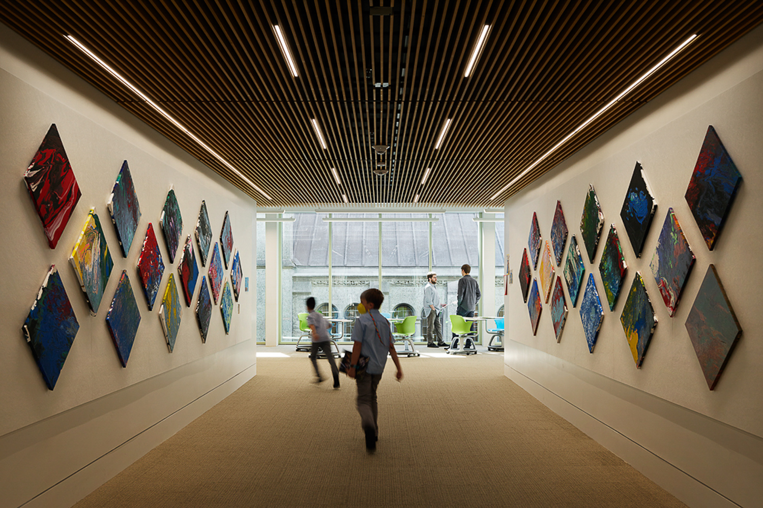
Cathedral School interior hall, photograph by Matthew Millman courtesy Bloszies Offices
Given the block was already jam-packed with buildings, Bloszies and his design team worked from a master plan which had identified a sliver of space between the cathedral and the school, where an outdoor terrace structure with classrooms below had been added in 2009. The site also afforded a structurally robust platform, the terrace itself, on which to erect an addition without requiring new foundation work or extensive seismic strengthening of the original building.
While the new addition site flanked the existing school’s footprint, its design elevated it as a new focal point by renovating existing classrooms on two levels and adding a wide hall connecting the main entrance lobby and the new addition. The resulting view into the addition from the entrance lobby, with a glimpse beyond to the cathedral wall and its stained-glass windows, essentially creates a new heart for the school.
Subscribe to YIMBY’s daily e-mail
![]()
Follow YIMBYgram for real-time photo updates
Like YIMBY on Facebook
Follow YIMBY’s Twitter for the latest in YIMBYnews

It is nice, but the upper floors don’t look like they belong there. They did okay on the bottom 2 floors. Maybe if they arched the top of the windows or something or peaked the top floor. It is too blatantly different and square in my opinion.
Gage, agree it is starkly rectilinear given its context. Even if the top railing was inset slightly, it would imply some tapering at the top of the volume, similar the adjacent buildings without compromising the clear geometry or it’s verticality. It’s a tiny detail, and overall I believe this new building is a very handsome addition to the collection of buildings at the site. I’m delighted by the green color, a nice reference to the age/architecture of the adjacent buildings.
Very elegant pairing of stark modern with tradition. Blatantly compatible.
Well said.