New plans have been filed for two 39-story towers at 655 4th Street in SoMa, San Francisco. The plans, drafted by architecture firm SCB, represent a significant shift from the previously-approved design by Bjarke Ingels Group for four swooping towers. Tishman Speyer is the project developer.
The two 400-foot tall towers will yield a combined 1.144 million square feet, with 1.135 million square feet for housing, 9,450 square feet for retail, and 7,740 square feet for a Privately Owned Public Open Space or POPOS. Parking will be included for 283 cars and 427 bicycles.
The new application has removed the hotel and co-working components from 655 4th Street, shifted the POPOS from an interior courtyard to a visible corner location and focused the retail space on the public realm. Writing to YIMBY, a spokesperson for Tishman Speyer said, “these changes will create a more viable project. Tishman Speyer is committed to moving the project forward at the point and time that make sense.”
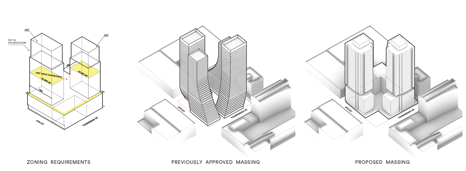
655 4th Street zoning requirements (left), previous design (center) and most recent proposal (right), illustration by Solomon Cordwell Buenz
The new proposal will provide more dwellings, with 1,148 apartments. Unit sizes will vary with 287 studios, 415 one-bedrooms, 409 two-bedrooms, and 46 three-bedrooms. A total of 138 private balconies will be spread across the two towers.
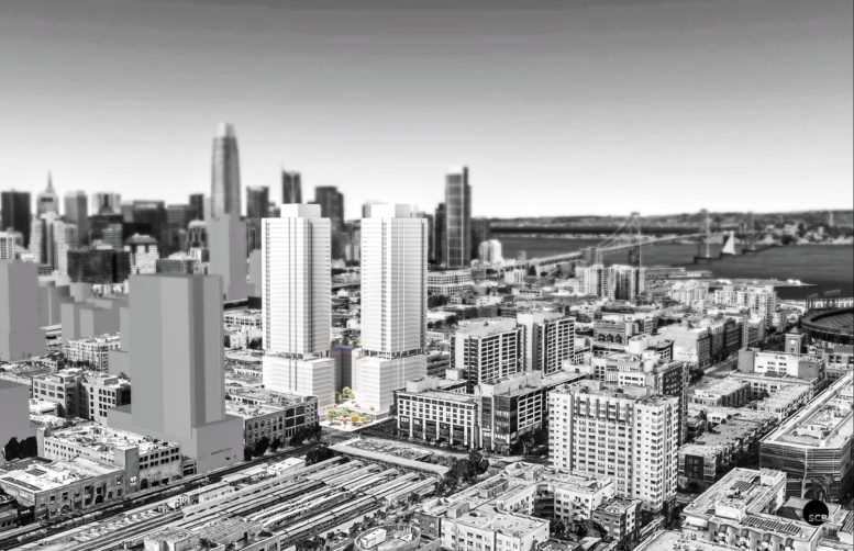
Solomon Cordwell Buenz is responsible for the design. Renderings show the basic massing for two towers rising from 11-story podiums, divided by an open-air balcony. The project will include new trees along 4th Street and Townsend and an open-air landscaped plaza at the very corner, functioning as the project’s POPOS. Retail shops will encircle the plaza.
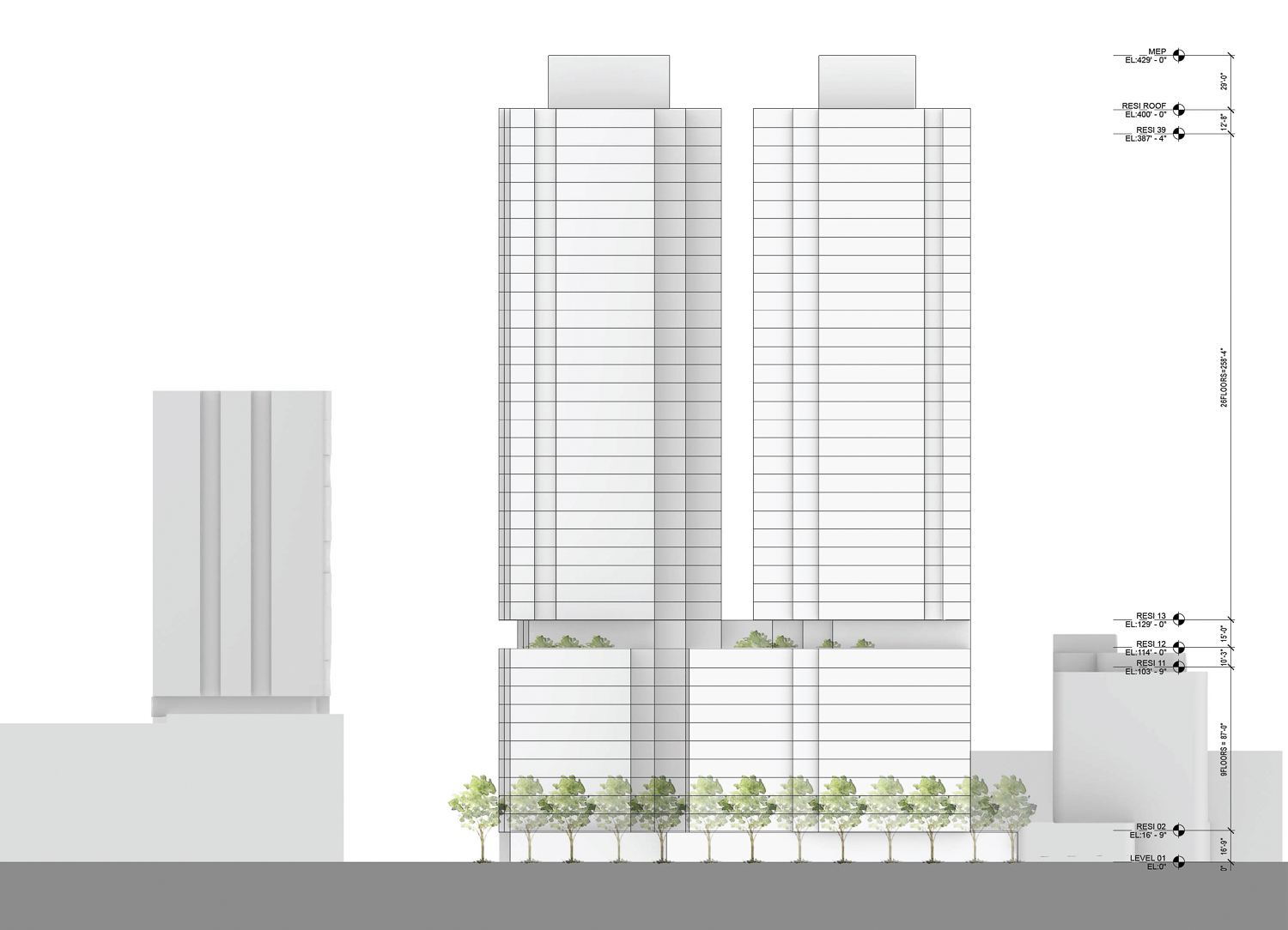
655 4th Street east facade elevation, illustration by Solomon Cordwell Buenz
It is clear that the high-profile block will not look anything like the curved project by BIG. Beyond that, the design for 655 4th Street remains preliminary, and it is unclear if SCB will be the final design architect or if Tishman Speyer will hire a design architect for the exterior, as Strada had for 395 3rd Street. Preliminary massings by SCB for 395 3rd were followed up eight months later with a Redwood-inspired design by Henning Larsen Architects.
The new plans have come paired with a Preliminary Project Application review by the planning department. The document highlights three points for the development team to revise; cohesion with the Central SoMa Plan, POPOS pedestrian access, and coordination with the planned Downtown Extension rail project, which aims to connect the Caltrain station with the Transbay center.
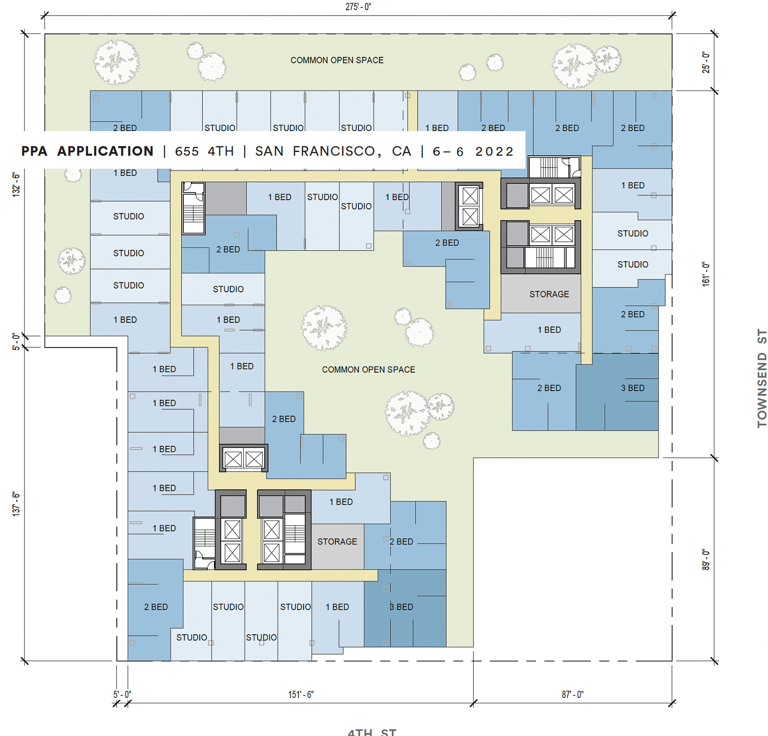
655 4th Street residential floor plan, illustration by Solomon Cordwell Buenz
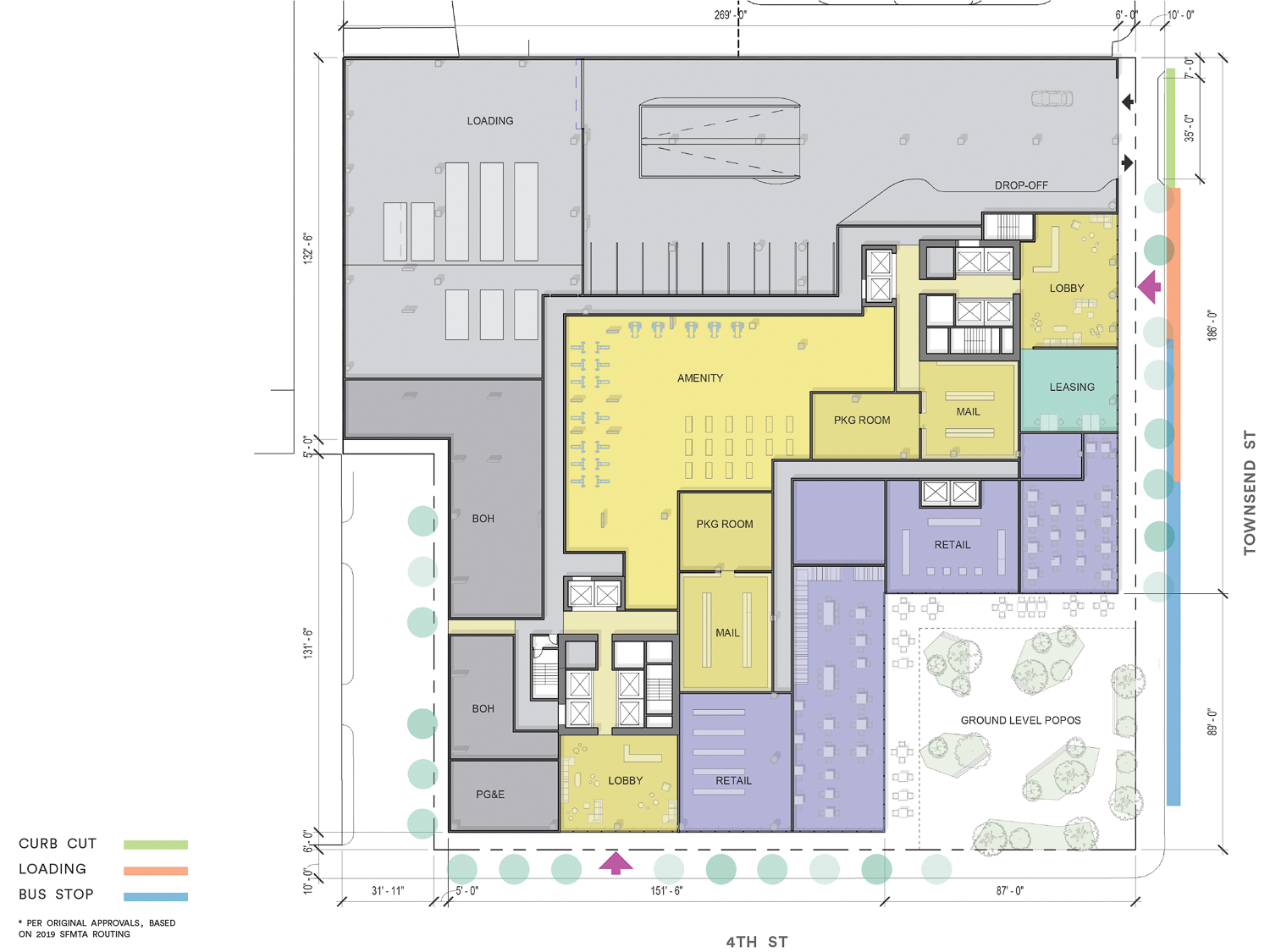
655 4th Street ground-level floor plan, illustration by Solomon Cordwell Buenz
The architecture firm will have to contend with the Central SoMa Plan. Among the design requirements, the preliminary project application document dictates that “the Project architecture should substantially differentiate the expression of the two towers, including but not limits to height, bulk, modulation, and architectural expression… They should each add a distinct character to the skyline.”
The current application is preliminary, offering the most basic visual illustrations of the potential massing. The above extract from the Central SoMa Plan provides just one insight into how the project may change throughout the approval process.
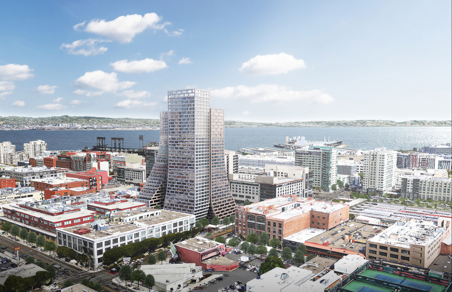
655 4th Street, rendering by Bjarke Ingels Group
Adamson Associates and BIG designed the previous iteration, first filed in 2015 and called The Creamery. The 425-foot project would include two structures, each with a half-block podium and two towers. There will be 960 homes, a 38-room hotel, 24,500 square feet for retail, and parking for 276 cars.
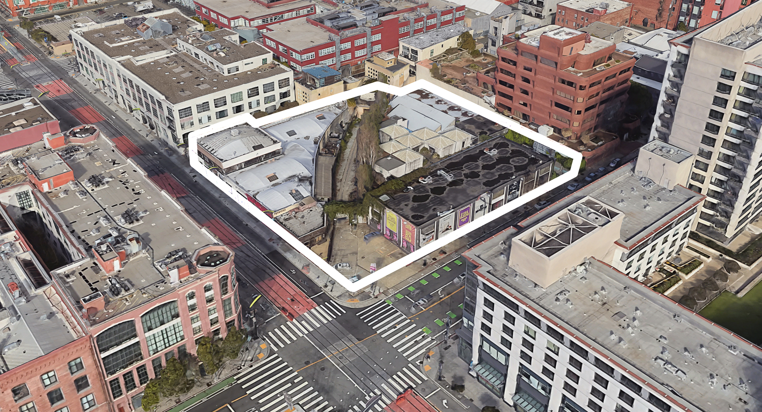
655 4th Street, image via Google Satellite, project site approximately outlined by YIMBY
655 4th Street is a 1.64-acre plot of land at the corner of 4th and Townsend Street, directly across from the city’s Caltrain Station. Demolition will be required for three existing buildings and surface parking. An estimated timeline for construction and completion has not yet been established.
Subscribe to YIMBY’s daily e-mail
Follow YIMBYgram for real-time photo updates
Like YIMBY on Facebook
Follow YIMBY’s Twitter for the latest in YIMBYnews

Snore. Hello 1972.
The original design was great. The new one is terrible. Good job, idiots!
Couldn’t agree more. WTF!
This new proposal is so ugly. It’s a shame, the city planners have an opportunity to make this neighborhood beautiful and attractive to live in. It’s a real shame and sad…
The original version was incredible, but at this point I will take anything. That area around Caltrain is painfully underdeveloped.
If less-than-stellar design is the trade-off for more housing in the project then I will still call it a win. Just please, San Francisco, approve this project.
I’m with TB and Pean Dreston – just build something. It’s been in process so long and the area desperately needs more residents and more life. I live two blocks away in a very similar building (two towers over an 8-story podium built around a C-shaped common area) and can say it’s a very functional design for a building. The color/finish of the outside doesn’t matter to me.
Personally I thought the “swooping” curved towers looked stupid – there’s no functional advantage for a residential building to have curving/sloped walls.
Ewww.. This are not at all anything like the approved design. They look like buildings fro the 1950’s era, just look at Russian Hill and Pac Heights. Let’s hope this fails as it does not contribute to building a neighborhood in this area that desperately needs an architecture marvel. This is San Francisco, we can definitely do better.
I thought Architects were supposed to be artists too, what happened to the design aesthetic on this project? BORING! Surely inspired design and more housing can go hand n hand, back to the drawing board please.
This looks like a public housing project that would have been built in 1960s Chicago. Please don’t.😡
Too bad BIG’s proposal won’t be built. Question – Why was the term, “Skyscraper” used in the title of the article when these aren’t tall enough to be considered such?
Clearly no one reads the content above. What you’re seeing is basically a wireframe, low poly placeholder. Sad to see the BIG design get swept aside, but I’m also not mad at a new rev on this parcel.
I liked the BIG design much better. It was unique whereas the new design is sort of boring, although the plans are not all that detailed. They seem to be building a lot of studios in some of these projects. To me, a studio is a temporary place to live or a hotel room sort of if you’re there only a couple of days a week.
Chip Maker: there is no single agreed upon definition of what constitutes a “skyscraper”. According to some of them, these are definitely skyscrapers, and I guarantee you that your average person that doesn’t pay attention to urban development/architecture stuff, would find it very reasonable to call a 39 story tower a “skyscraper”. Don’t worry about it.
Why build something distinctive and interesting when build something.Yet another thudding disappointment.😞
JEEBUS; did y’all even read the article -? This is a MASSING STUDY; zero design intent. If you’re so enthralled by the One-Trick Pony Ingalls then by all means go visit the same design he’s proposing in half a dozen cities
San Francisco’s conservative attitude towards tower design again is thwarted back to tall square box silos….the BIG original design was unique and stood out.
The earlier design looks much more interesting, adding distinctiveness to the area.
How can any readers really care about the tower DESIGN during a MASSING STUDY in an area where so so many are displaced? That’s actually disappointing that some hope it gets turned down just because it isn’t visually exciting. Get a grip! SF needs 10s of thousands of units and it needed them decades ago. Imagine a future SF market cooled by remote relocation AND adequate supply home and renting stock – you personally would probably be paying less (for a nicer apartment!) and thousands would not be dislocated via economic violence. Build baby build.