The San Francisco Symphony has started the entitlement process for renovations of the Louise M. Davies Symphony Hall at 201 Van Ness Avenue in San Francisco’s Civic Center. While plans are preliminary, the Symphony has hired local Mark Cavagnero Associates and the world-renowned Gehry Partners to produce a dramatic reimagination inside and out. Construction is expected to cost at least $100 million.
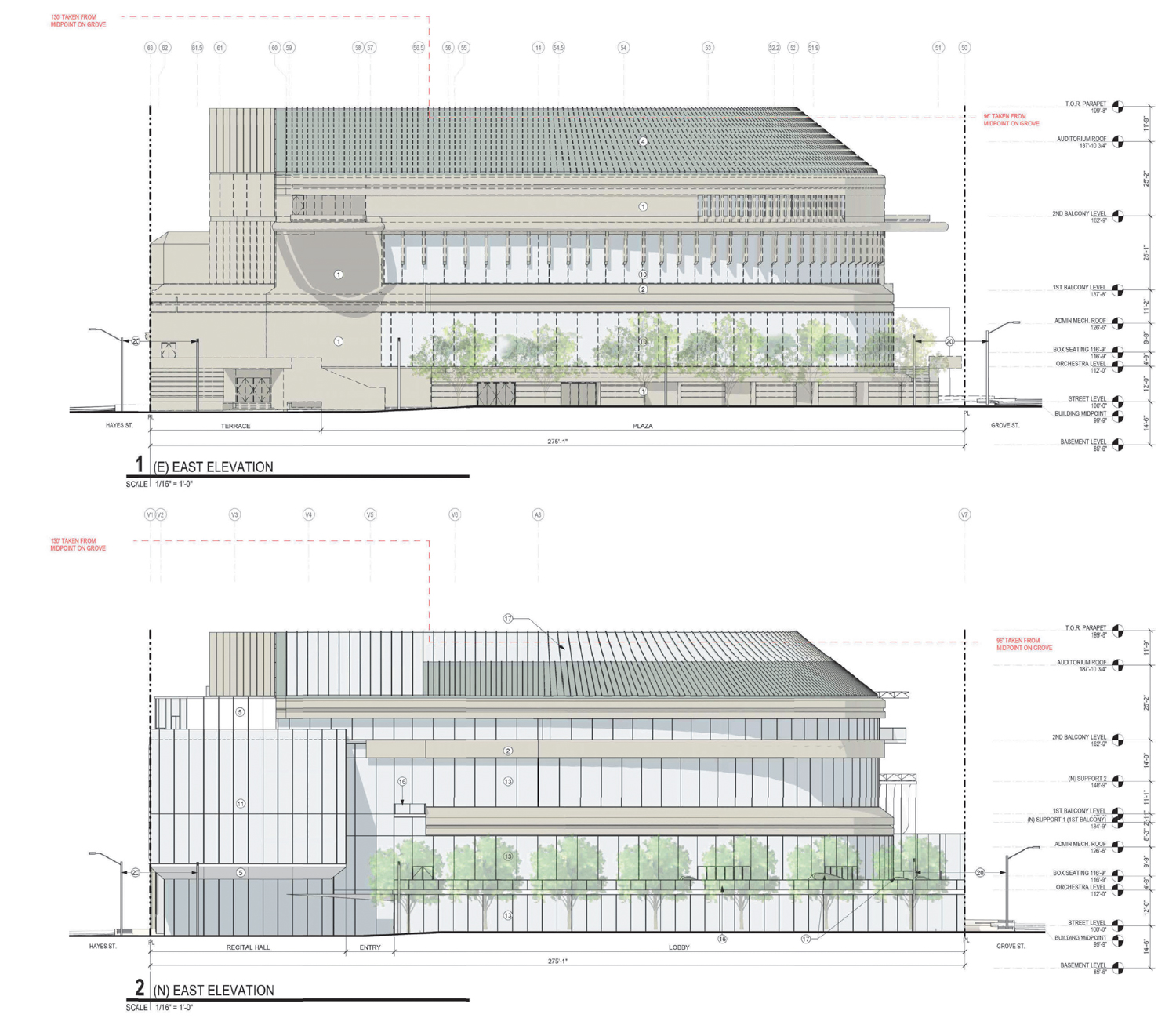
San Francisco Symphony Hall existing (top) and proposed changes (bottom) along the east elevation, illustration by Mark Cavagnero Associates
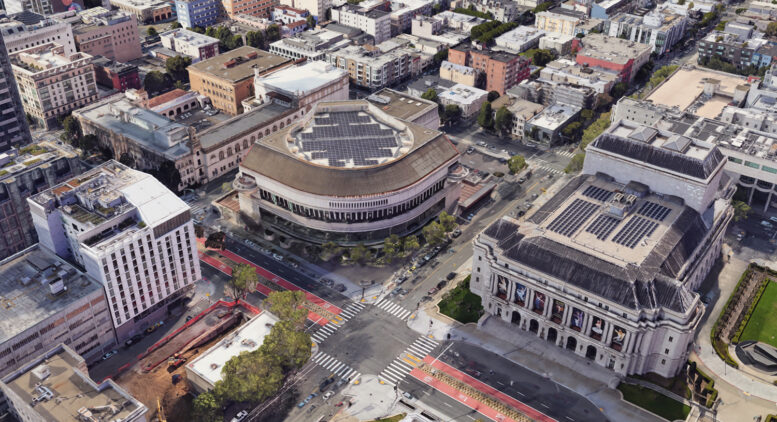
The existing symphony hall was built in 1980 with a post-modern design by SOM and Pietro Belluschi. The project shows inspiration, reflecting the neighboring neo-classical icons, City Hall, and the Opera House, with sloped copper roofing and formal exterior organization. Futuristic details include two balconies extending out of the third floor. In a public statement, the Symphony writes that it is “exploring ways to enhance the physical space to make the building more publicly accessible, transparent, and operationally efficient.”
Mark Cavagnero Associates is responsible for designing the project lobby, exterior envelope, and new recital hall. Gehry Partners will oversee the design of the concert hall interior, utilizing the firm’s longstanding experience designing many concert hall interiors, the most famous being the Walt Disney Concert Hall in Los Angeles. Preliminary elevation plans show much of the original pre-cast facade, and a portion of the copper roofing will be replaced with curtain-wall glass skin and patterned shading ornamentation.
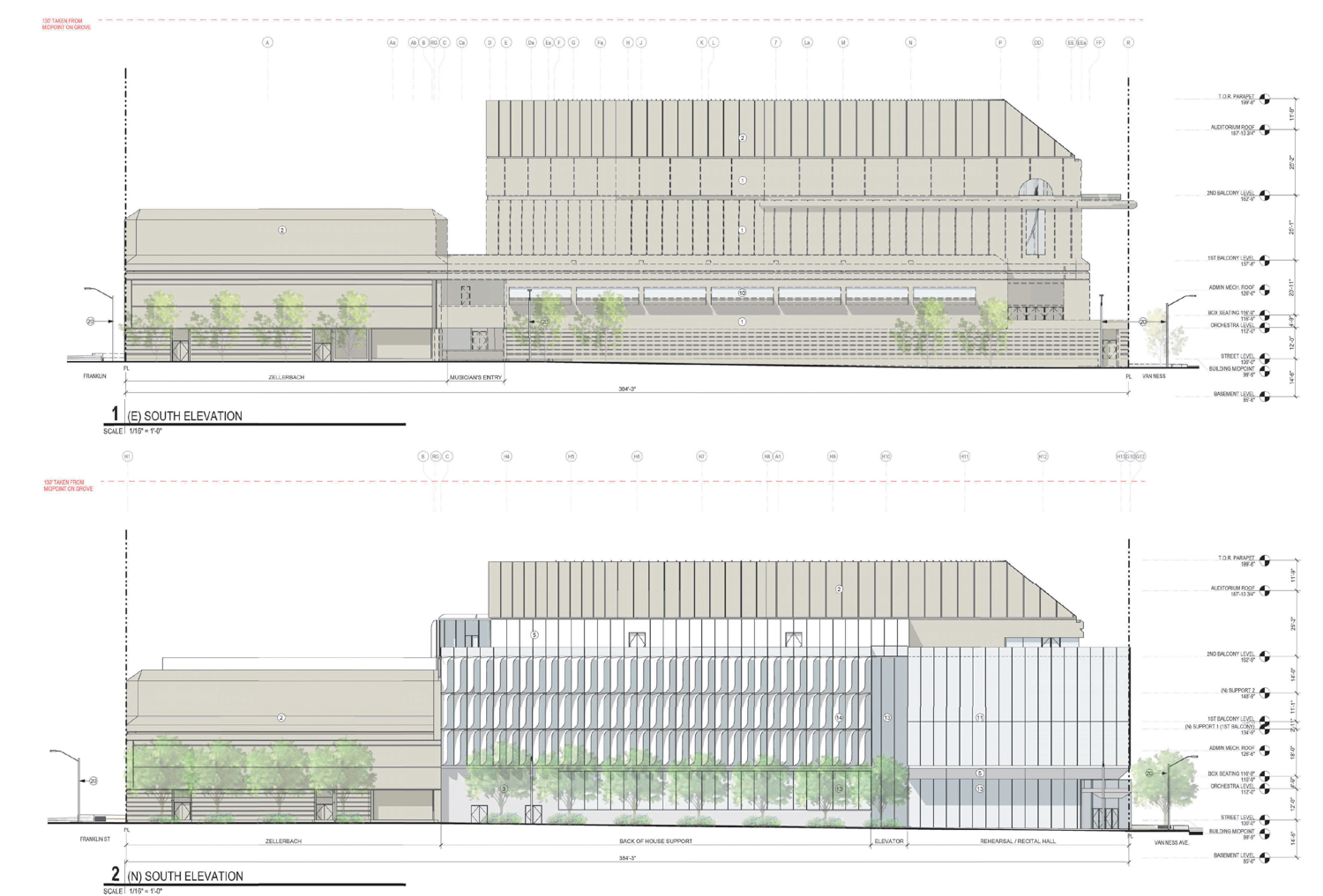
San Francisco Symphony Hall existing (top) and proposed changes (bottom) along the south elevation, illustration by Mark Cavagnero Associates
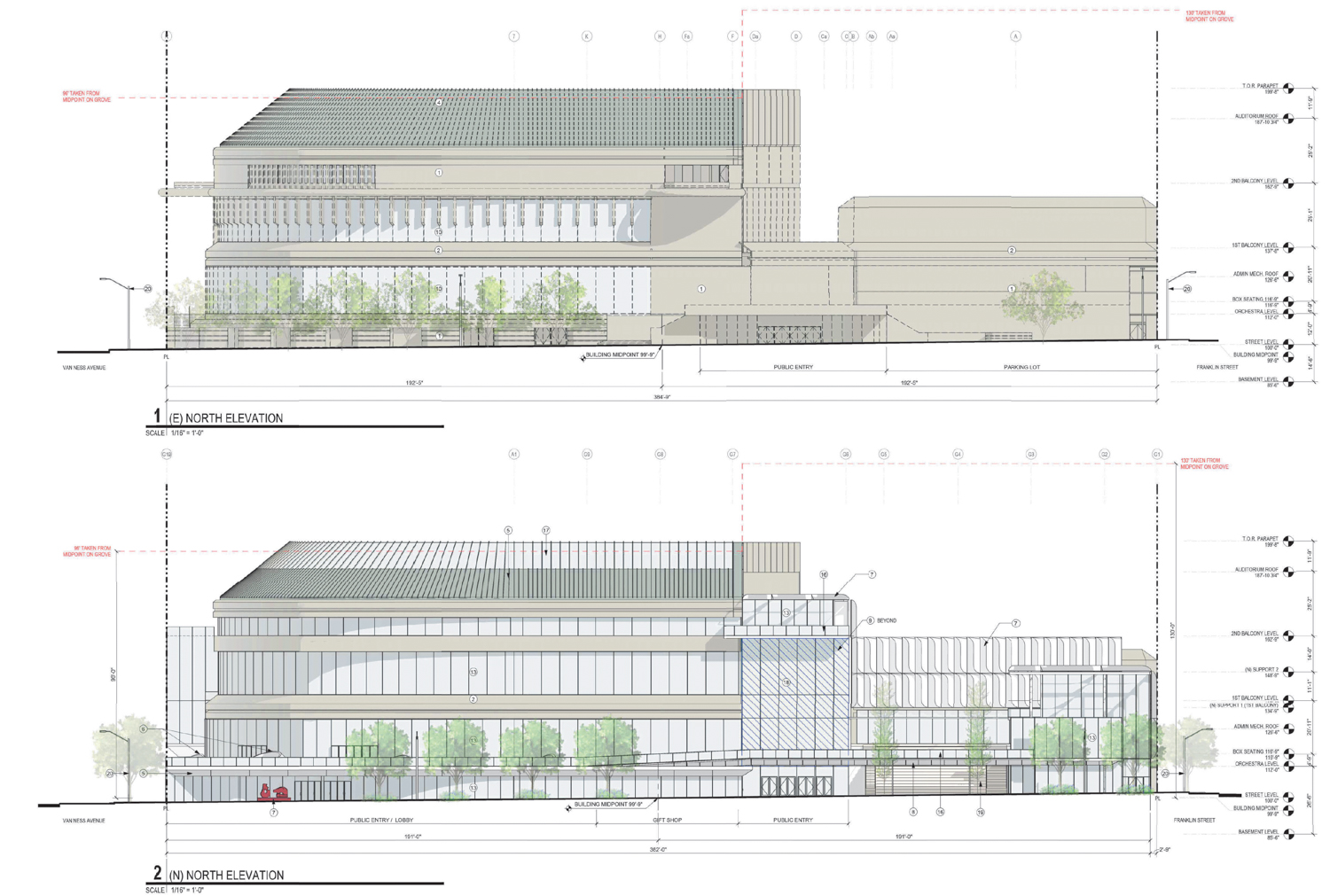
San Francisco Symphony Hall existing (top) and proposed changes (bottom) for the north elevation, illustration by Mark Cavagnero Associates
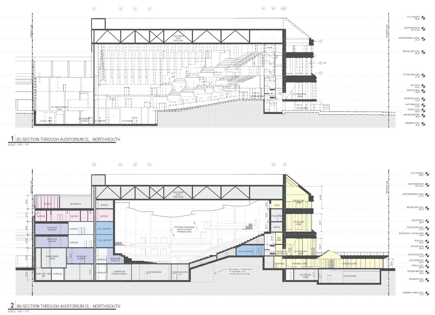
San Francisco Symphony Hall existing (top) and proposed changes (bottom) for the interior concert hall, cross-section illustration by Mark Cavagnero Associates
The project will expand the Symphony Hall from 210,200 square feet to 247,780 square feet, including a new 400-seat recital hall at the corner of Van Ness Avenue and Hayes Street. The interior hall will expand by 5,000 square feet, though the total seat capacity will decrease from 2,700 seats to 2,100 seats. Parking will be increased to hold 76 cars and 133 bicycles, shifting the capacity from a surface lot along Franklin Street into a two-level basement garage. An outdoor performance terrace and event space will replace the surface parking. The Zellerbach Hall at the corner of Franklin Street and Hayes Street will remain the same through construction.
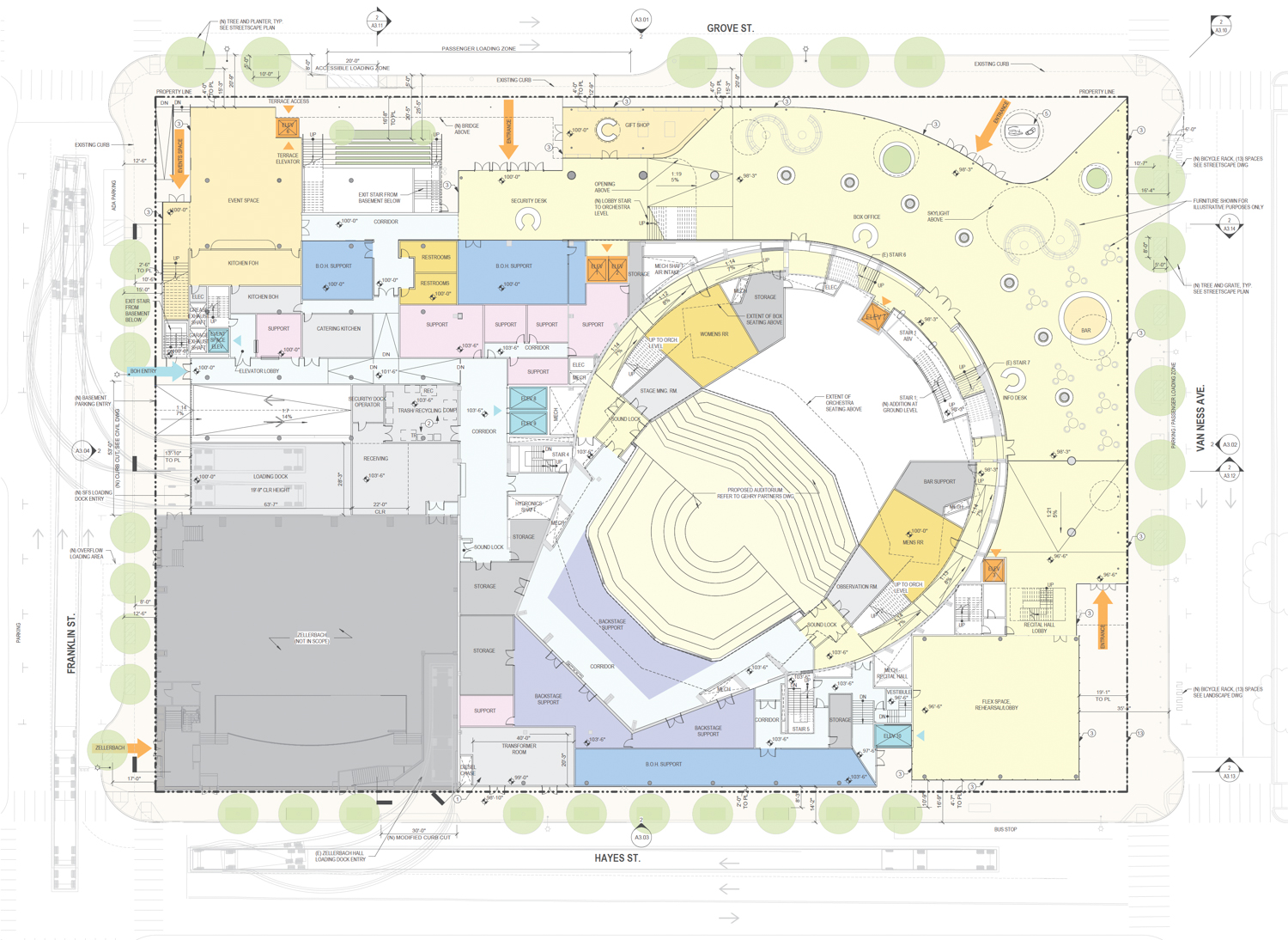
San Francisco Symphony Hall proposed ground-floor map, illustration by Mark Cavagnero Associates
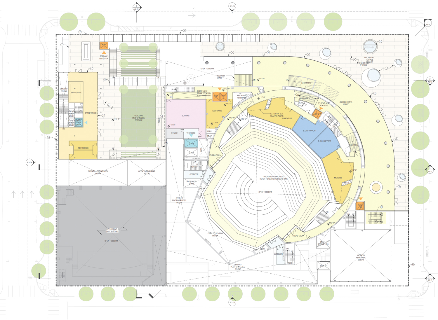
San Francisco Symphony Hall proposed orchestra-level floor plan, illustration by Mark Cavagnero Associates
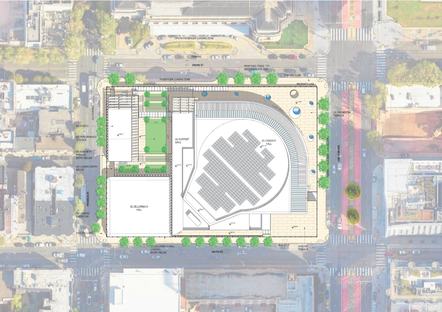
San Francisco Symphony Hall birds-eye view, illustration by Mark Cavagnero Associates
OJB will be responsible for the landscape architecture. The plans will reduce the public space available along the streetscape with an expanded ground-level floor space, though compensated with widened sidewalks along Grove Street, Franklin Street, and Hayes Street. For visitors, though, the proposal could bring a remarkable expansion of open space, up from 4,600 square feet to 39,000 square feet across several outdoor terraces. The most significant will be the orchestra-level terrace above the lobby, providing a 10,500-square-foot balcony facing City Hall and punctuated with oculus skylights.
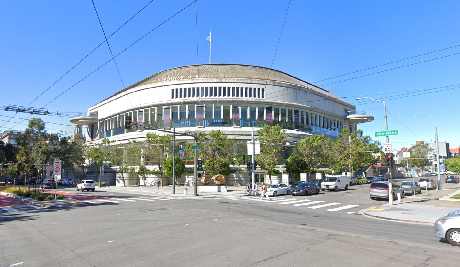
San Francisco Symphony Hall, image by Google Street View
Arup is consulting on engineering. The estimated timeline for construction has yet to be established. In a closing statement, the Symphony said they “enthusiastically look forward to sharing details about the plans as they evolve in the future.
Subscribe to YIMBY’s daily e-mail
![]()
Follow YIMBYgram for real-time photo updates
Like YIMBY on Facebook
Follow YIMBY’s Twitter for the latest in YIMBYnews

Great idea. Reduce the seating capacity by over 22% and expand the viewing area of city hall and the surrounding buildings. This proposal comes from the same board that ruined the Symphony Opening Ball by reducing participation?
Reducing the seating capacity actually makes sense to me. Let’s be honest: the symphony is not selling out regularly. Like what baseball is doing, it’s best to reduce the number of seats to it feels more intimate. No point in having tons of empty seats every night. New baseball stadiums are only around 30K seats, which is a far, far cry from what they used to be. Hopefully the comfort of each seat goes up.
I have been to many sold-out concerts at Davies, including recent ones. Reducing the seating capacity by almost a quarter seems a bit crazy, and of course it just means tickets will become more expensive.
I’m a long-time symphony subscriber, and my initial reaction to this is pretty negative.
I can’t think of why the client would want to remove the most iconic aspect of the building: the keyboard window design. It’s a wasted expense that can only be explained by wanting to erase the previous designer’s work. They’re taking a very iconic structure and making it basic, basic, basic.
Is this really necessary?? Can’t this money be better spent elsewhere?? What’s next—turning the Opera House into a spaceship??
Where is the $100M coming from?
A donor with a big ego and desire to have their name somewhere…
There already is a donor’s name on the hall…Mrs. Ralph K. (Louise M.) Davies. Ever heard of Davies Medical Center??
Why can’t they just change the ugly surface parking lot? The description only rhapsodizes about the design and doesn’t mention the need for structural upgrades or repairs. Seems like a lot of money for very little benefit unless a big donor wants their name recognized for a new iteration of this building.
Gehry Architects. What nobs. Regardless, the hall does need a lil facade refresh and the lot on Gough does need some infilling. Otherwise, please don’t over-glass this or destroy the auditorium.
$100 million for this project seems unrealistic. Granted in New York, the total gut rehab of Geffen Hall at Lincoln Center cost $600+ million. Reducing the main Hall’s seating capacity and adding a small recital hall makes sense in today’s classical music market. I always felt the main curving facade of Davies Hall was rather unrefined and unwelcoming. Kind of in an awkward dialogue with its beaux arts neighbors…
Reverse the Architects’ roles and then we’d have an interesting project on our hands.
Civic Center doesn’t need a tepid 2020’s remake of a tepid 1980’s design.
The original design was an overdone attempt to become a visual part of the Beaux Arts plan, yet it (and its sibling, the state office building on the other side of the War Memorial complex) are both unpleasant on the street level. While it appears that there’s an attempt to undo some of the building’s current hostility to the pedestrian, the rest of it reads as pretty plain. Obviously this is early days so it may well evolve into something more interesting, but these elevations don’t seem too inspiring. The new skylights on the roof could create some interesting interior spaces, though the rest of the interior experience is difficult to read from just the floor plans and sections. While the cantilevered balconies on the exterior have always been fun, they’re often too crowded to enjoy so the expansion of outdoor spaces will be welcome. Looking forward to some renderings.
I’m glad the Symphony is doing so well as to be able to waste $100 million on this, especially since some comments here argue they are “not selling out regularly”. No matter whether you think certain aspects of the project are a good idea or not, is it worth $100 million and is that the best way to spend that kind of money? As for me, I wonder why the Symphony needs a new recital hall with at least 4 smaller performance spaces already within a block or two. Finally, the exterior modifications just seem like a lot of change for change’s sake which will make the building a bit more attractive to some and perhaps less contextual for others.
$100M is six times what SF is receiving for retail crime mitigation. Donors need better alignment on priorities. The current hall is decent enough, not some midcentury monstrosity in dire need of updating.
How about using some of the money to pay the fabulous orchestra players a decent raise. They certainly deserve one.
I never thought the building fit in with the neighborhood, but since it is there just refresh it. It doesn’t need a total makeover. Instead of reducing the # of seats, reduce the prices so more people can go. Increase interest. What are they going to do when more people quit going, reduce the seating again. The A’s wanted a new stadium to reduce the # of seats, a better idea would have increase the audience by lowering ticket prices and popcorn so that the average person and their family could attend. Build a new stadium, keep up with the Jones, only make it so the rich can afford seats. There marketing plan has been all wrong for years. It is not always what you can get, it is sometimes what you can give. They lost focus on why they started.
I love how architects today think they are so creative and innovative (and love to tell everyone) then come up with the same bland tired designs as literally every other architect of the last 15 years. Yawn… yet more generic curtain wall as the answer to every design problem. The interior will have the same sparse minimalist look like every office lobby renovation of the last 15 years.
I agree with the many commenters who question this project and instead propose lower ticket prices and/or higher pay for the artists who perform here. I find it troubling that this proposal would apparently increase the symphony hall’s car parking spaces. UCLA’s parking guru professor, Donald Shoup, has lauded Davies for being car-light, which helps improve the pedestrian landscape and the neighborhood’s vibrancy (and is so different than the Disney/Gehry hall in downtown LA). More car parking combined with a construction project of dubious benefit equals increased pollution and carbon footprint of our city’s symphony hall. This seems to be a step backwards.
The car parking lot is most likely for musicians. Who have it in their contract to have parking within a certain distance of the venue so as not to have to lug their instruments too far. Some of these instruments are over $10s of thousands of dollars. Right now the parking for the orchestra is a real mess. And no they are not taking a cello or bass that over 200 years old onto mass transit. Some professions need vehicles to transport the tools of the trade.
The main acoustical problem with the symphony hall from the beginning, has been that it has too much volume (too reverberant) as well as inadequate reflecting surfaces of shape, size, and placement to promote a beneficial distribution of sound. If you bow the ceiling into the space and push side and rear seating into the room to reduce the volume, the available seating will necessarily have to be reduced. Disney Concert Hall has “only” 2,265 and that was staring with a new, clean-sheet-of-paper design, not trying to adapt an existing box. If the LA Phil could have had more seat revenue without detrimental effects on the acoustics, they surely would have.